WARU WARU DONUT
Branding / Logo / Graphic / Package
![](https://pntr.jp/login/wp-content/uploads/2023/10/WDN_012_re-2.jpg)
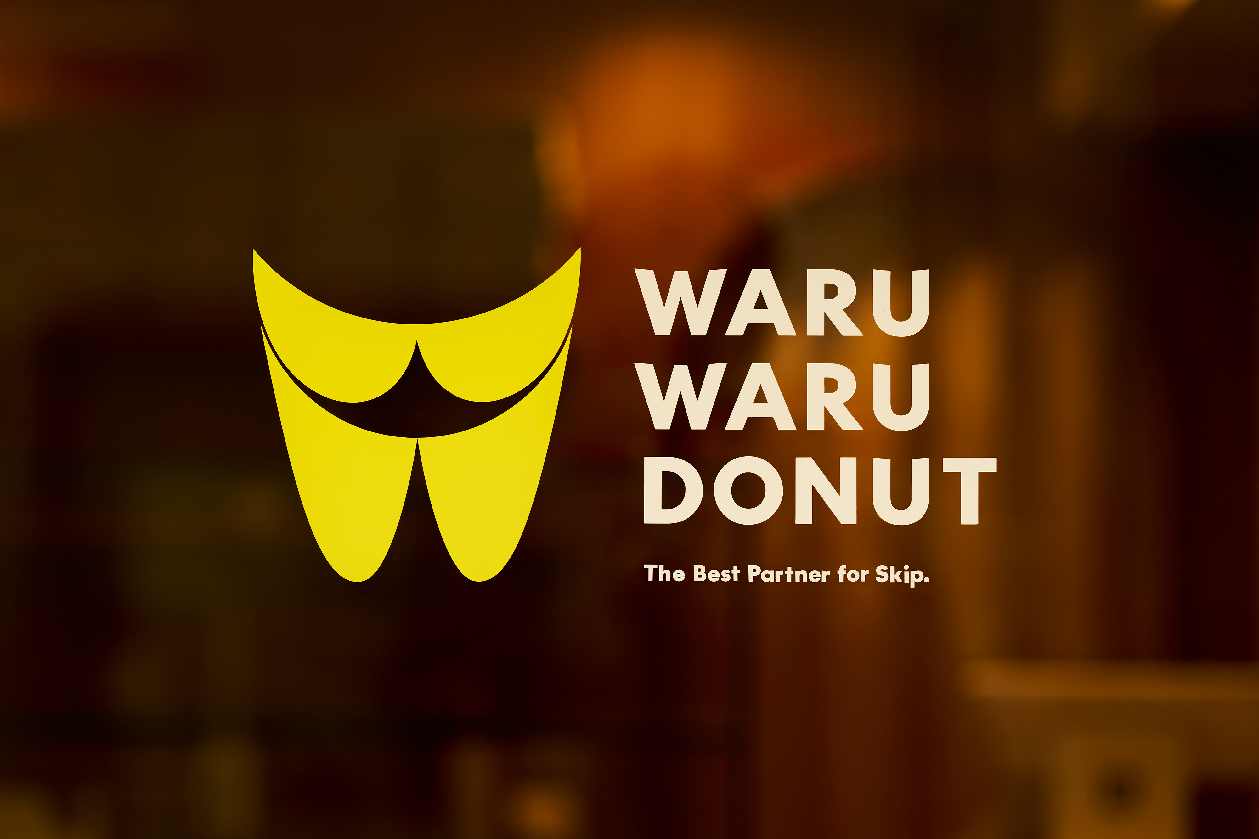
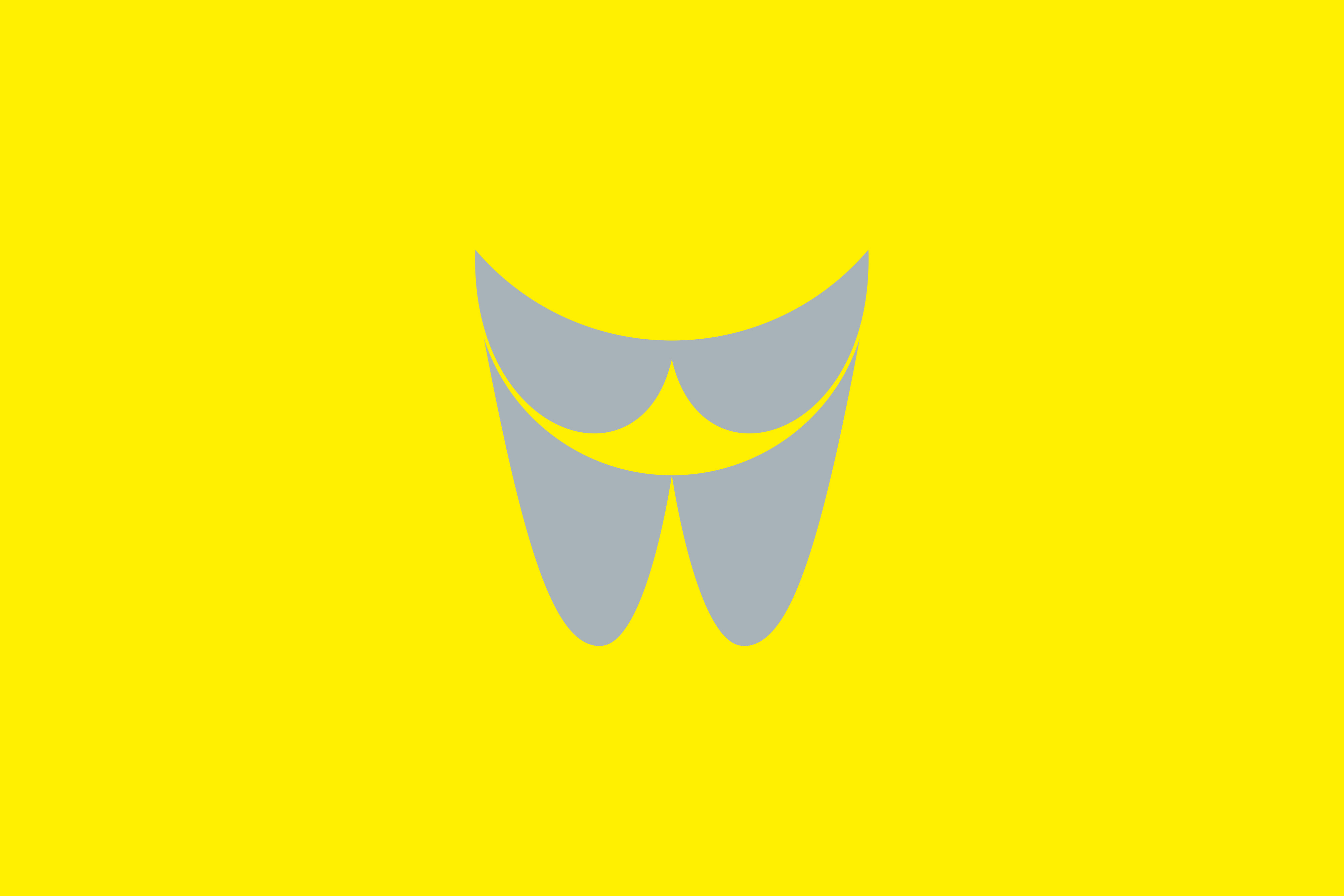
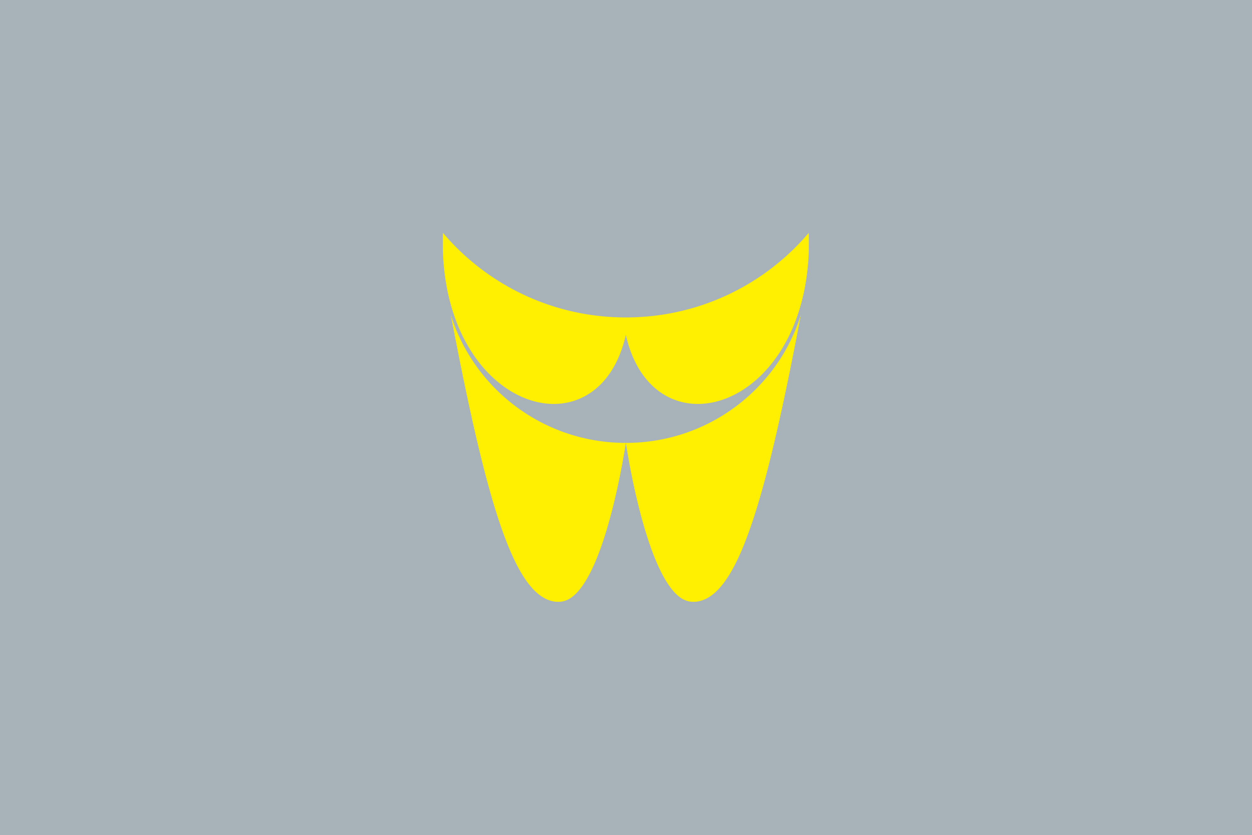
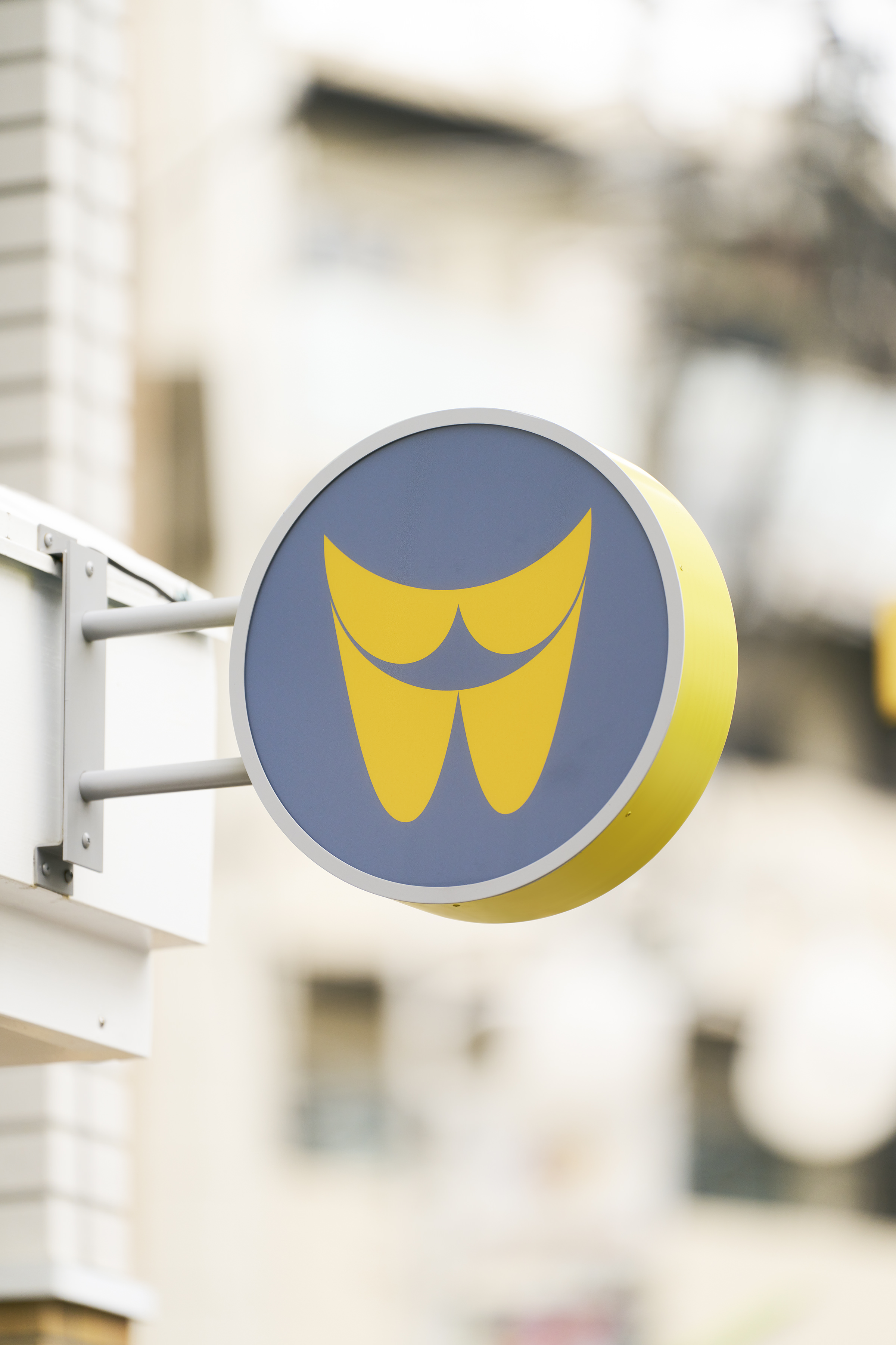
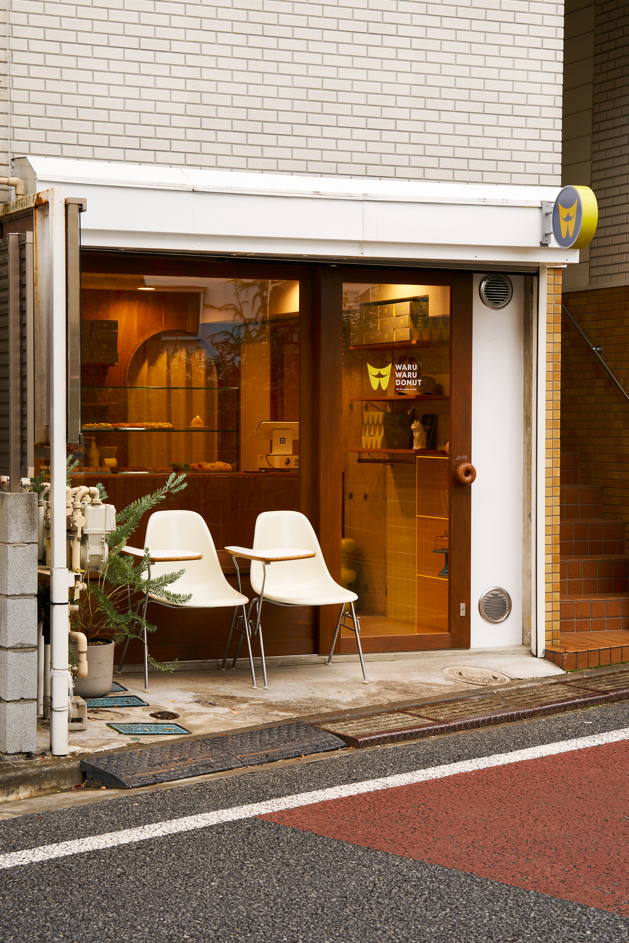
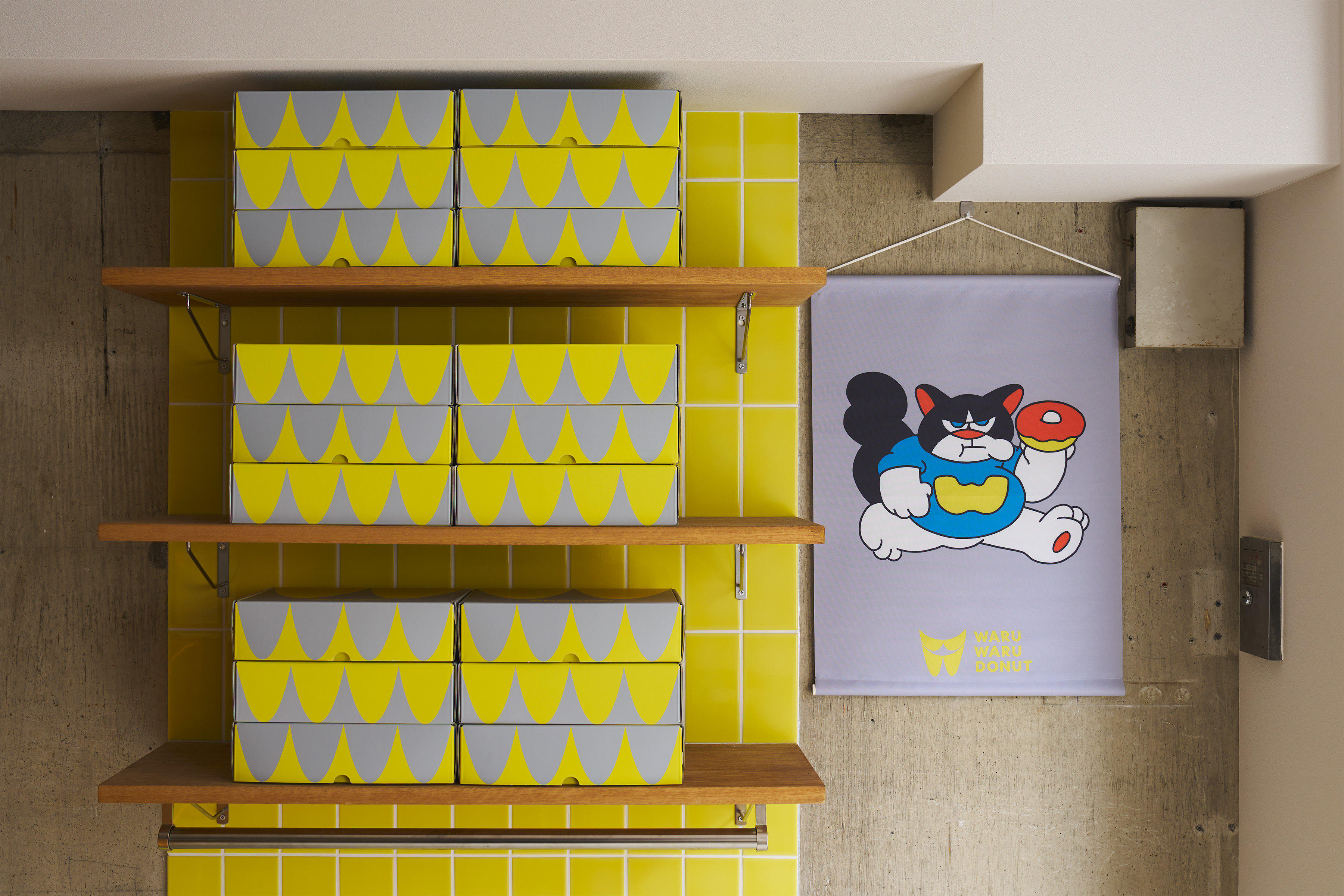
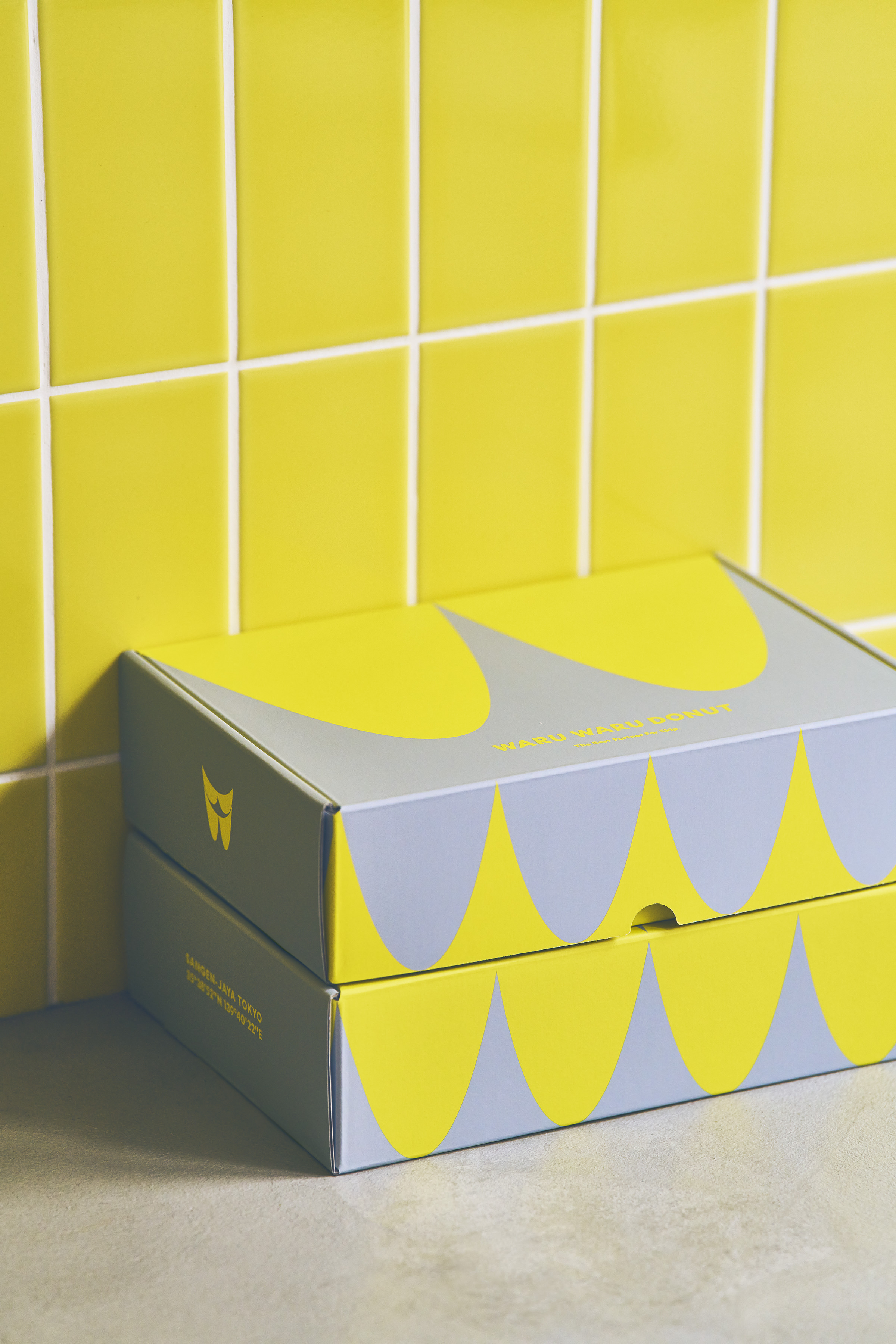
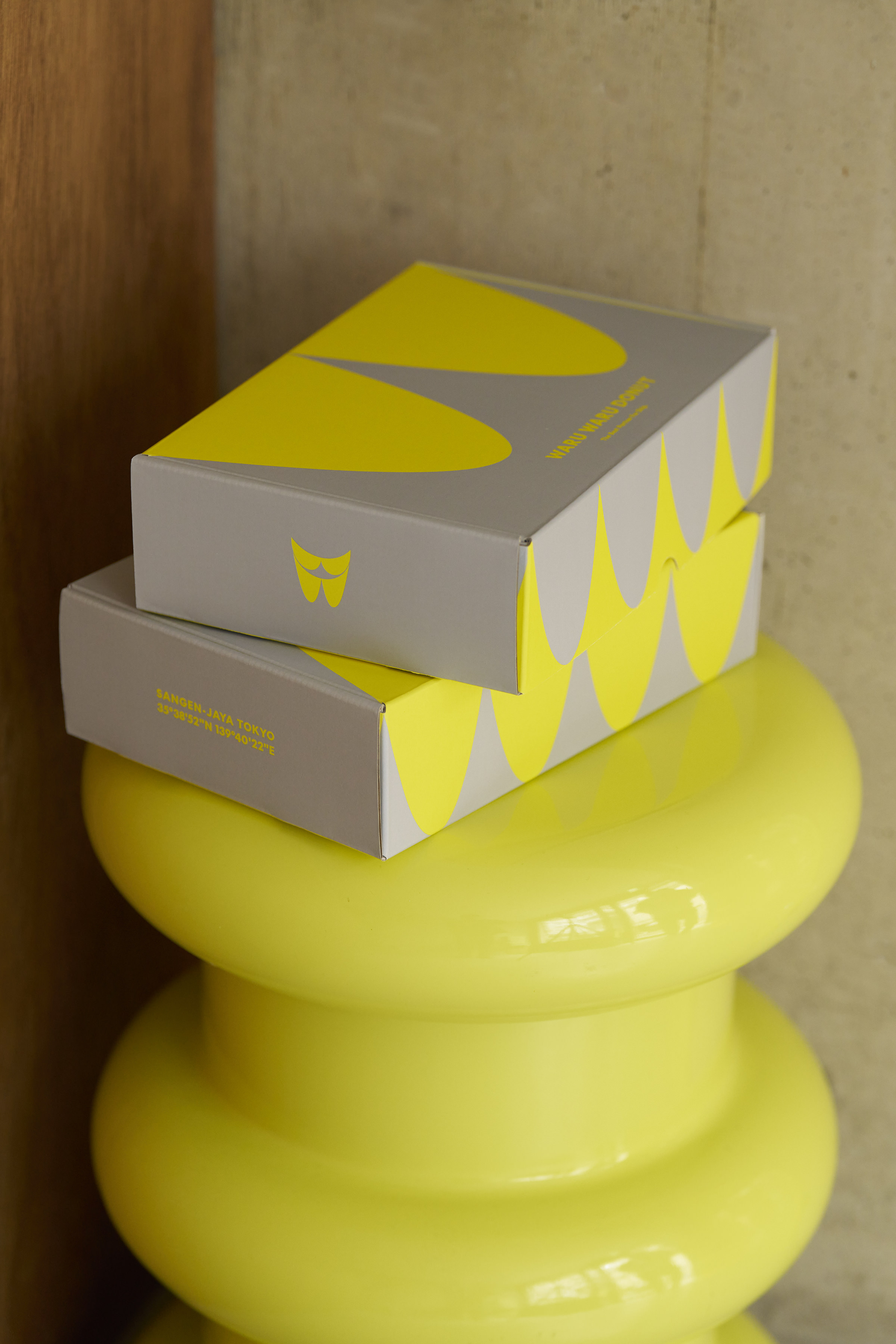
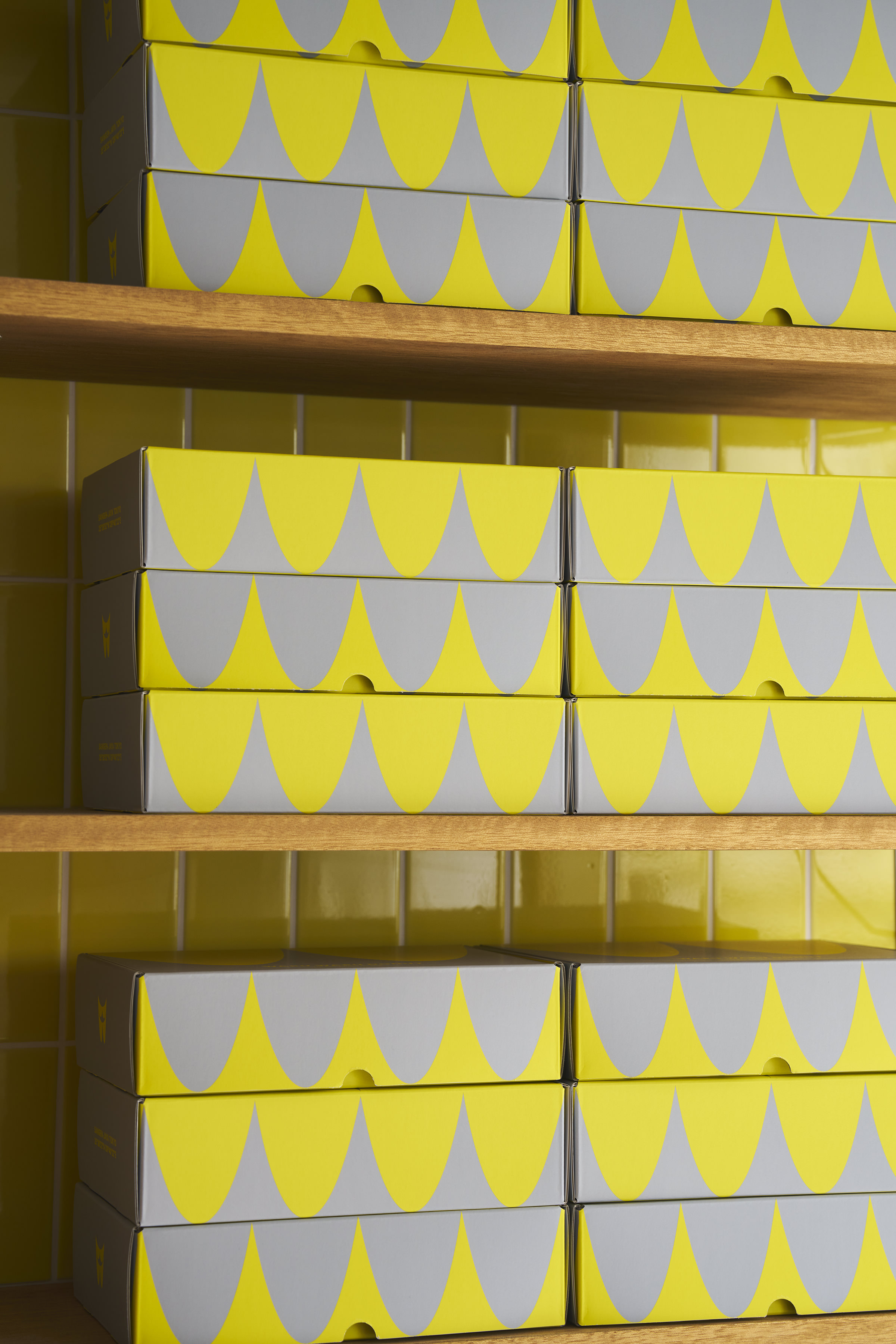
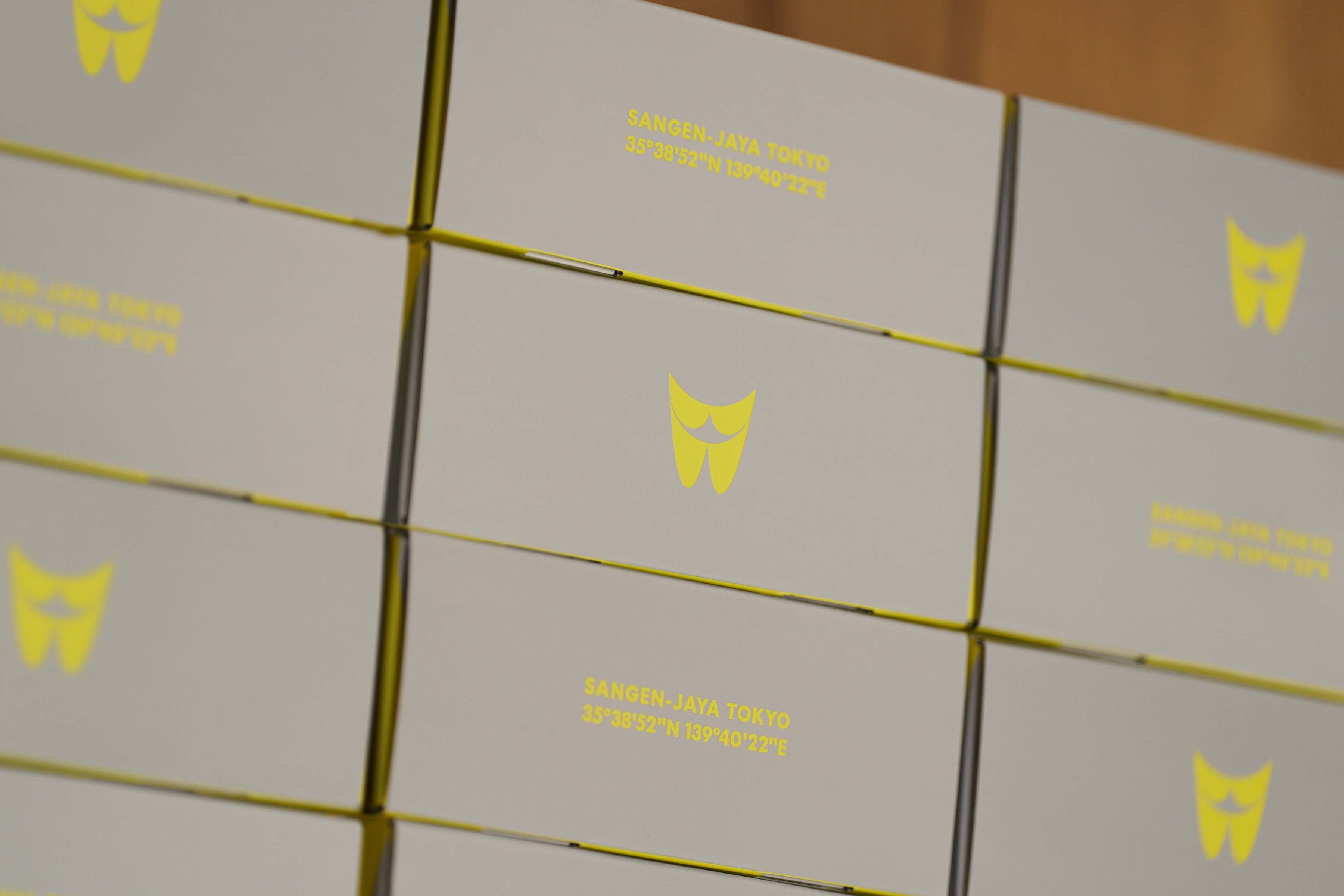
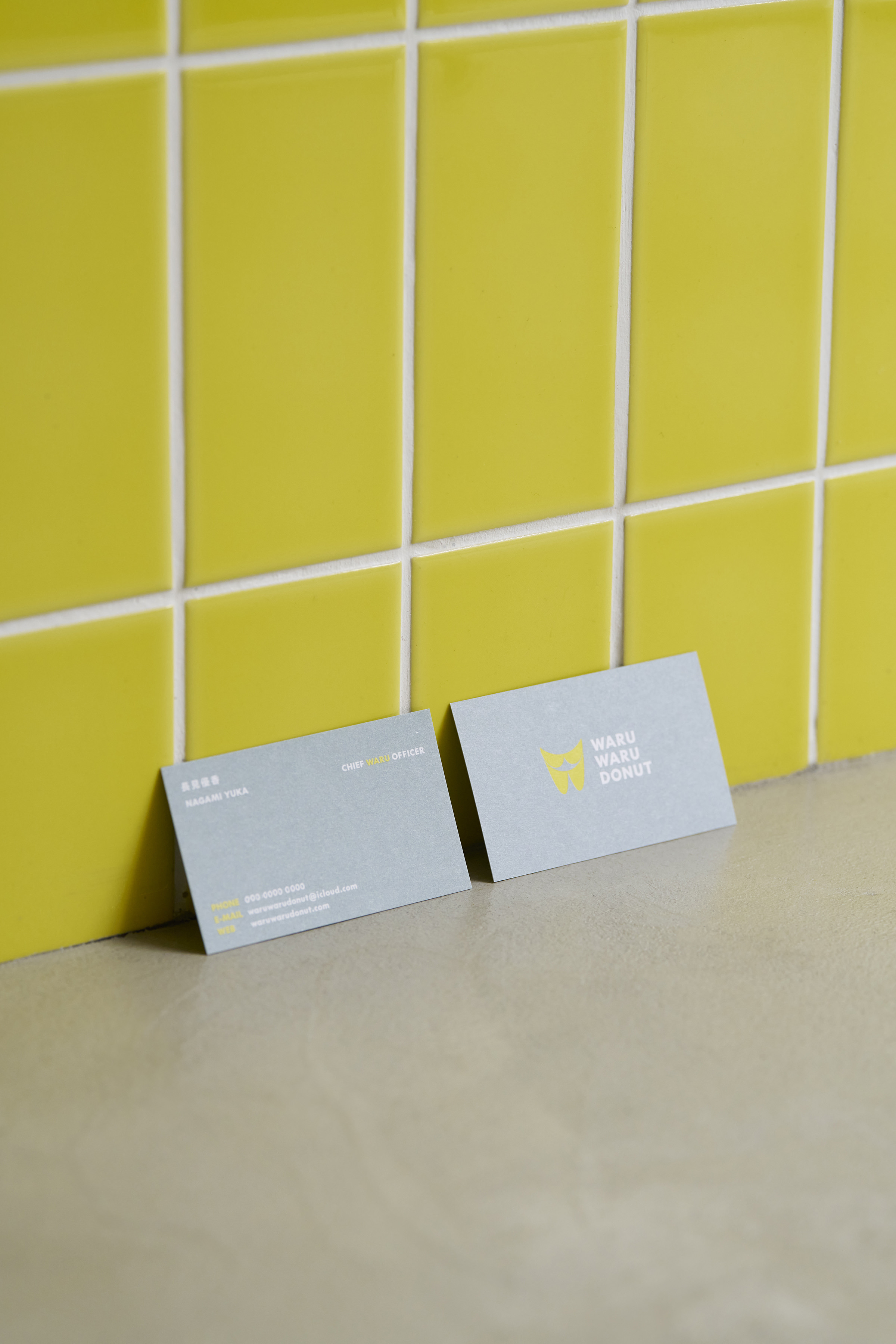
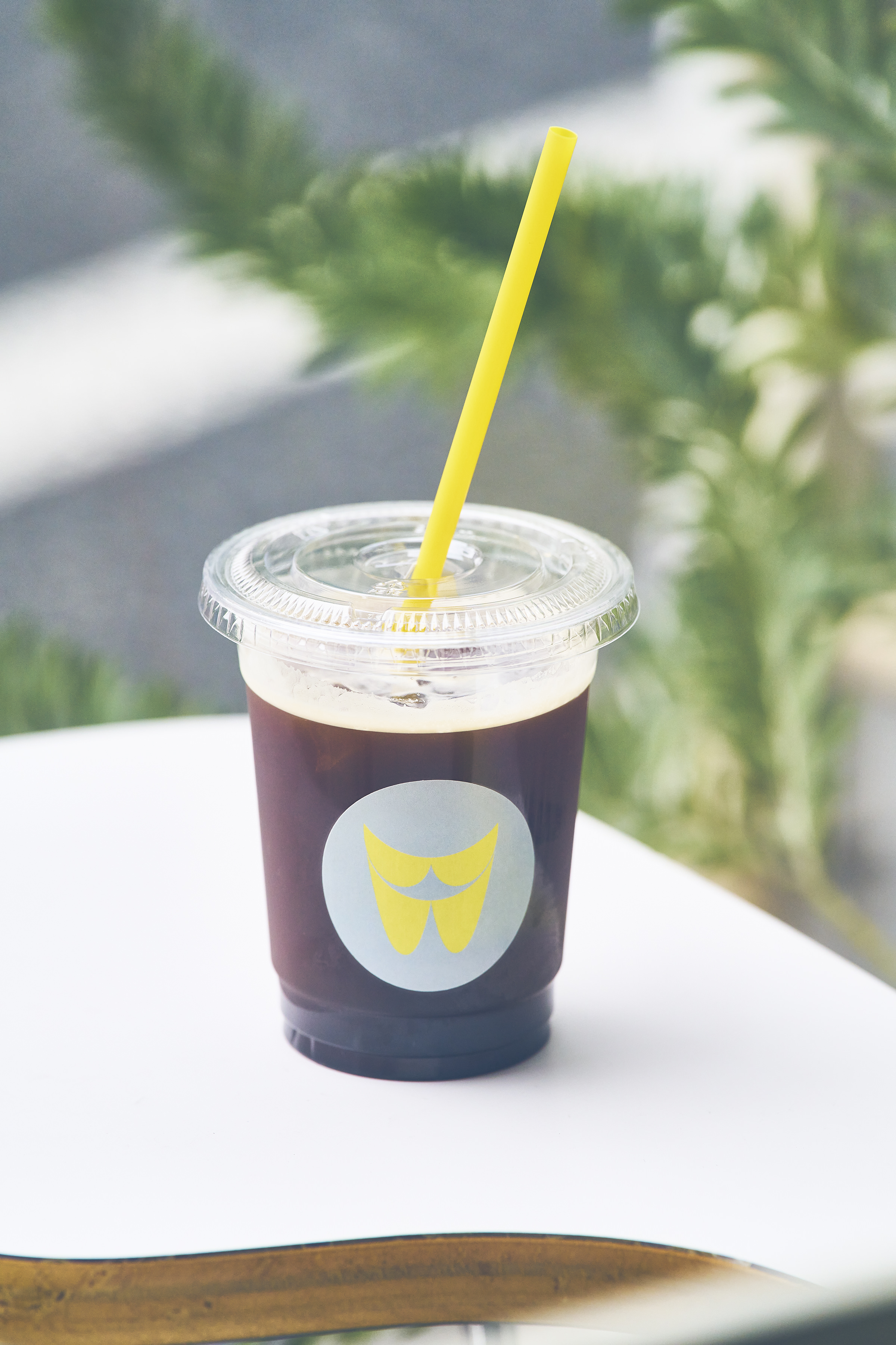
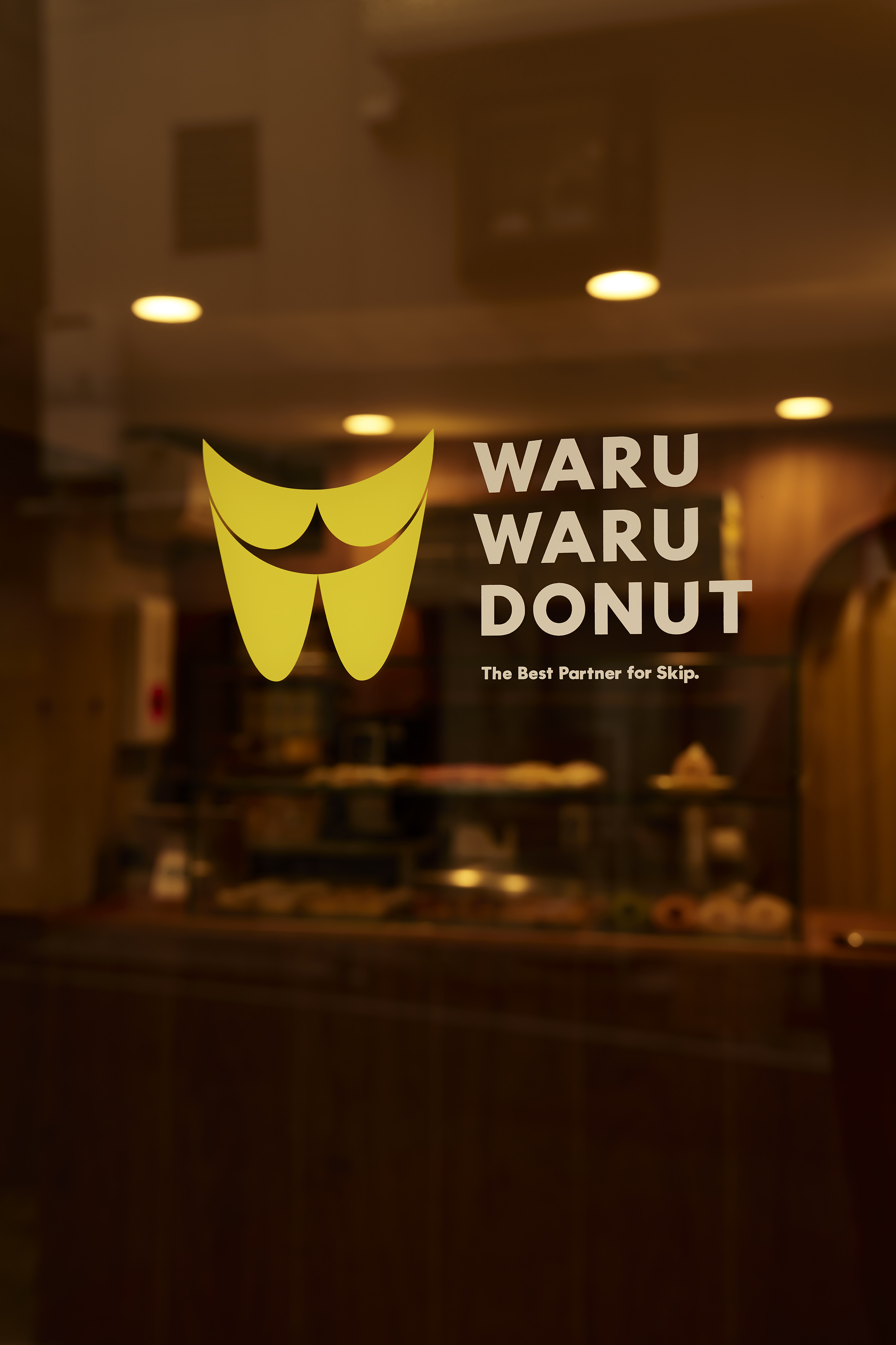
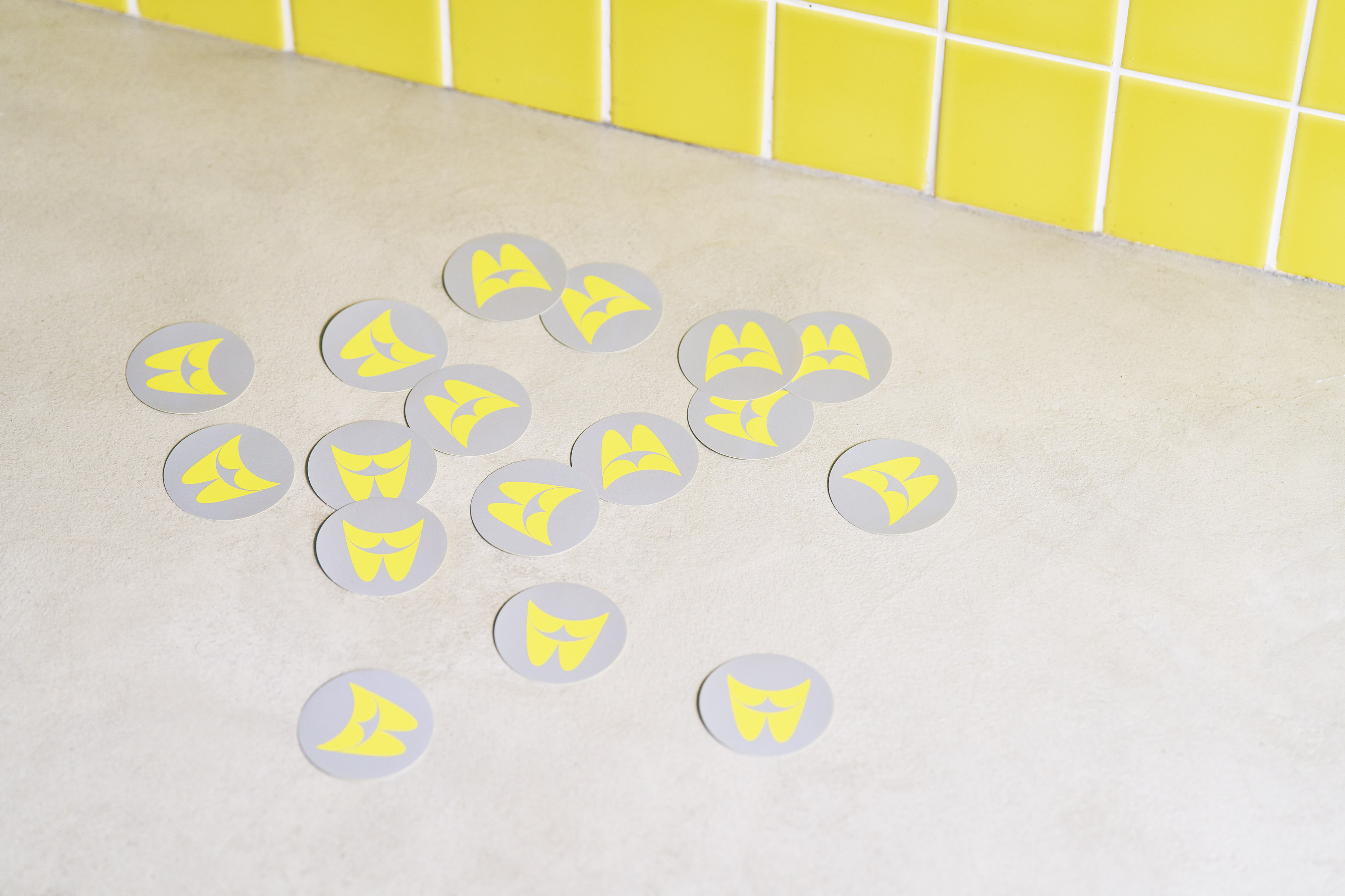
三軒茶屋・三宿エリアにあるドーナツショップ「WARU WARU DONUT」のロゴやパッケージなど全体のアートディレクション・デザインを担当しました。WARUWARUという特徴的なネーミングをヒントにWを重ね、オーナーの飼い猫をモチーフにしたキャラクターとリンクするように縦に連なったWが猫が笑った口に見えるマークを制作、全体のシルエットも猫のように耳が立っている雰囲気に仕上げています。パッケージも積み重ねることでWが連なり重なるシームレスでポップな印象のデザインに落とし込みました。
I was in charge of the overall art direction and design of the logo and packaging for a doughnut store in the Sangenjaya and Mishuku areas, taking a hint from the distinctive name WARUWARU and creating a mark that looks like a cat's smiling mouth with the W overlapping to link with a character based on the owner's cat. The stacked Ws look like a cat's smiling mouth, linking to the character based on the owner's cat. The packaging was also designed to have a seamless, pop impression, with the Ws stacked one on top of the other.
Year: 2023
Art Direction, Design: Tomoya Wakasugi
Client: WARU WARU DONUT
![](https://pntr.jp/login/wp-content/uploads/2023/10/wwd_1.jpg)
![](https://pntr.jp/login/wp-content/uploads/2023/10/wwd_3.jpg)
![](https://pntr.jp/login/wp-content/uploads/2023/10/wwd4.jpg)
![](https://pntr.jp/login/wp-content/uploads/2023/10/wwd_5.jpg)
![](https://pntr.jp/login/wp-content/uploads/2023/10/WDN_002_re.jpg)
![](https://pntr.jp/login/wp-content/uploads/2023/10/WDN_162_re.jpg)
![](https://pntr.jp/login/wp-content/uploads/2023/10/WDN_021_re.jpg)
![](https://pntr.jp/login/wp-content/uploads/2023/10/WDN_043_re.jpg)
![](https://pntr.jp/login/wp-content/uploads/2023/10/WDN_134_re.jpg)
![](https://pntr.jp/login/wp-content/uploads/2023/10/WDN_022_re.jpg)
![](https://pntr.jp/login/wp-content/uploads/2023/10/WDN_133_re.jpg)
![](https://pntr.jp/login/wp-content/uploads/2023/10/WDN_084_re.jpg)
![](https://pntr.jp/login/wp-content/uploads/2023/10/WDN_058_re.jpg)
![](https://pntr.jp/login/wp-content/uploads/2023/10/WDN_174_re.jpg)
![](https://pntr.jp/login/wp-content/uploads/2023/10/WDN_066_re.jpg)