NATSUHASHA DIARY
Graphic / Editorial
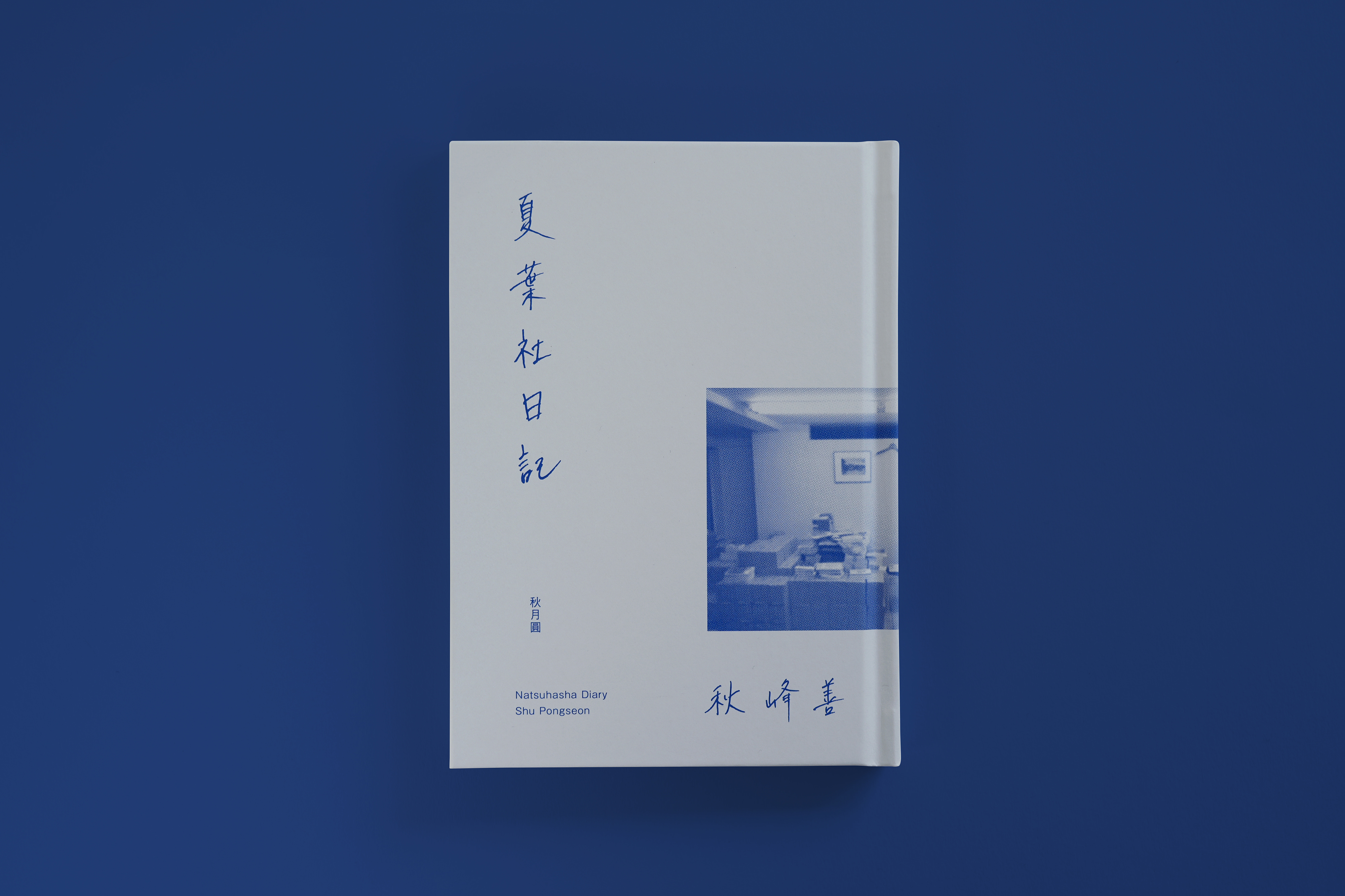
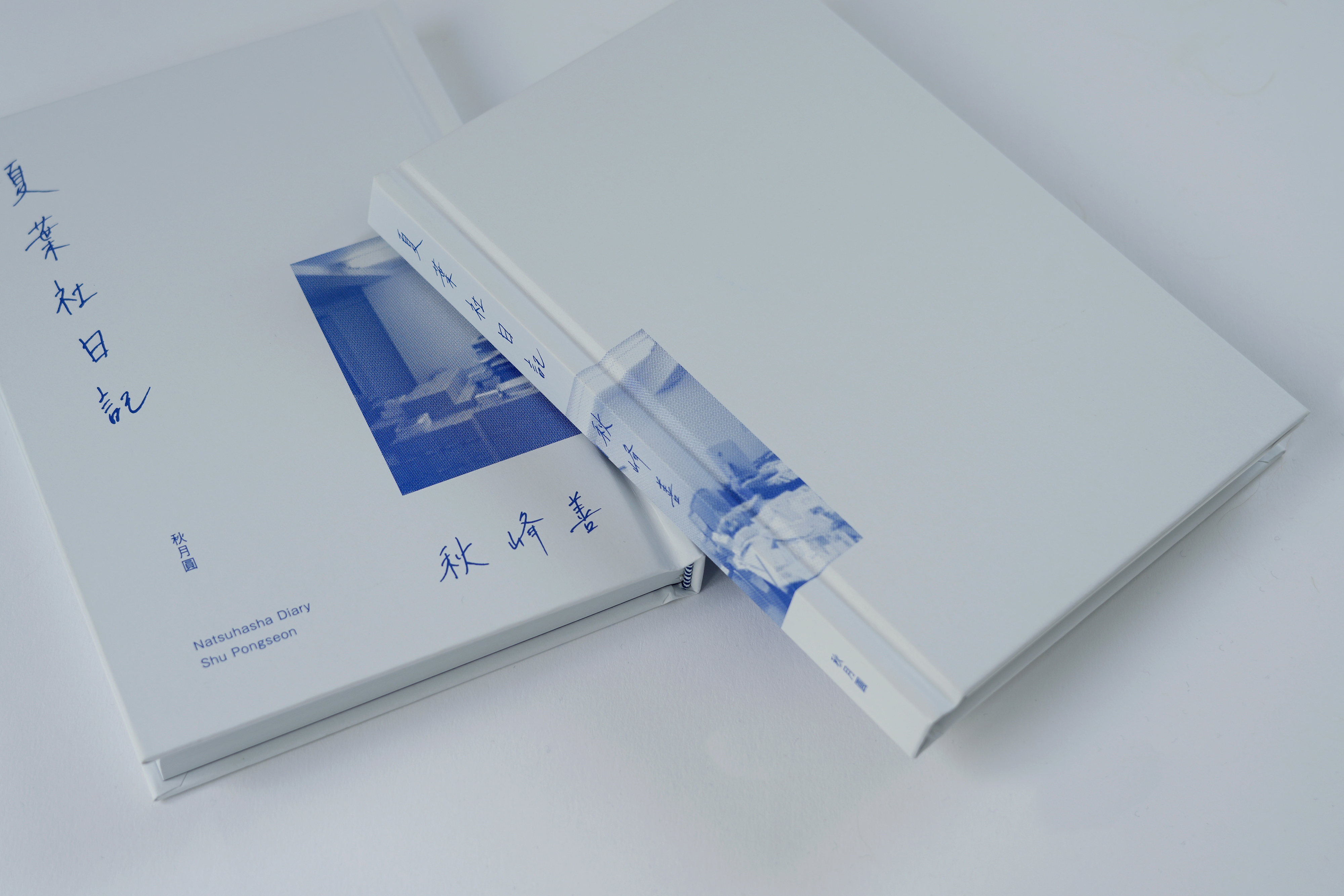
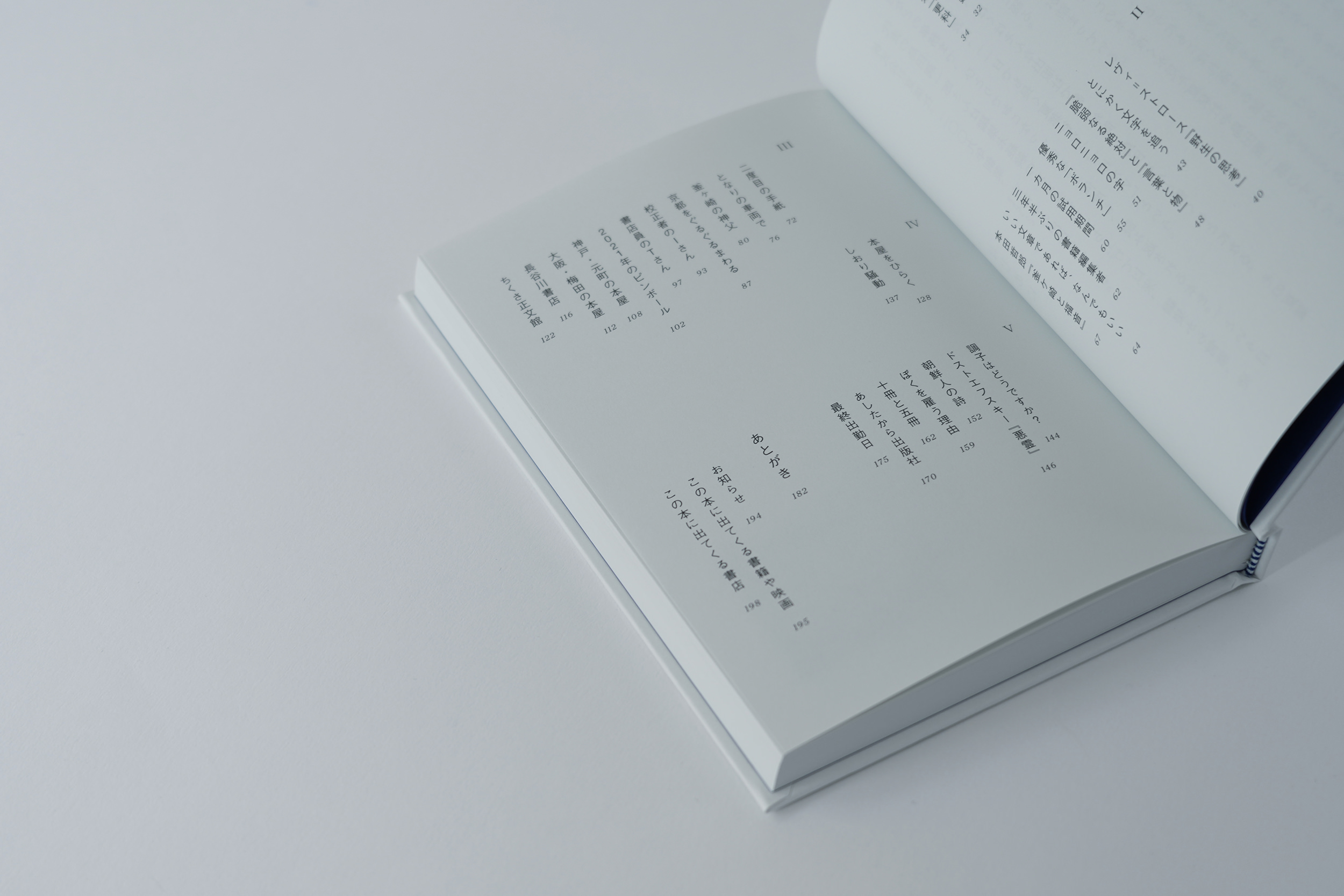
吉祥寺のひとり出版社、夏葉社でアルバイトとして働いた一年間を綴った『夏葉社日記』(秋峰善/秋月圓)の装丁・組版を担当しました。
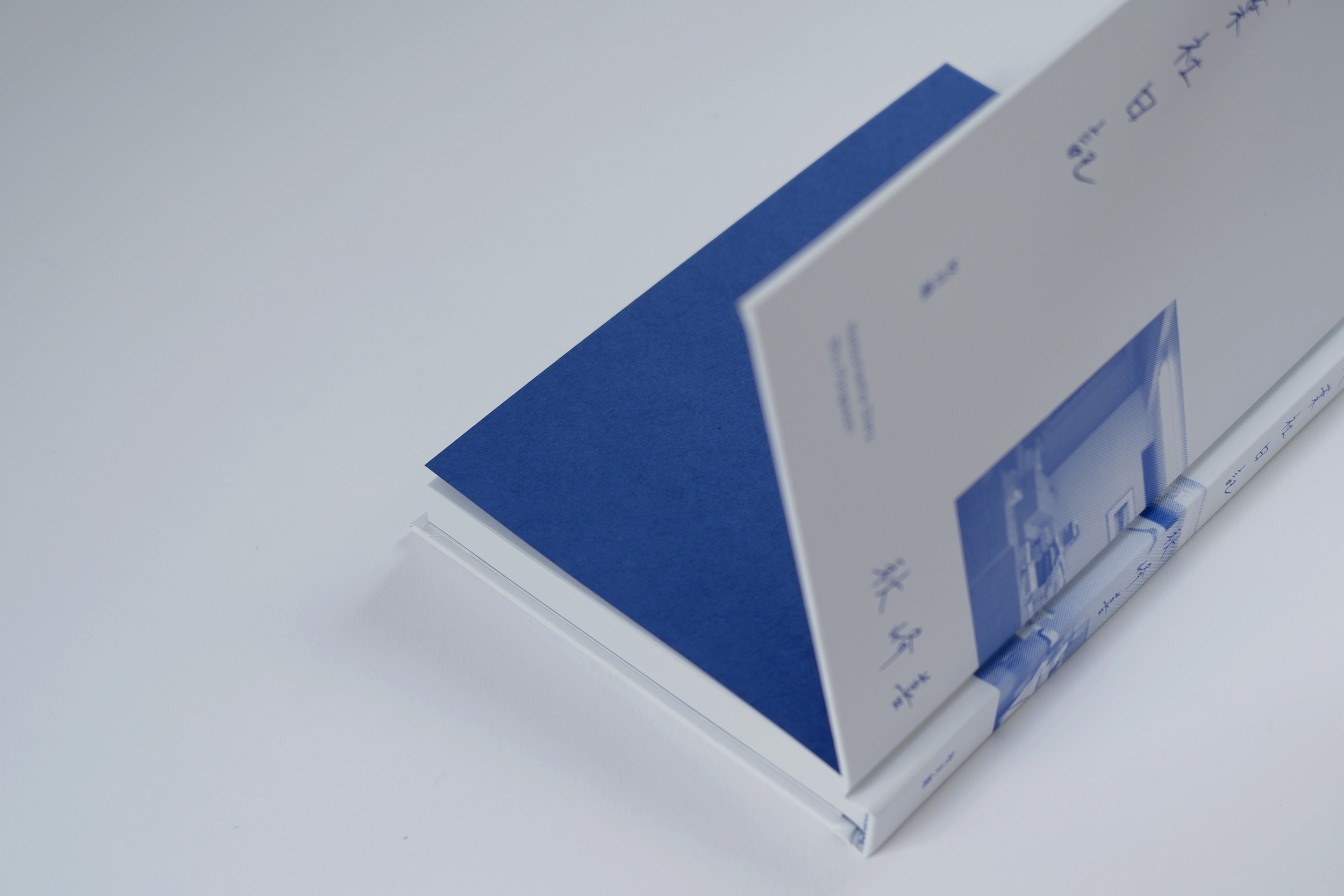
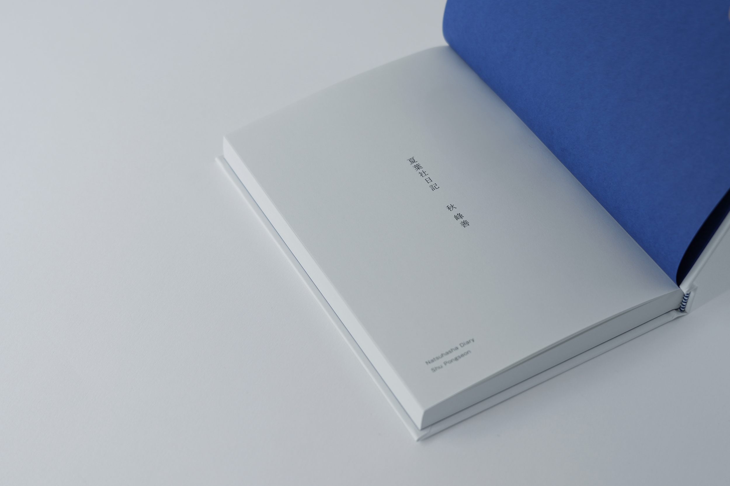
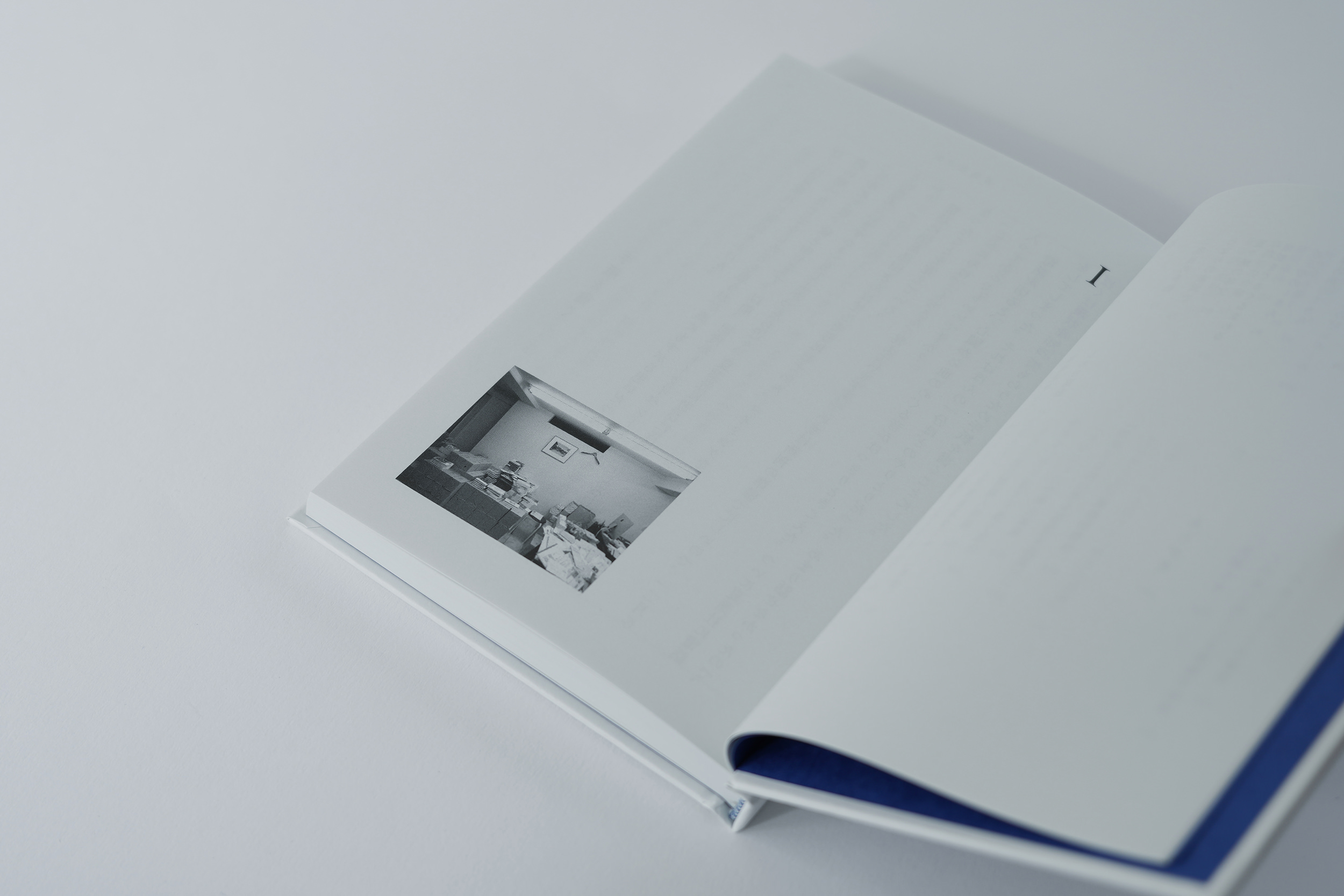
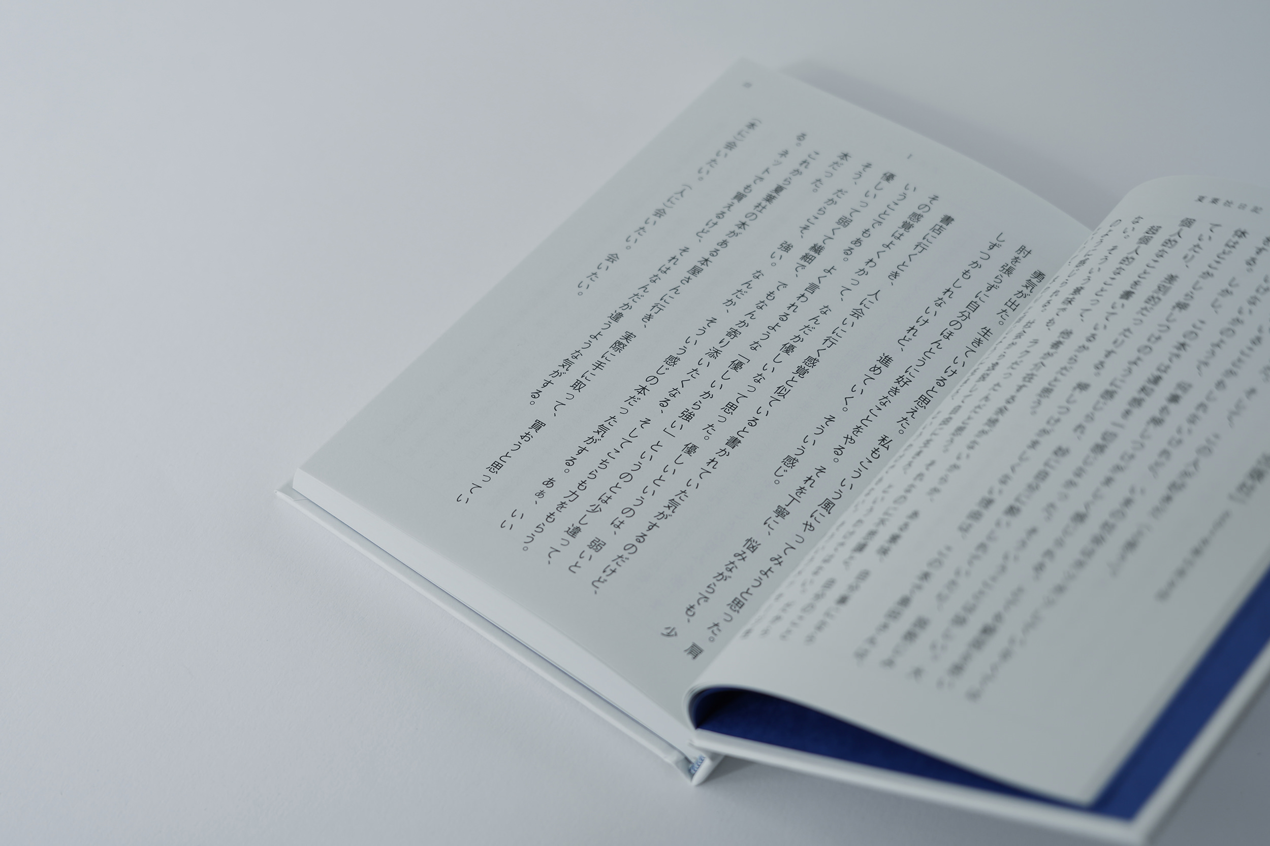
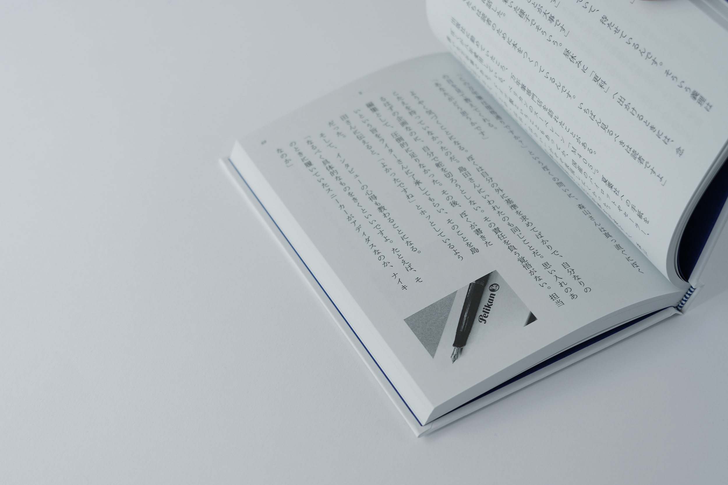
秋さん直筆のタイトルと、ご本人が撮ったこれ以上ない生の写真を組み合わせ、愛用の万年筆と同じ色の青一色でデザインすることで青春の日々を表現しています。表紙と本文用紙は共紙で、ノイエグレーを採用。真っさらではない当時の心境を表しながら、目に優しいグレーがかった紙で心地よく読み進めることが出来ます。見返しには万年筆のインクに一番近い色のビオトープ(マゼランブルー)を選び、落ち着いた印象ながらもグレーとの対比でハッとする仕様に。花布には青と白のストライプのものを採用。秋さんのチャーミングな人柄をさりげなく感じられるポイントの一つです。
We were in charge of the binding and typesetting of Natsuyosha Diary (Shu pongseon / Shugetsuen), which describes a year of working part-time at Natsuyosha, a one-man publishing house in Kichijoji.
The title, handwritten by Shu, is combined with no more raw photographs taken by the author himself, and the design is in blue, the same colour as his favourite fountain pen, to express the days of his youth.
The cover and text paper are co-paper, in Neue grey. The greyish paper is gentle on the eyes and allows for a comfortable reading experience, while expressing the feelings of those not-so-perfect days.
The biotope (Magellan blue), the colour closest to fountain pen ink, was chosen for the reverse side, creating a calm impression, but with a striking contrast to the grey.
Blue and white stripes were used for the headband. This is one of the points where He's charming personality can be subtly felt.
Artdirection, Book Design: Tomoya Wakasugi
Client: Shugetsuen