E&C Management
Branding / Logo / Graphic

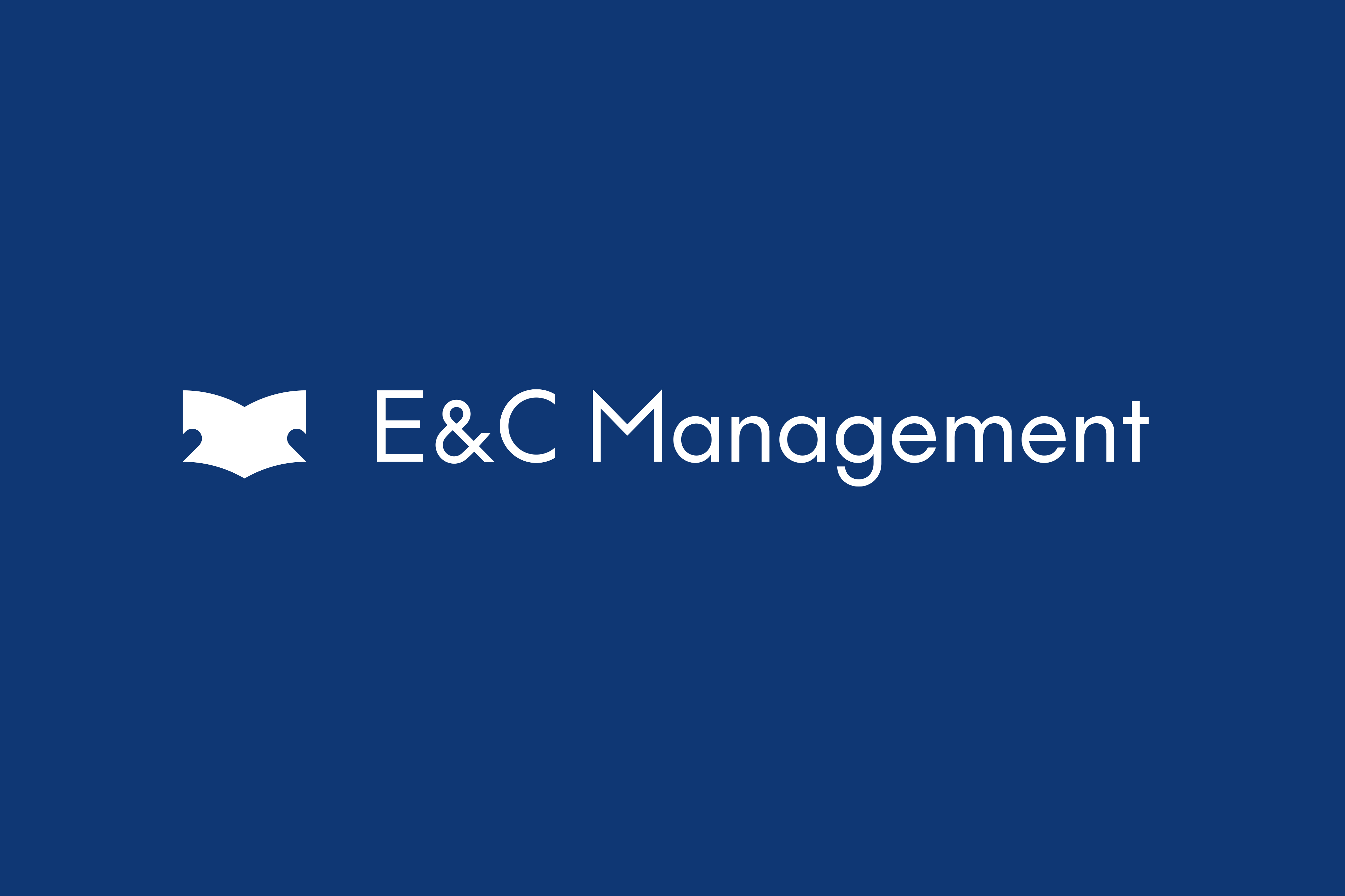
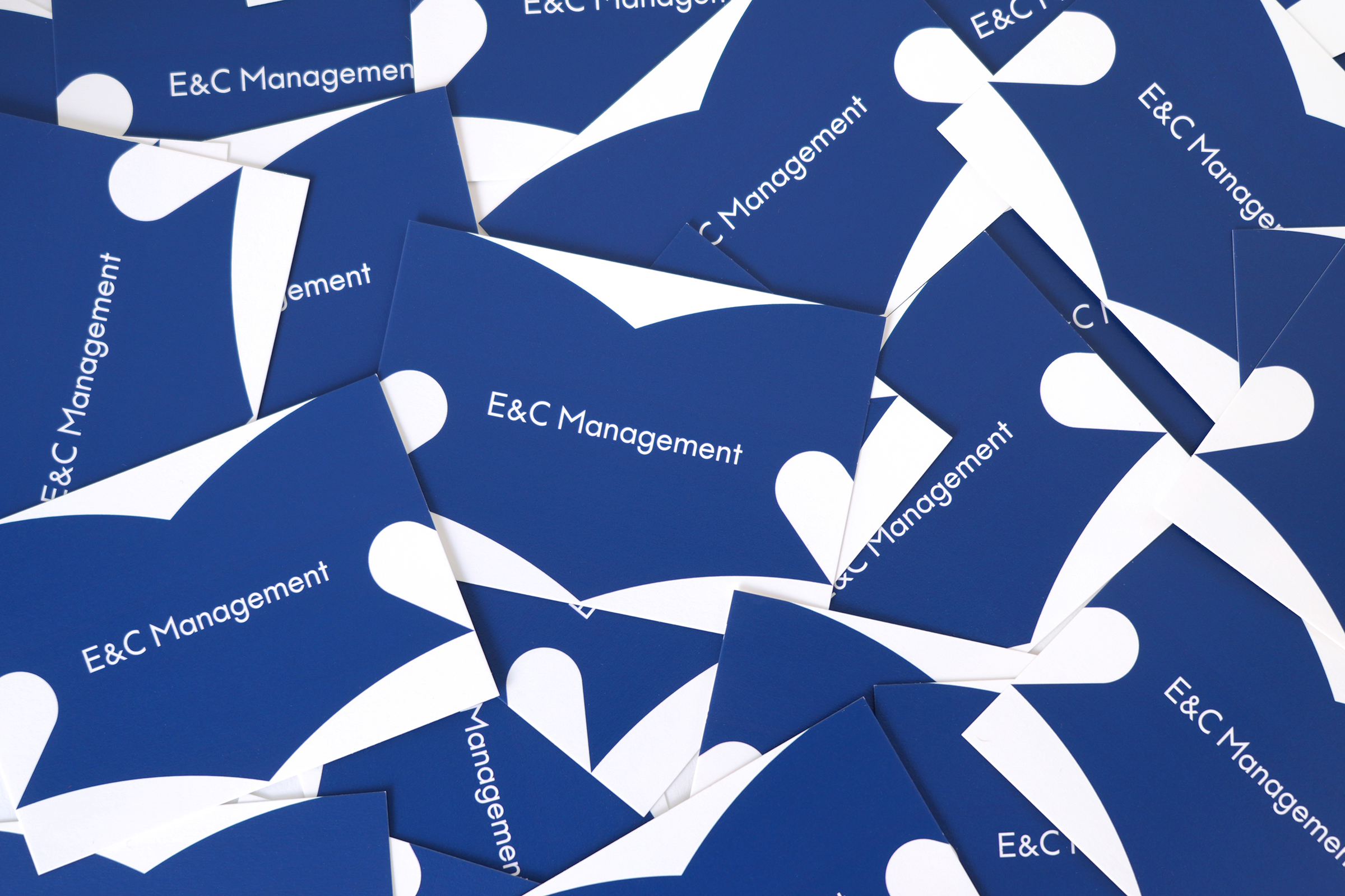
幼稚園・保育園の経営者のためのWebメディアE&C ManegementのVIを担当しました。EはEducation(教育)、CはCare(養護)の頭文字。
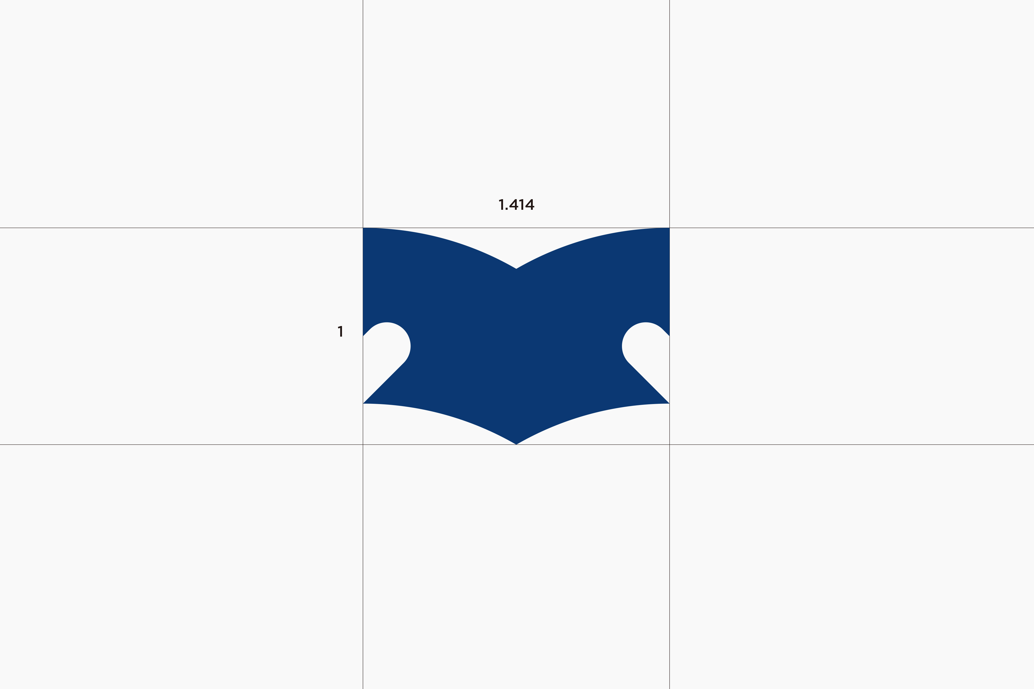
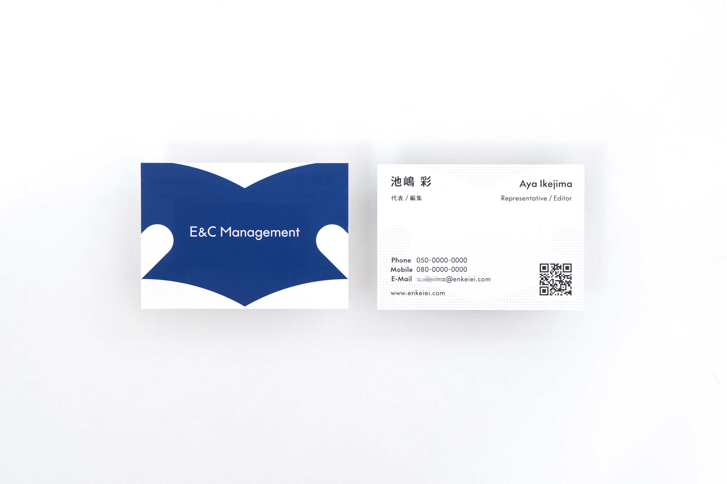
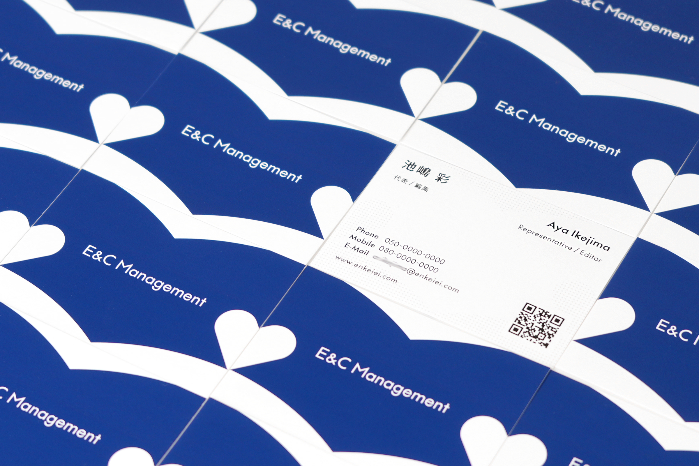
本を開いた時のシルエットを、Educationを意味する大きなシンボルとしています。 保育や経営に関する有益な情報を丁寧に提供する姿勢を象徴しています。そしてこのシンボルを横に並べると親指にあたる部分が繋がり新たにハートの形が浮かび上がり、 読者が増えていくほど養護(Care)の学びの輪が連鎖していく様子を表現しています。
経営や知識の専門性を象徴する深遠で洗練された印象を与える色としてブランドカラーにはネイビーを選定しました。
Designed the VI for E&C Manegement, a web media for kindergarten and nursery school managers, where E stands for Education and C for Care.
The silhouette of an open book is used as a large symbol to govern Education. It symbolises our commitment to carefully providing useful information on childcare and management. When these symbols are placed side by side, the thumbs are connected to form a new heart shape, expressing how the more readers there are, the more the circle of learning about childcare (Care) is linked through articles.
Navy was chosen as the brand colour to give a profound and sophisticated impression, symbolising expertise in management and knowledge.
Art Direction, Design: Tomoya Wakasugi
Client: E&C Manegement