
SARABIKI
Branding / Logo
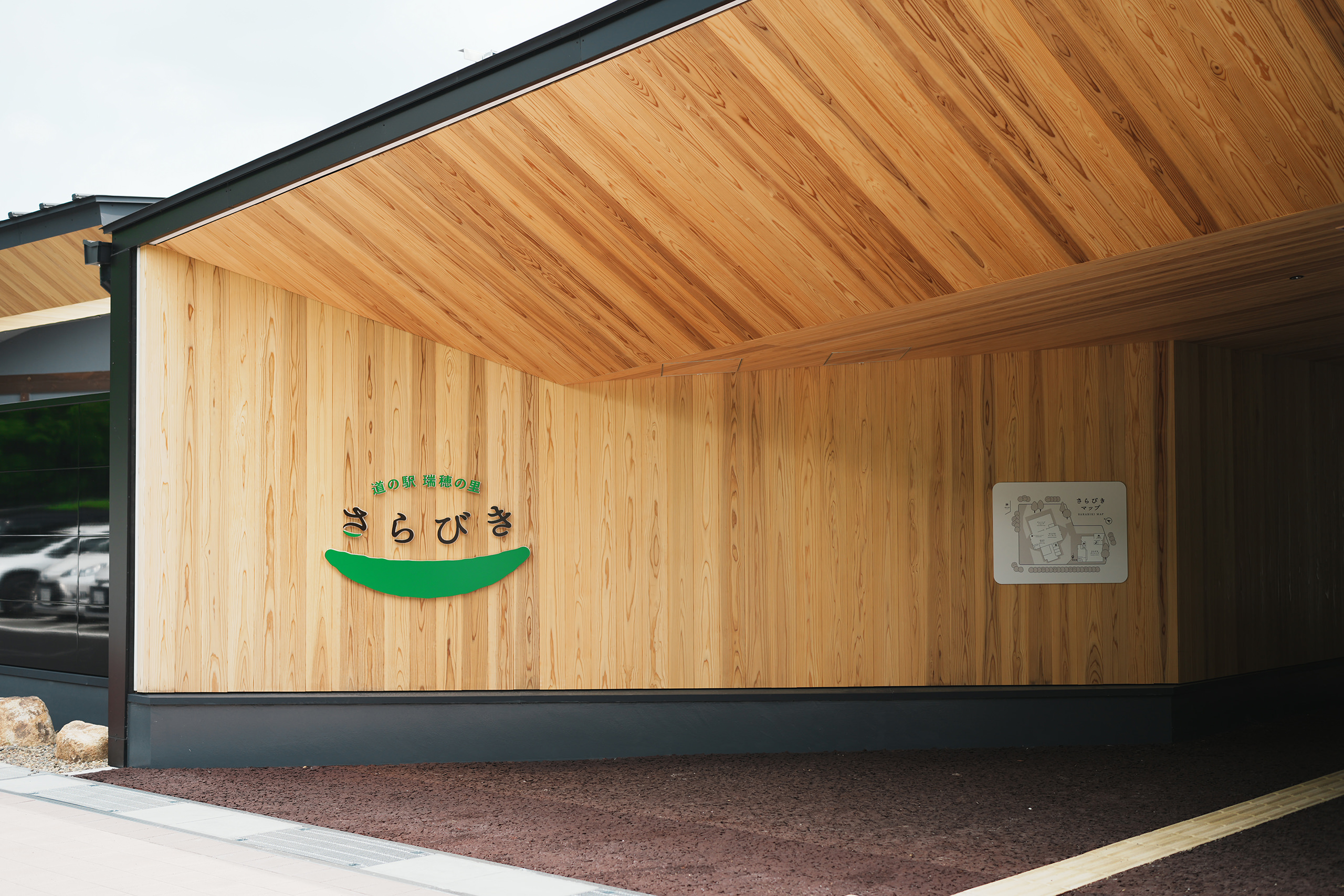
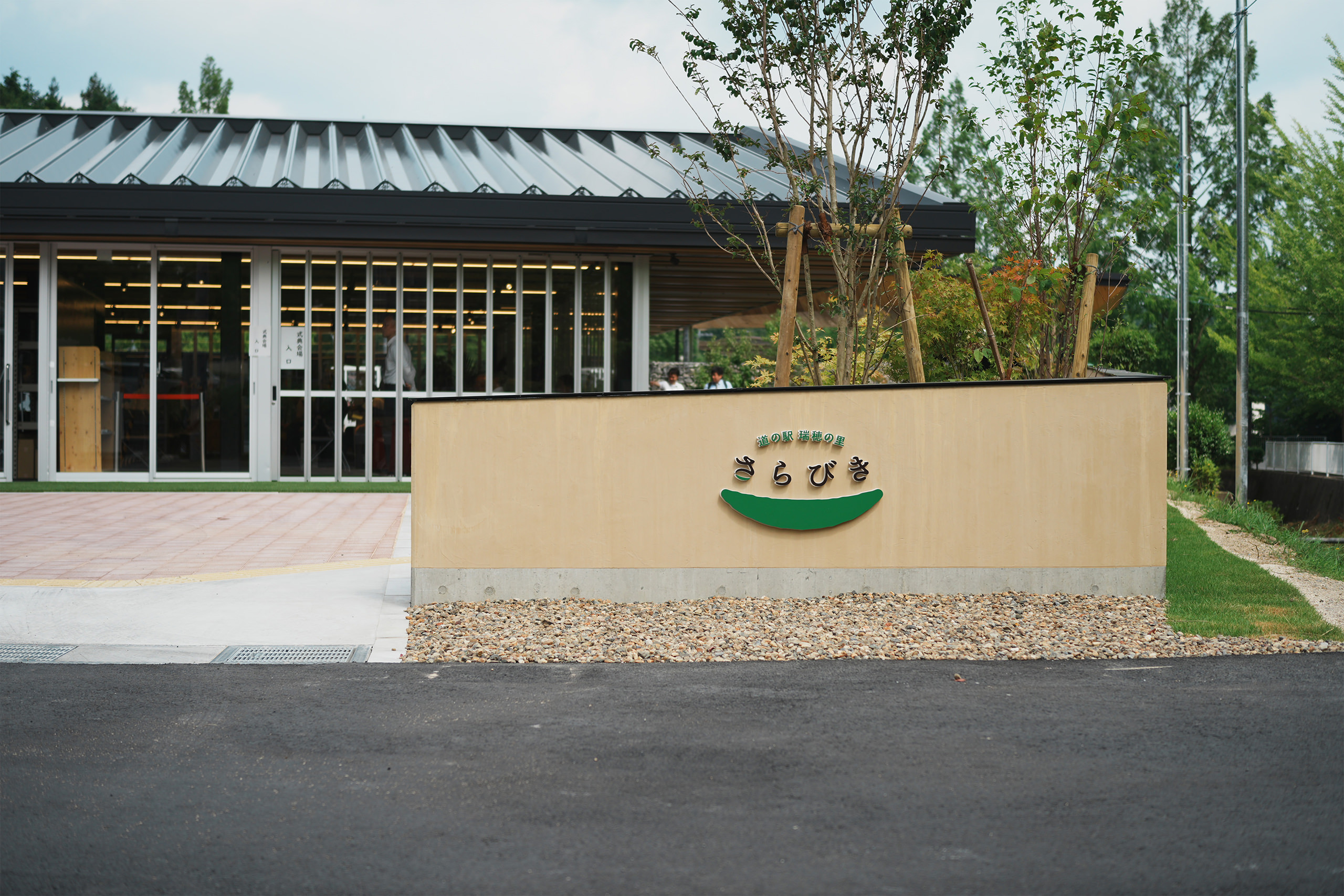
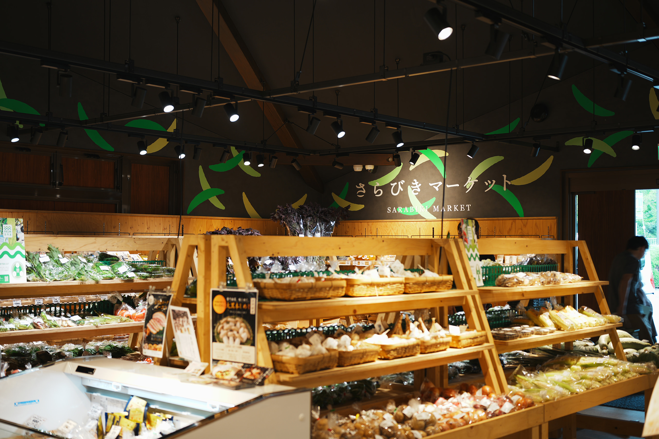
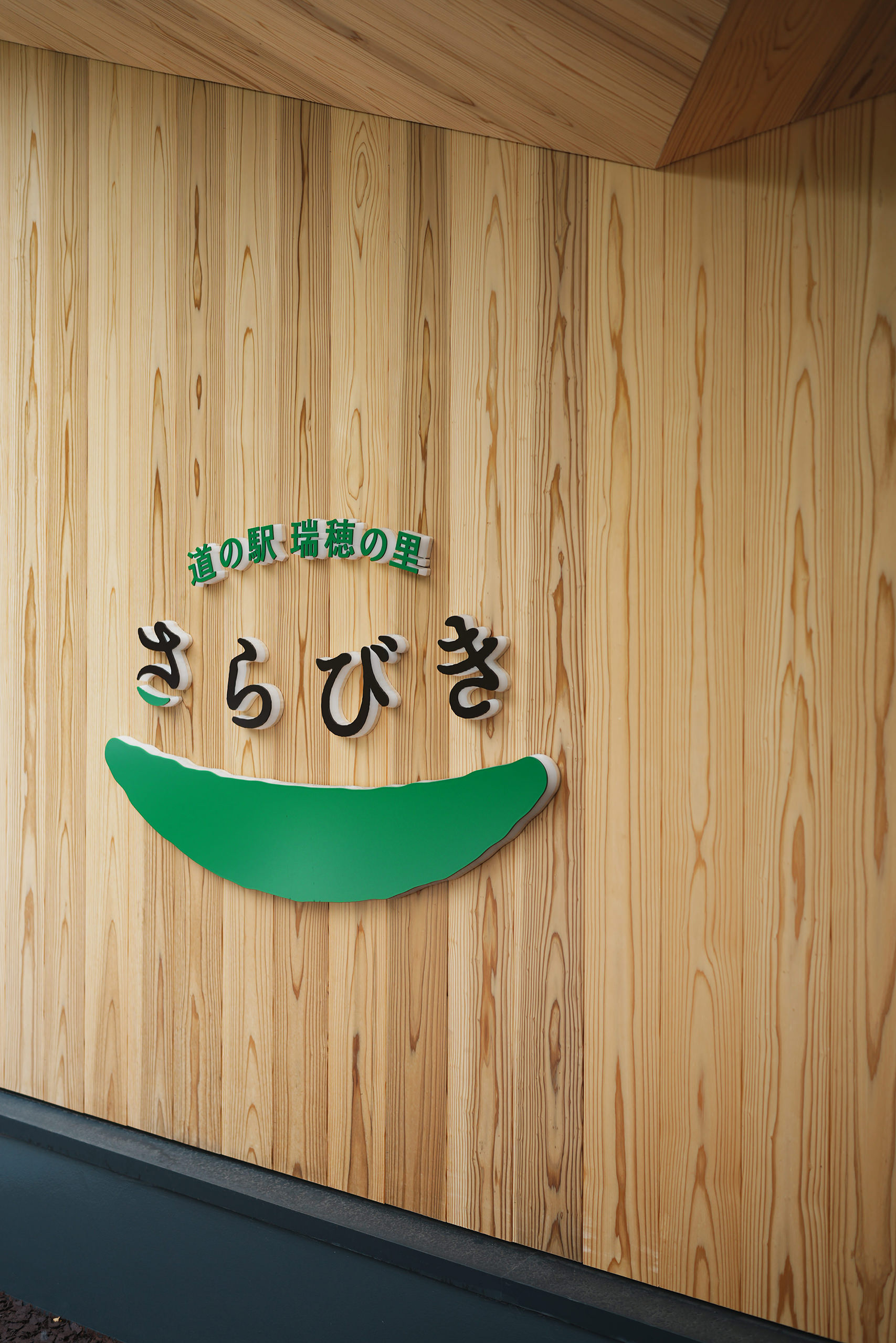
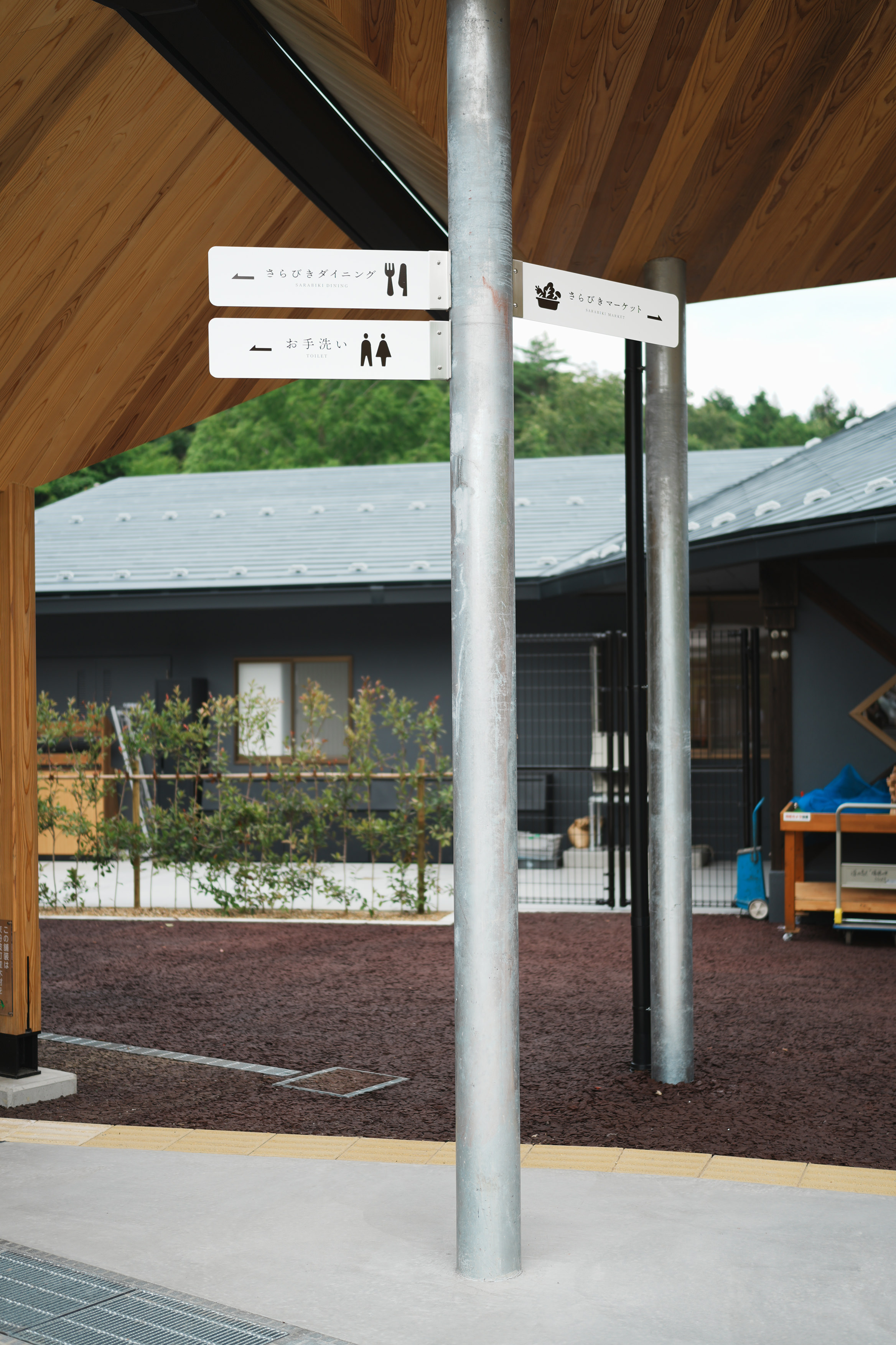
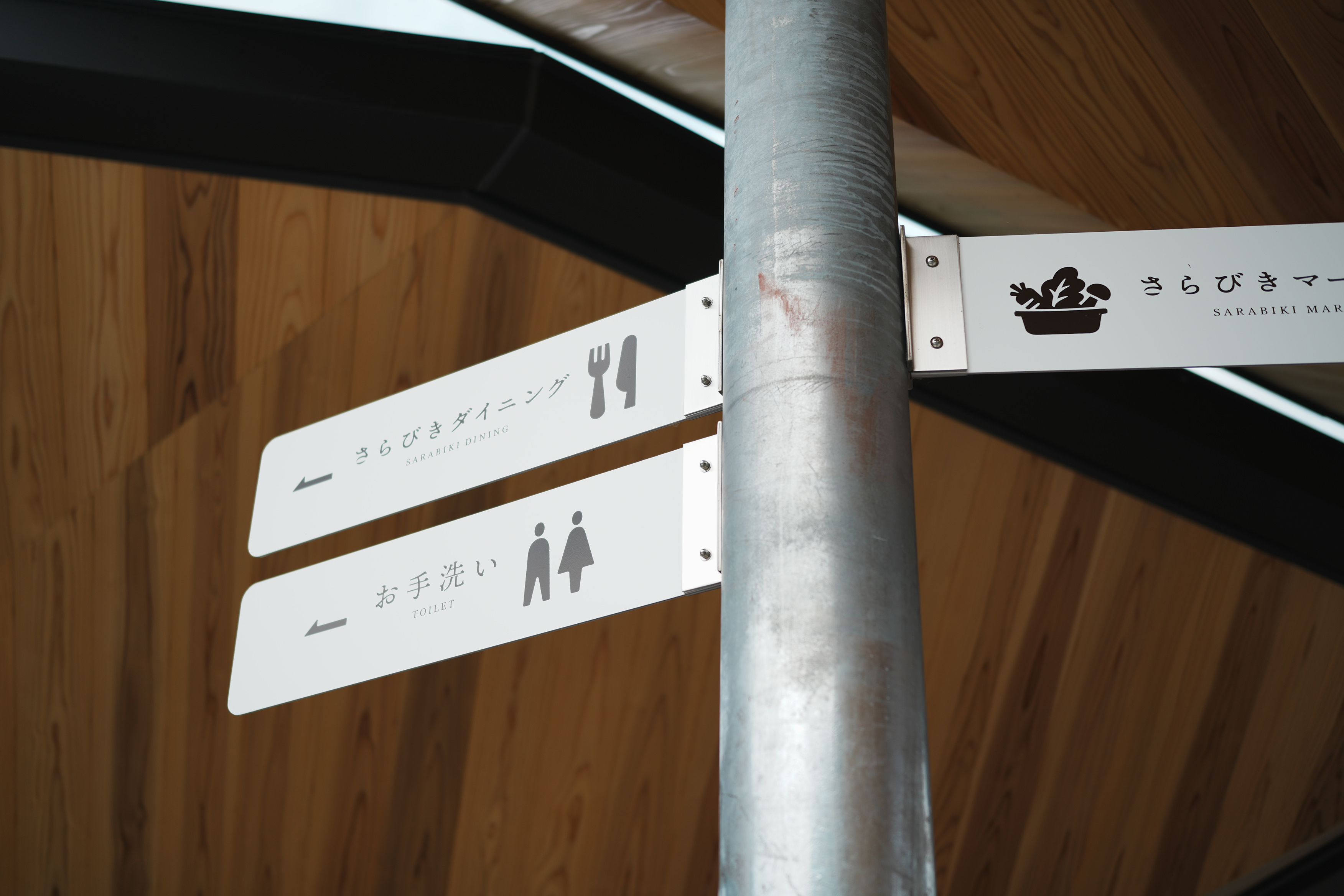
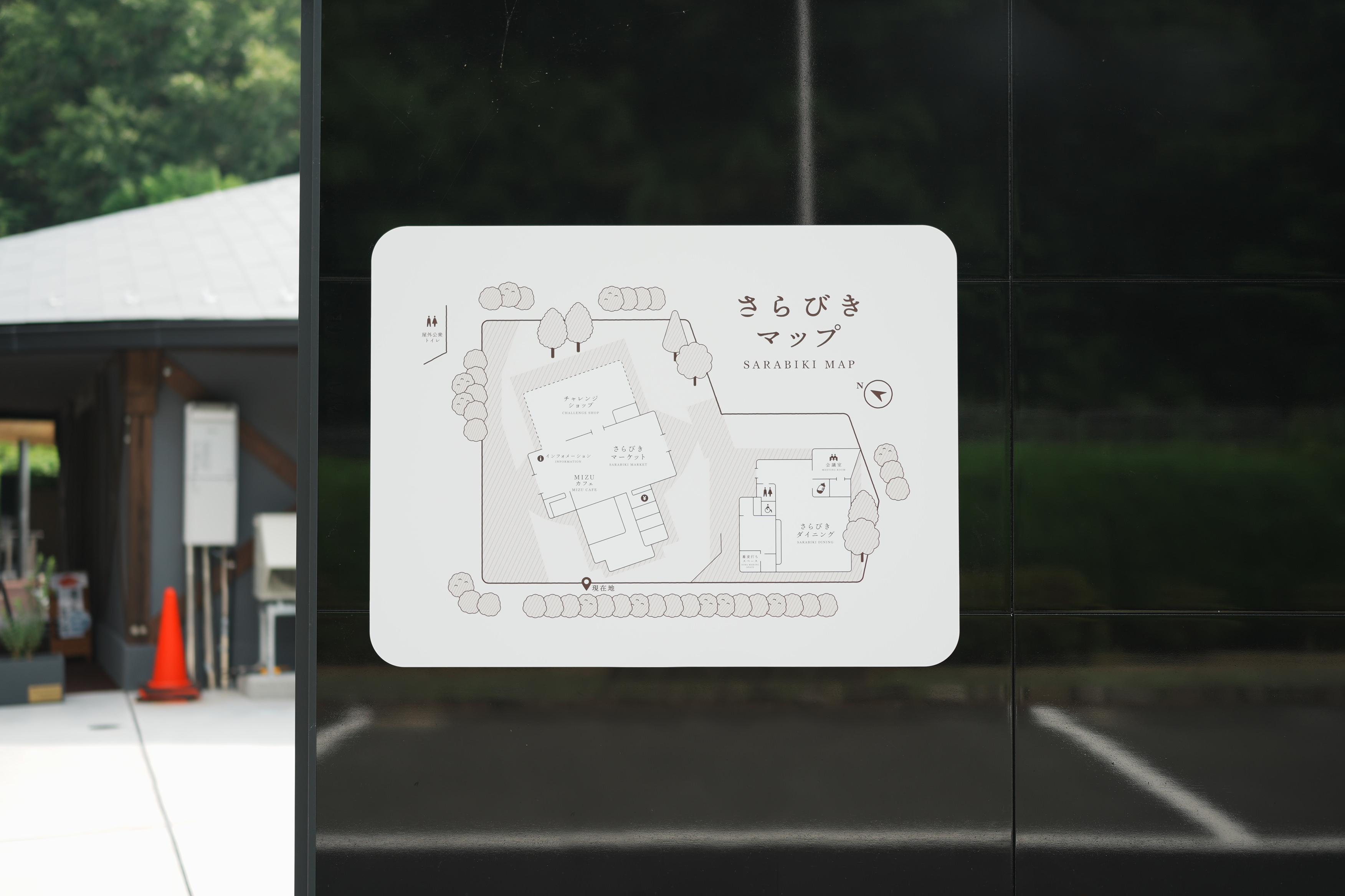
京都府京丹波町にある「道の駅 瑞穂の里・さらびき」のロゴデザイン、および施設内サインのアートディレクションとデザインを担当しました。同施設内のカフェスペースMIZU CAFEのロゴも担当しています。
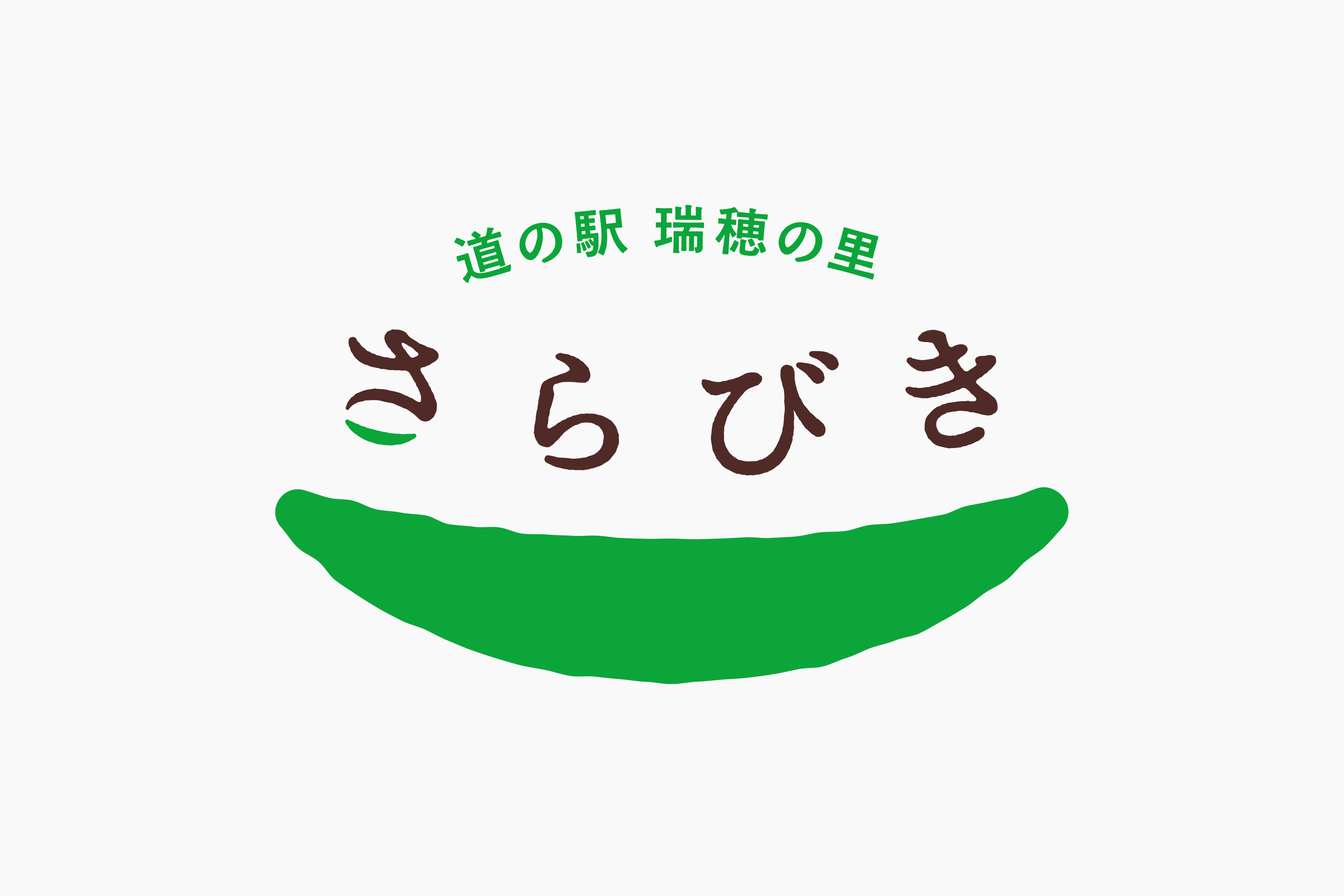
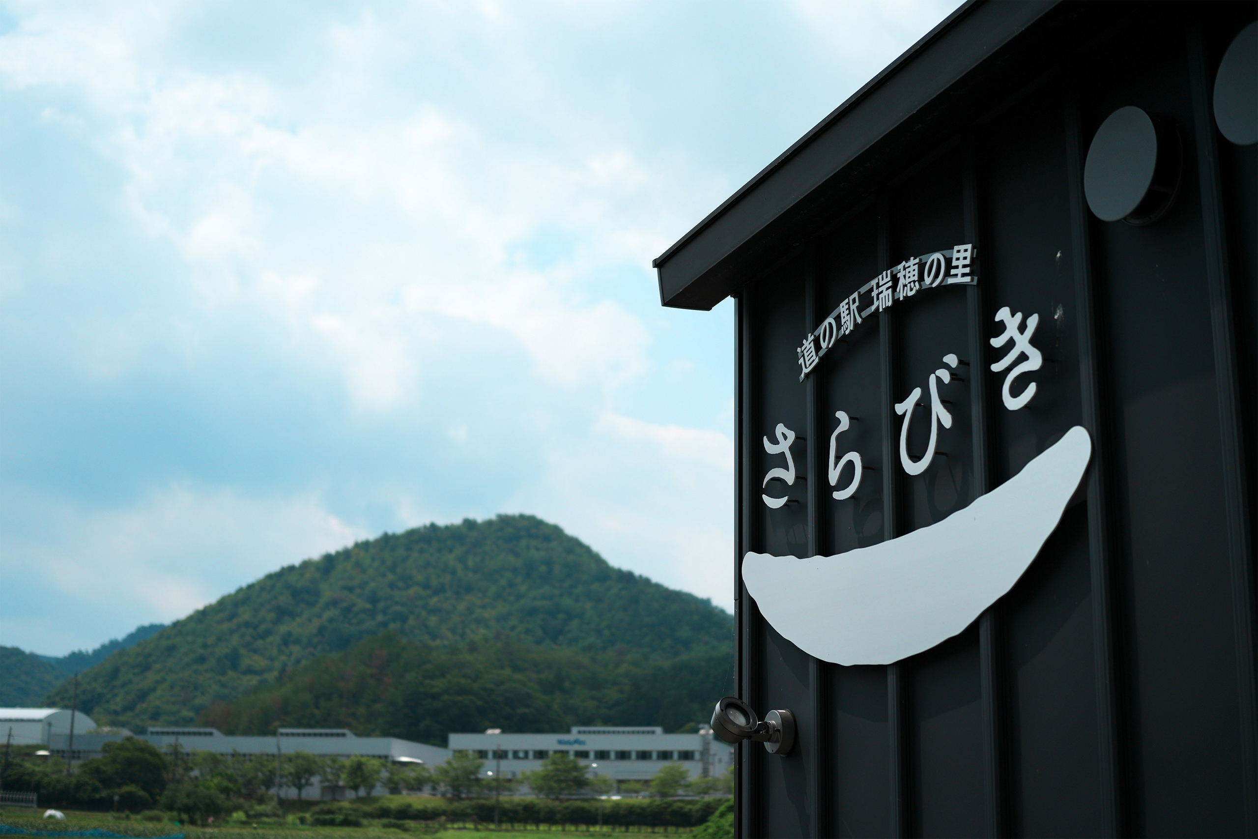
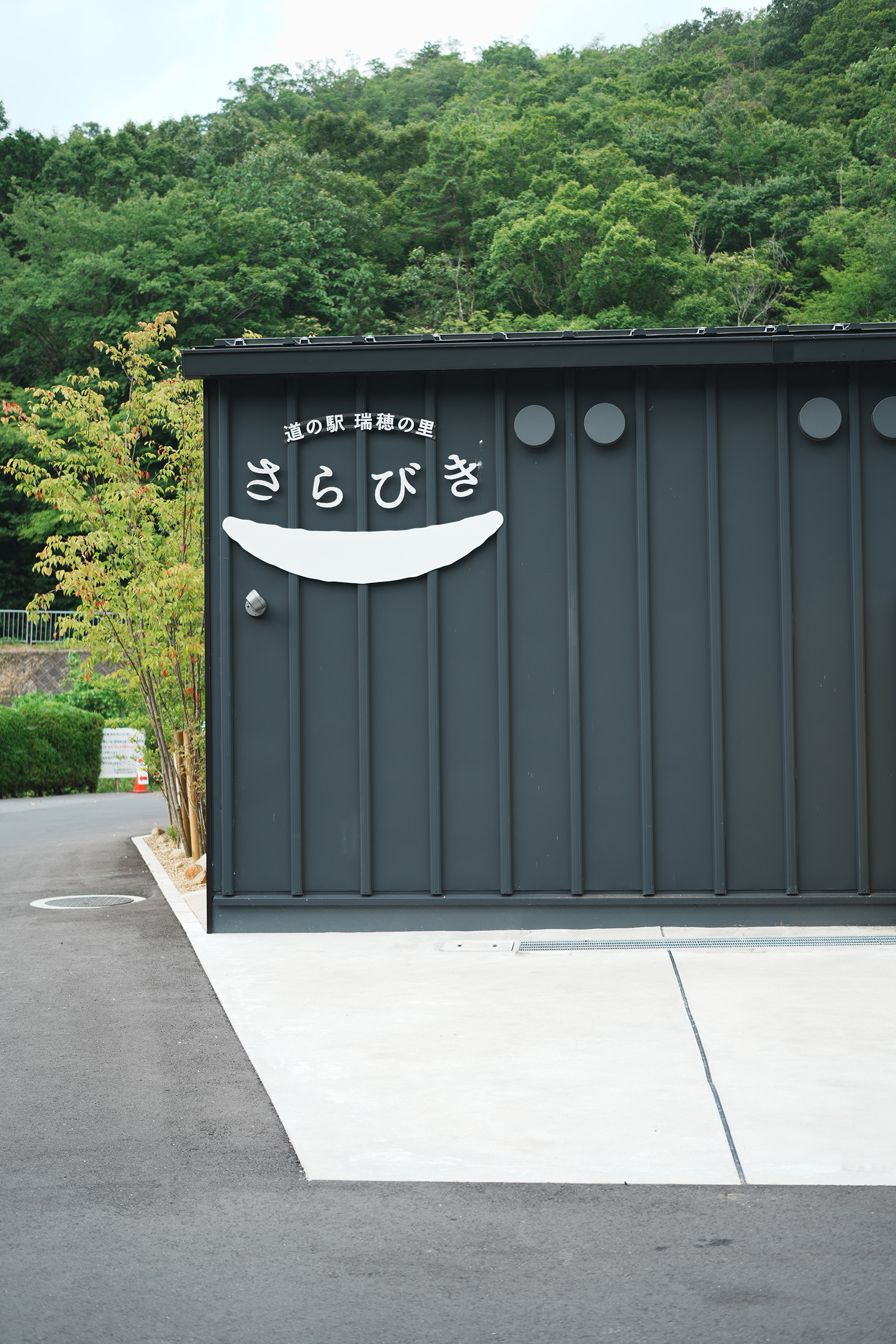
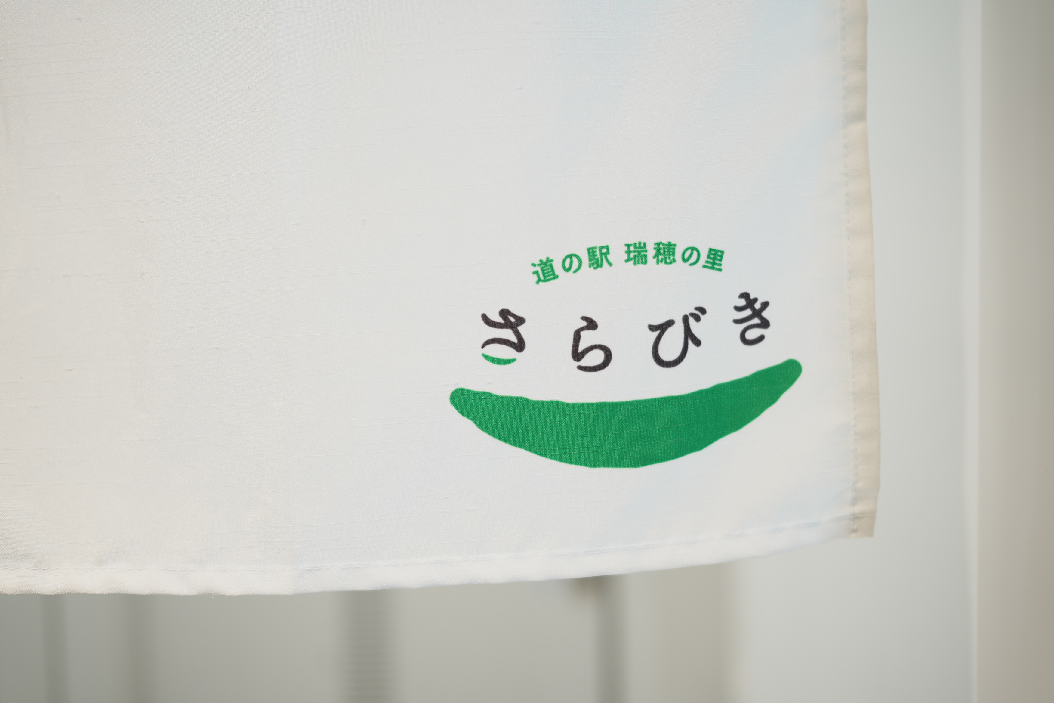
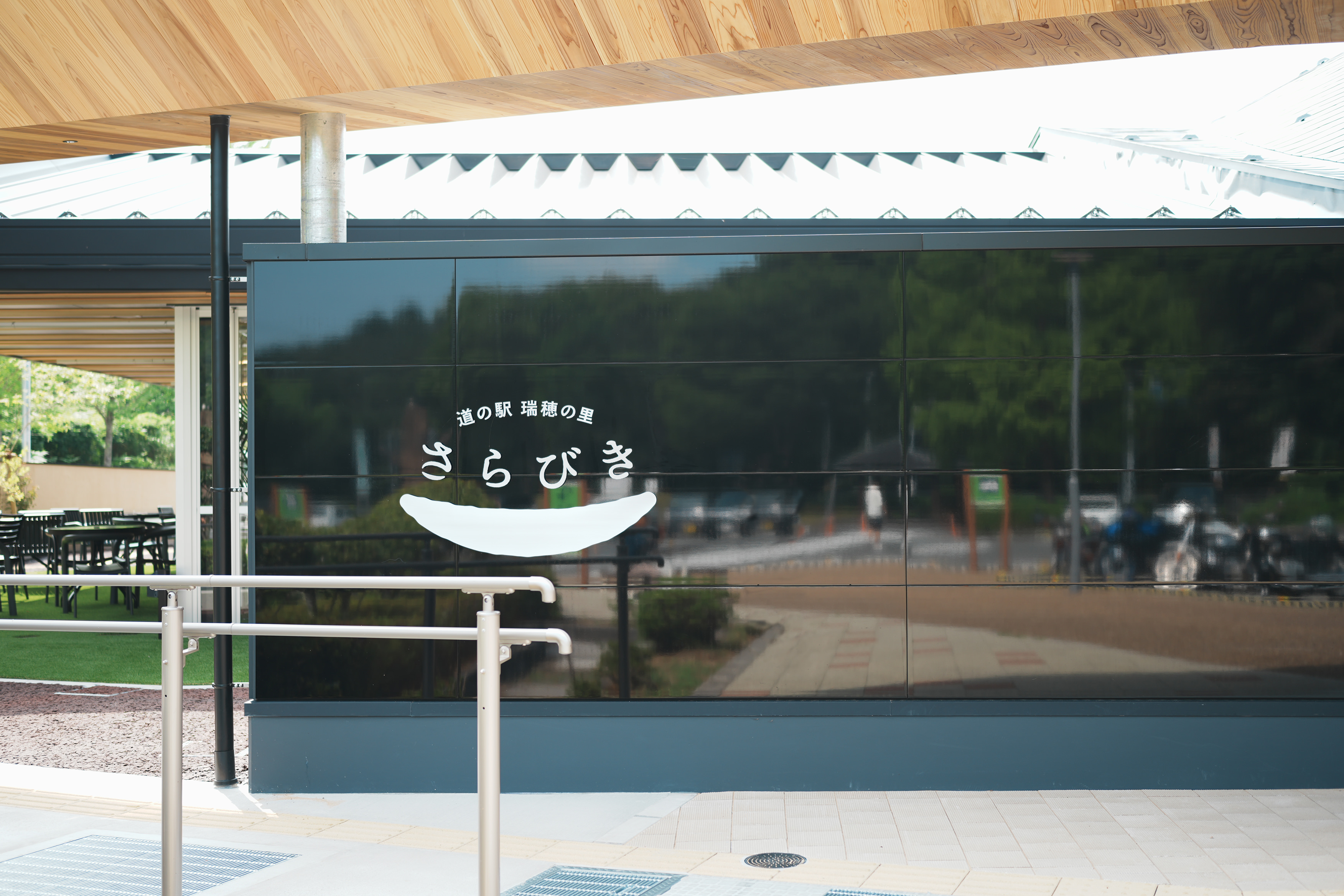
「さらびき」という名称は、この地域がかつて「皿引野」と呼ばれていたことに由来します。シンボルマークは、その名から着想を得て「皿」を抽象化。道の駅が笑顔のあふれる場所になってほしいという願いを込め、笑った口元にも見えるかたちに仕上げました。
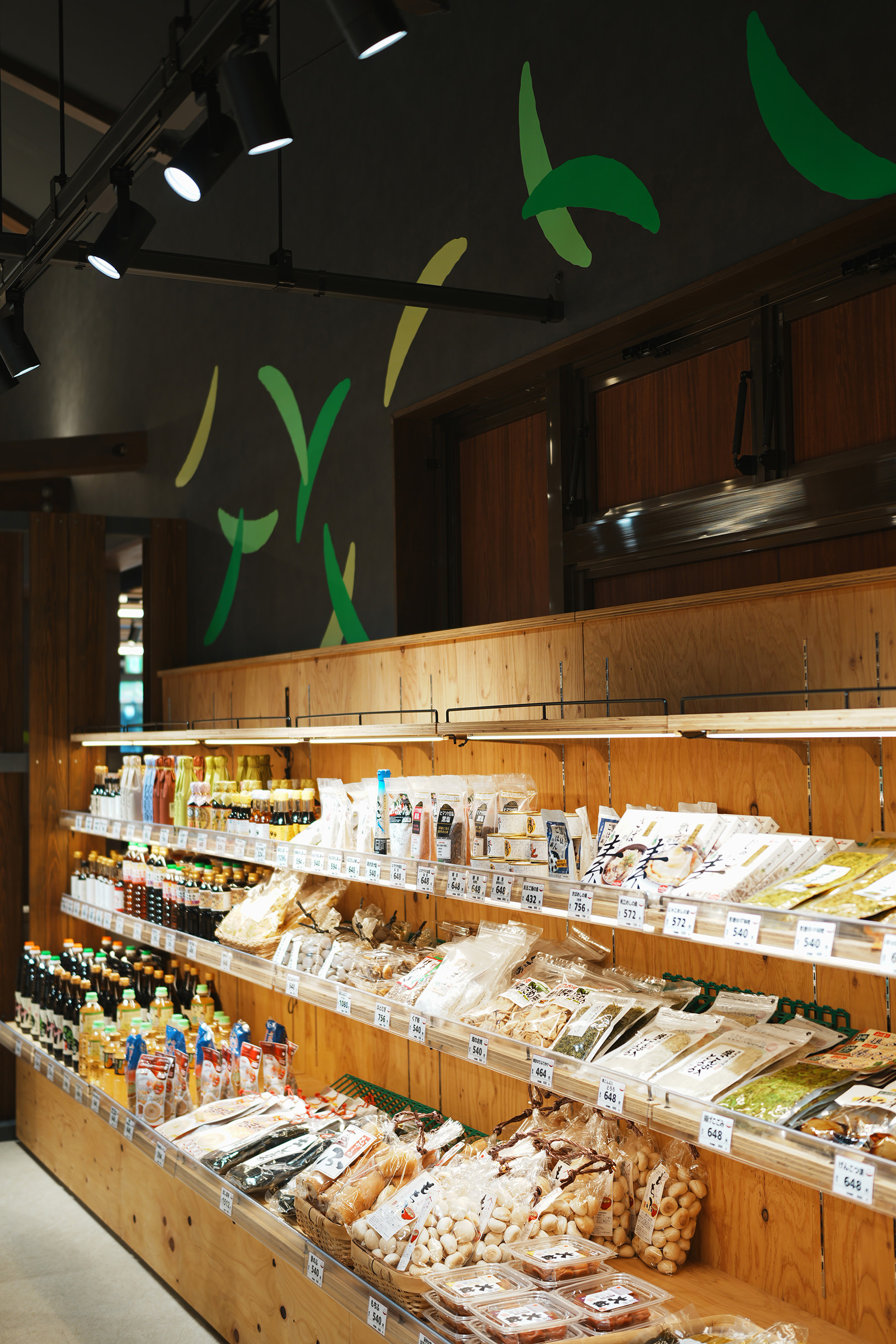
また、豊かな自然と美しい緑に恵まれた土地の風景を表現するため、ブランドカラーにはフレッシュなグリーンを採用。シンボルは、風に舞う葉のようにも見えるデザインとなっています。地域の方々や、これまで施設に親しんできた方々にも自然に受け入れていただける、明るく親しみやすい色彩を目指しました。
I was responsible for the logo design, as well as the art direction and design of the signage throughout Michi-no-Eki Mizuho no Sato Sarabiki, a roadside station located in Kyotamba, Kyoto Prefecture.
The name “Sarabiki” derives from “Sarabikino,” the historical name of this area. Inspired by this origin, the symbol mark is an abstract representation of a plate. It was also designed to resemble a smiling mouth, expressing the hope that the roadside station will become a place filled with smiles.
To reflect the area’s abundant nature and beautiful greenery, a fresh green was chosen as the brand color. The symbol can also be seen as leaves gently fluttering in the wind. The bright, approachable color palette was selected to feel natural and welcoming both to local residents and to those who have long been familiar with the facility.
CD: Takayuki Ogawa(Right Design inc)
AD,D: Tomoya Wakasugi(PNTR/Right Design inc)
D: Shu Yamamichi(Right Design inc)
Interior Designer/Design advisory: Shintaro Ishizaka(Right Design inc)
CL: Kyotanba Town