noom & co.
Logo / Graphic / Package
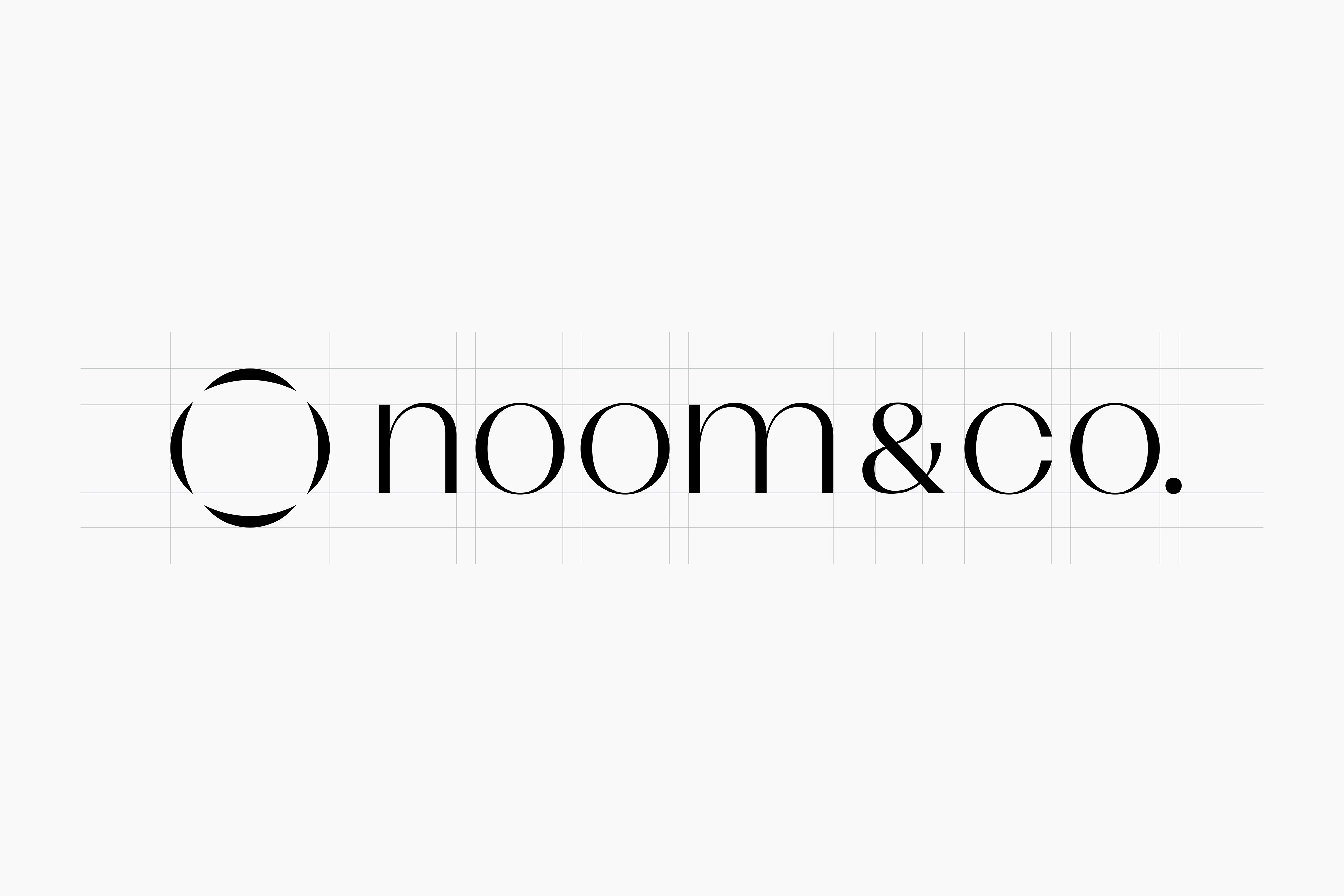
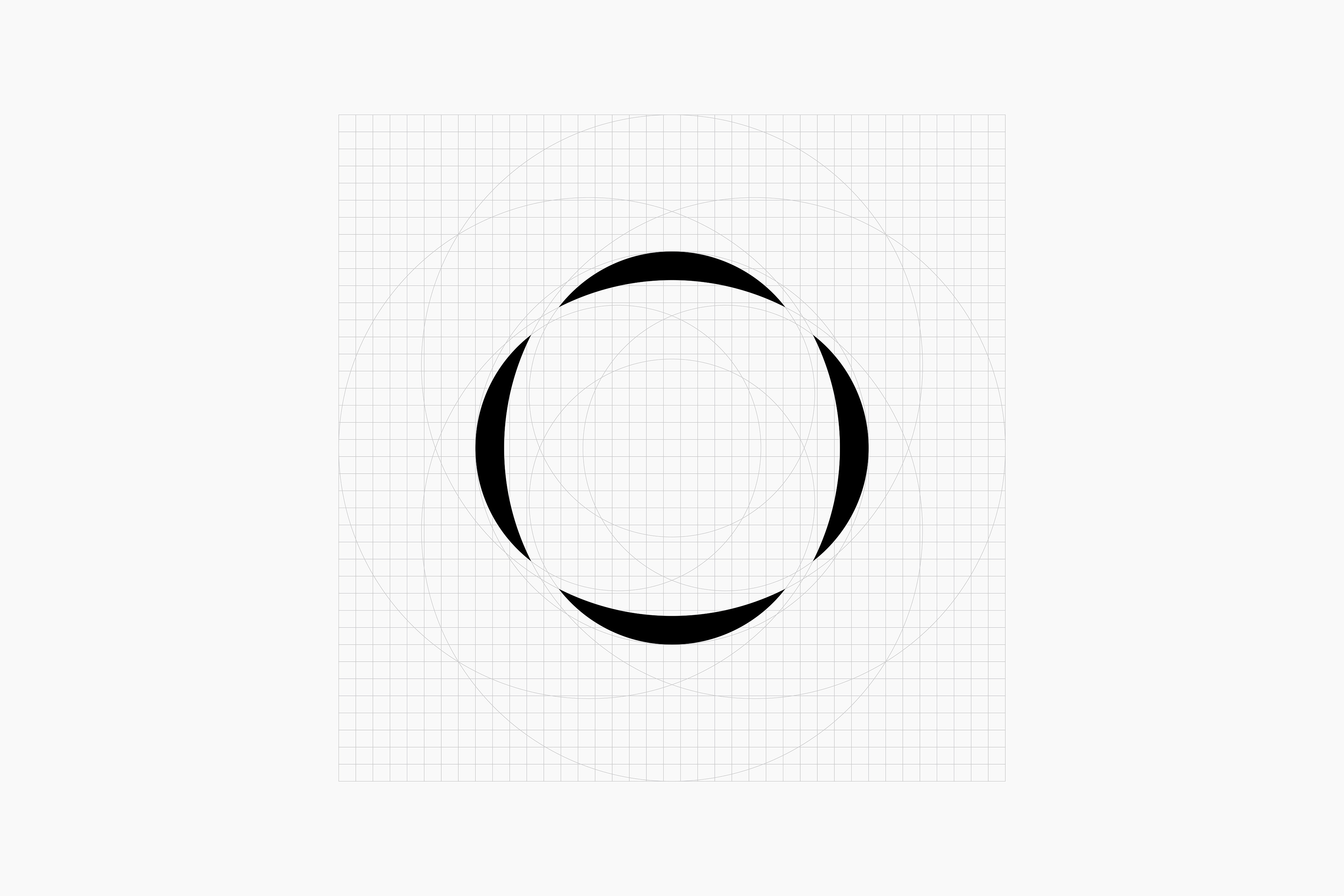
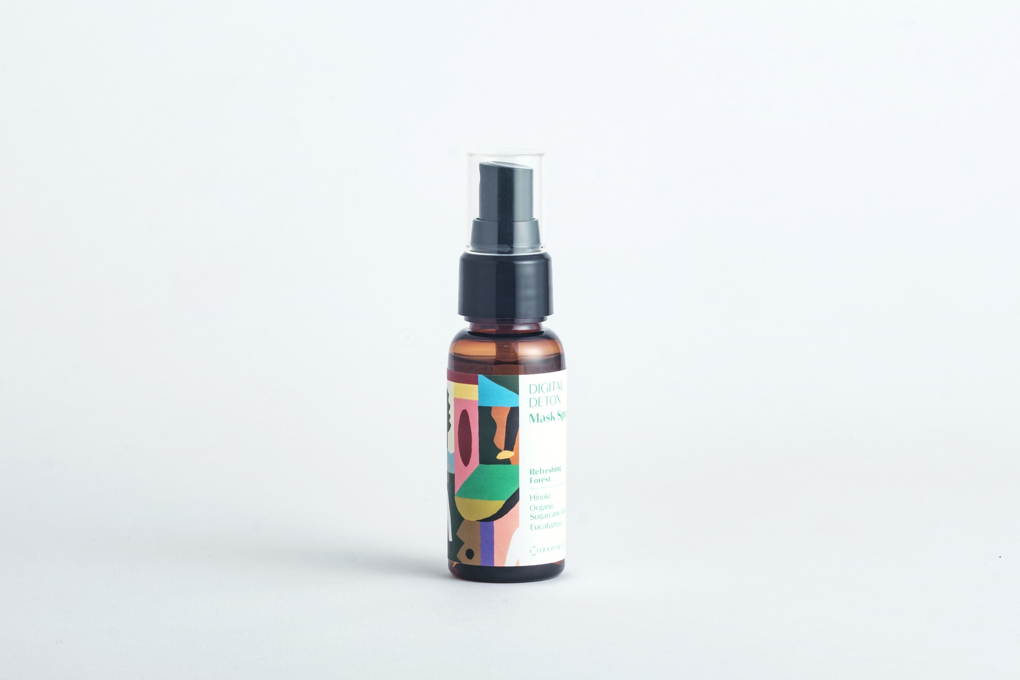
ライフスタイルブランド『noom & co.(ノームアンドコー)』。ロゴのリニューアルと新商品のマスクスプレーのデザインを担当しました。ブランド名の由来でもある月(noomはmoonを反対にしたもの)と仲間(& co.)というキーワードをもとに三日月を輪のように配置することで手を取り合う人々を表現しています。
Lifestyle brand noom & co. Responsible for the renewal of the logo and the design of the new mask spray.Based on the keywords moon (noom, the opposite of moon) and friends (& co.), which are also the origin of the brand name, the crescent moon is arranged like a circle to represent people holding hands.
Design: Tomoya Wakasugi
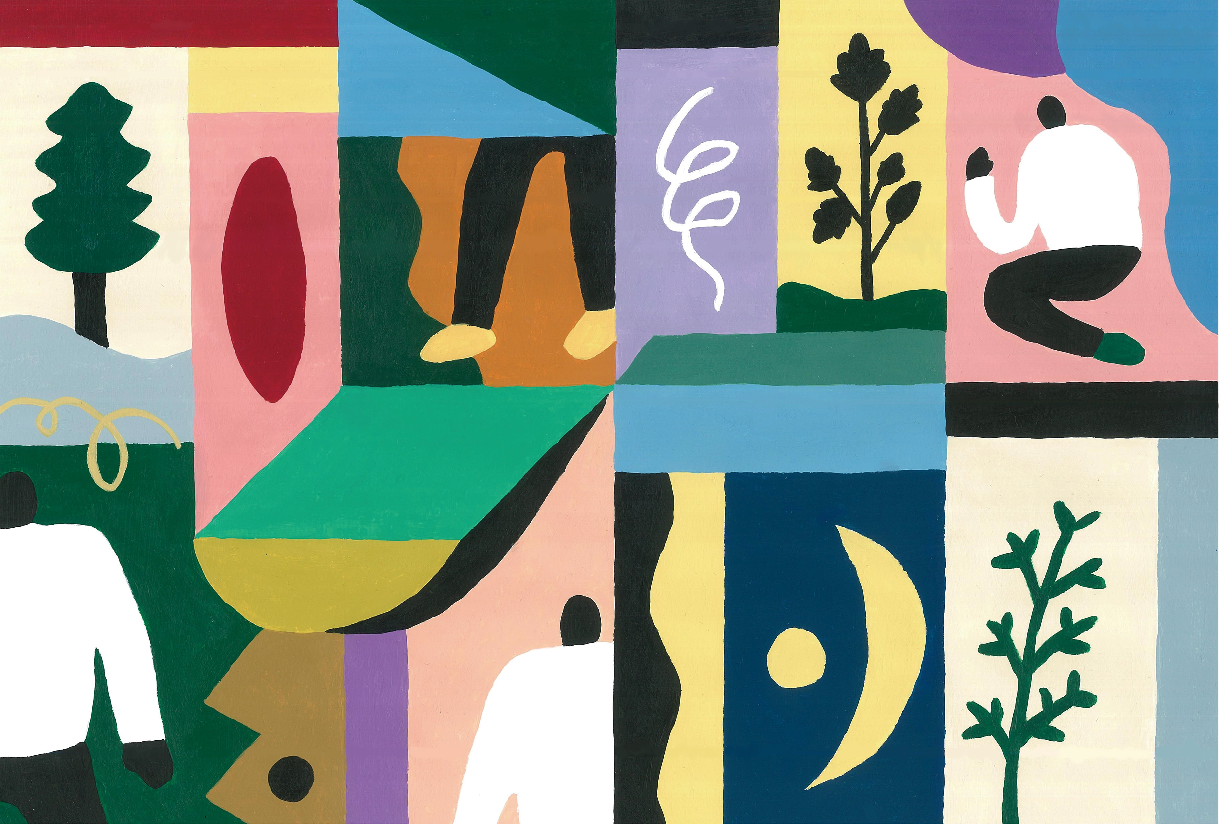
Illustration: watamiyu
Client : noom & co.