NANAMI SEIKOTSUIN
Logo / Graphic
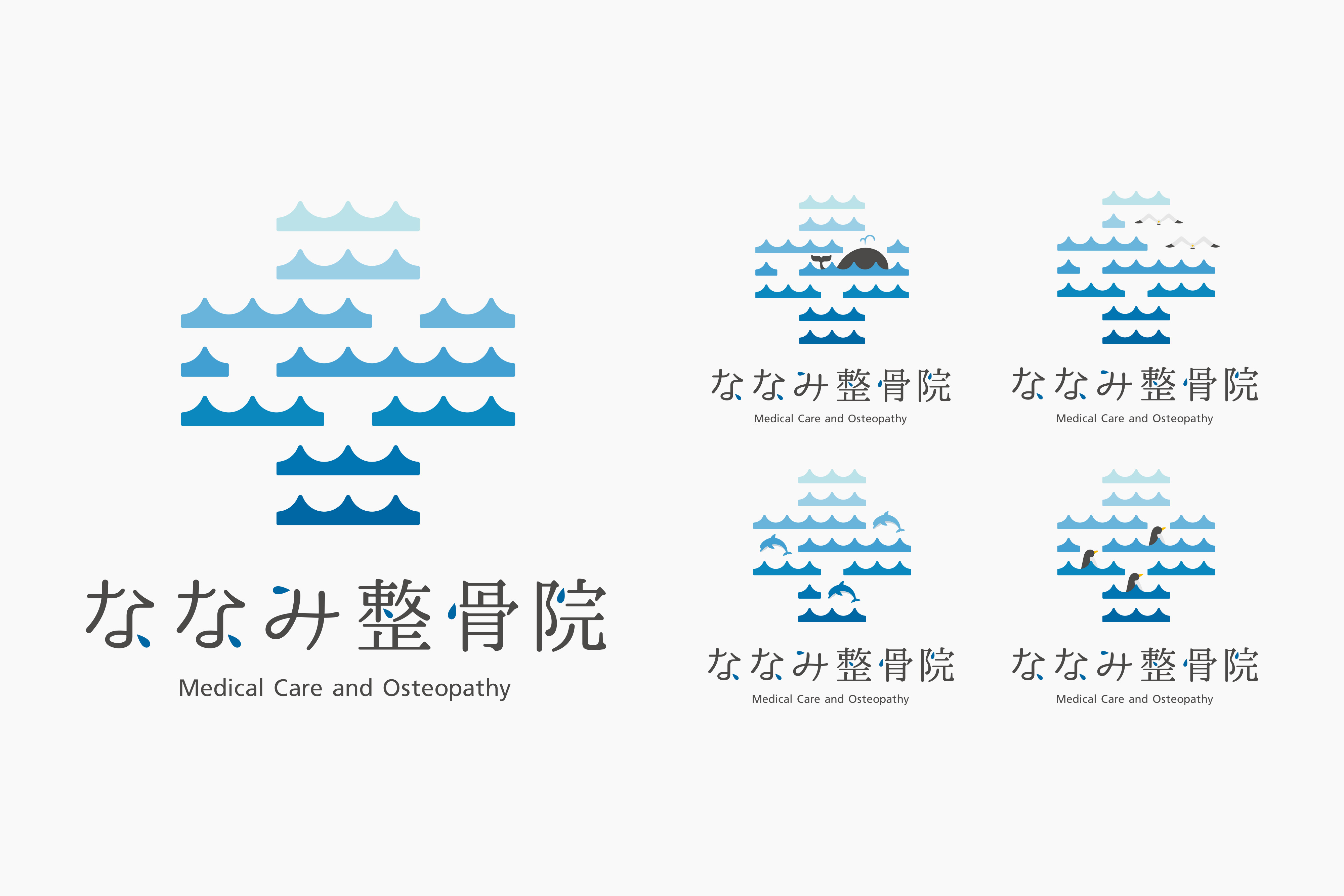
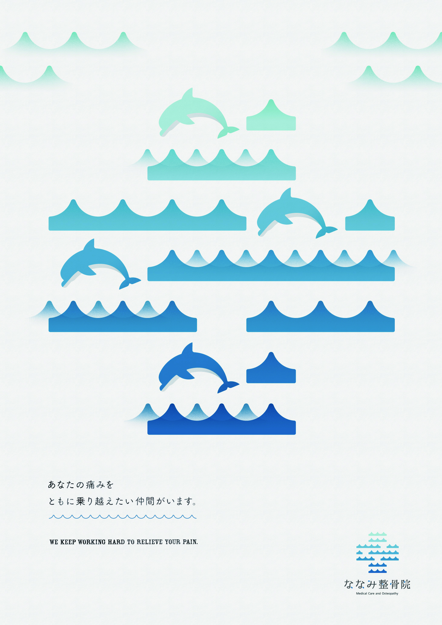
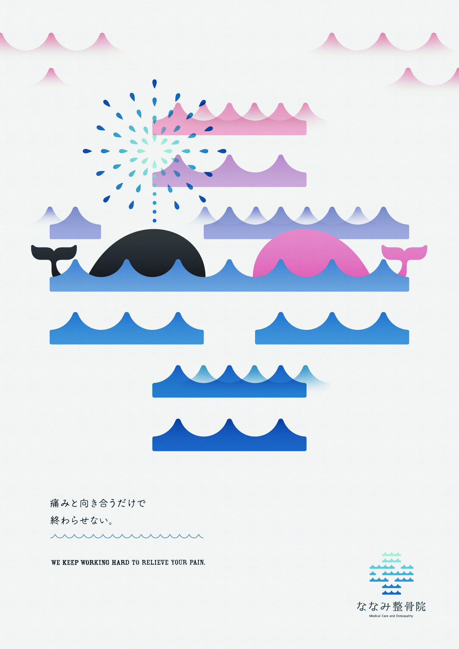
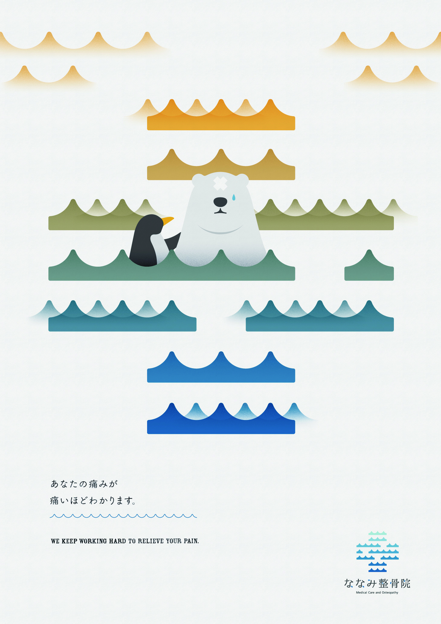
湘南地区を中心に展開するななみ整骨院のロゴ及び院内ポスターを制作しました。ななみの由来となる“7つの海”を色の異なるブルーで構成された7つの波で表現。大陸全てに繋がる海のようにグローバルで活躍する目標を掲げています。医療の象徴である十字のマークと組み合わせ、安らぎを連想させる落ち着いた印象のロゴに落とし込みました。不安を抱えて来院した患者の方々に少しでもリラックスしてもらえるよう、動物のキャラクターを使用した院内ポスターも制作、コピーライティングも担当しています。
Produced the logo and in-hospital posters for Nanami Osteopathic Clinic, which operates mainly in the Shonan area. The logo represents the 'seven seas' from which Nanami derives, with seven waves in different shades of blue. Like the oceans that connect all continents, the logo sets out the goal of being active on a global scale. Combined with the cross, the symbol of medical care, the logo has a calm impression reminiscent of peace of mind. To help patients who come to the hospital with anxiety relax as much as possible, we also produced posters with animal characters for the hospital and handled the copywriting.
Art direction: Tomoya Wakasugi
Illustration: Tomoya Wakasugi
Copywriting: Tomoya Wakasugi
Client: Nanami Osteopathic Clinic