IWATA unbleached
Logo / Graphic

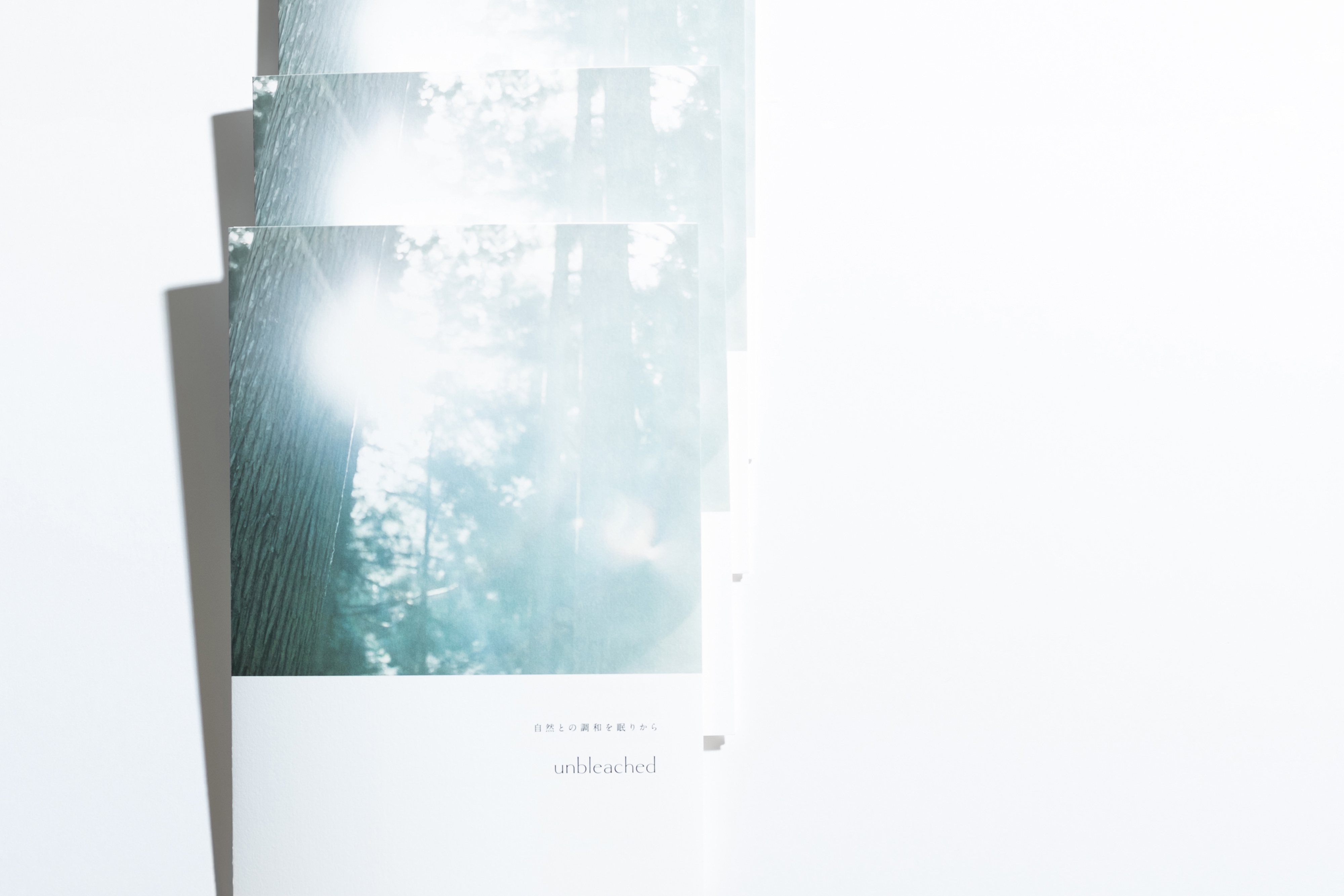
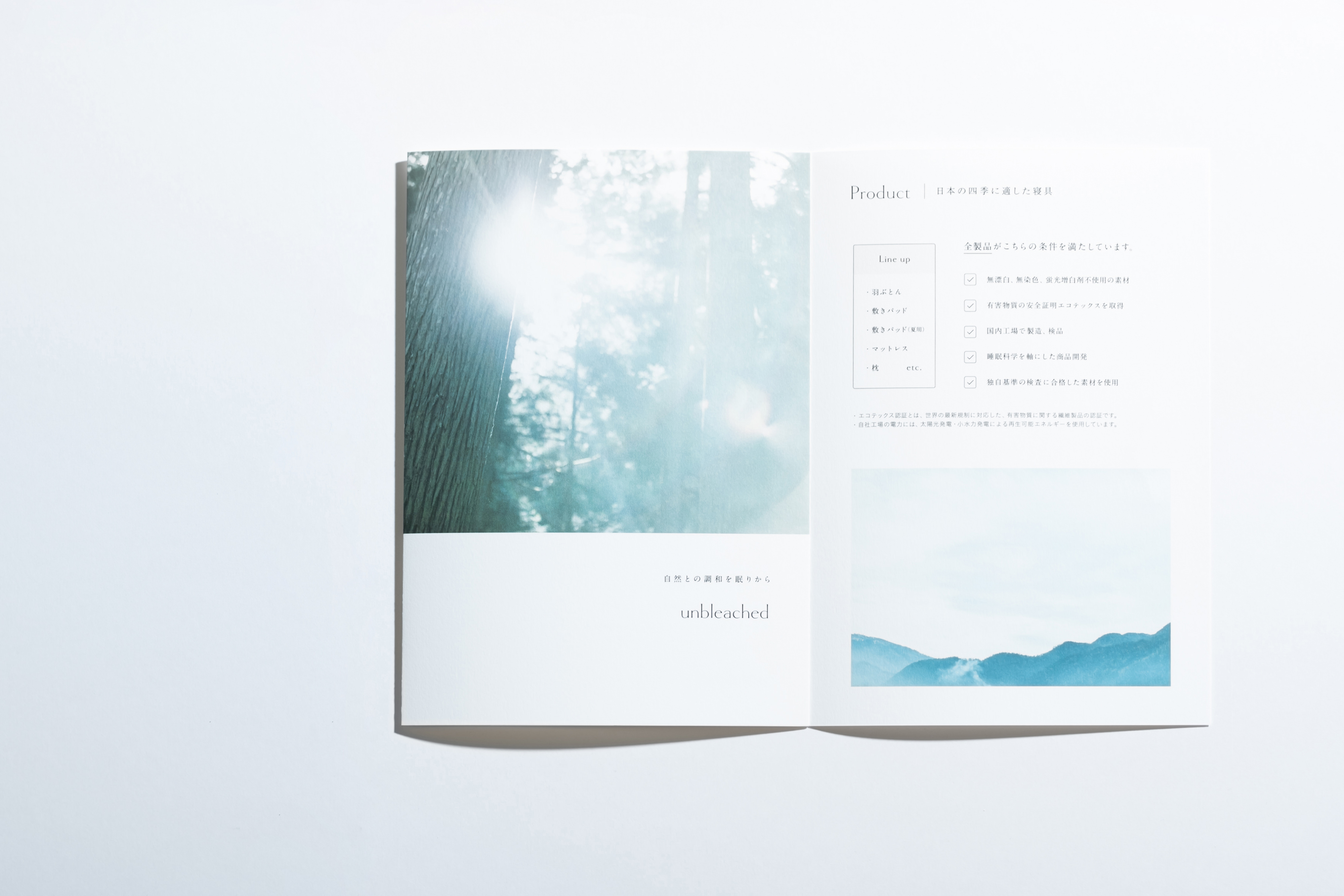
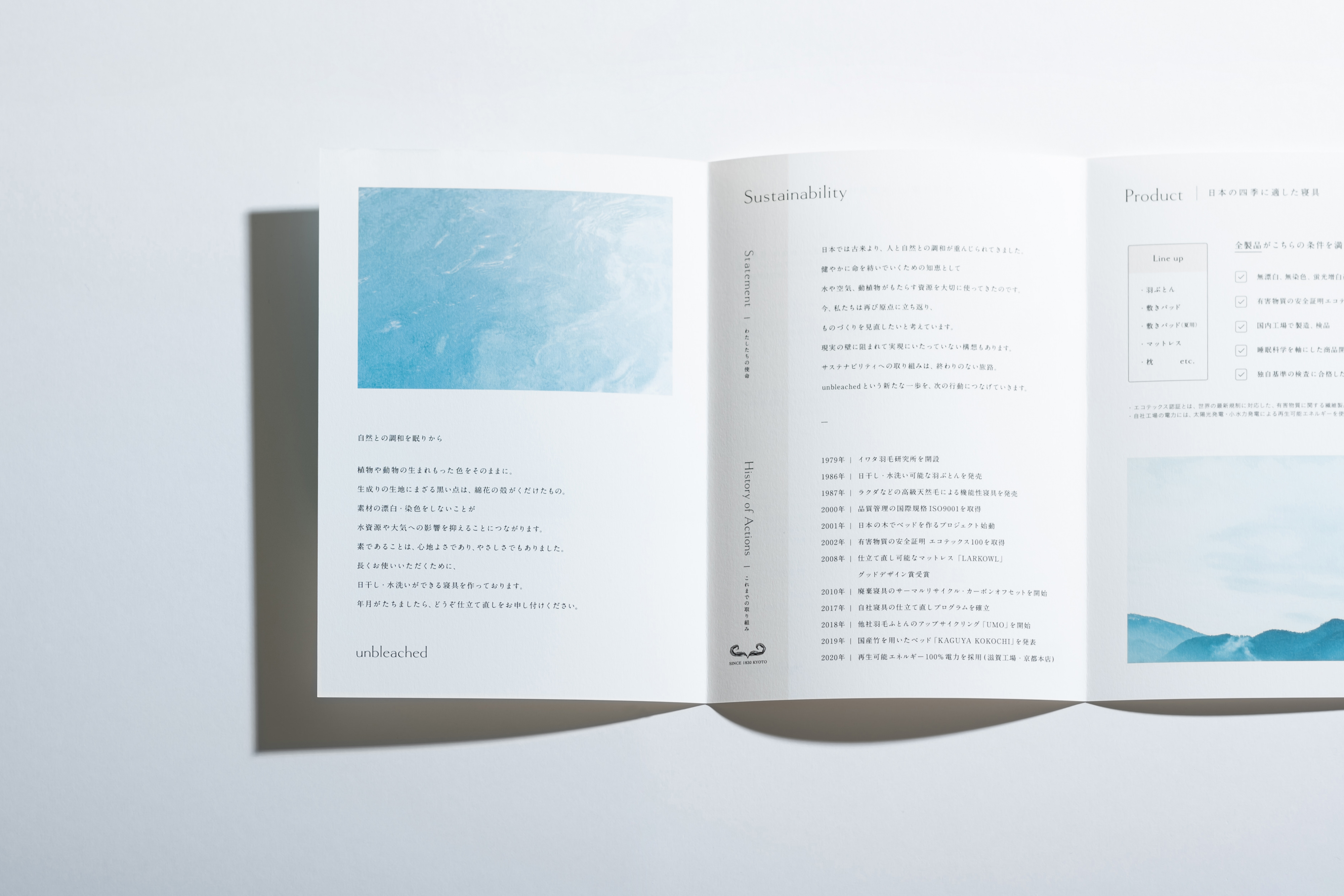
京都の寝具メーカーIWATAによるサスティナビリティをコンセプトとした新ブランド“unbleached”のブランドロゴタイプ・リーフレットのデザインをしました。ロゴタイプは綿花をモチーフにしており、綿花の茎のようにまっすぐ伸びがあり、ボウル部分の膨らみが綿を思わせる特徴的なロゴタイプとなっています。
Designed the logotype and leaflet for the new brand "unbleached", which is based on the concept of sustainability by the Kyoto-based bedding manufacturer IWATA. The logotype is based on the motif of cotton, with a straight extension like the stem of a cotton plant, and a characteristic logo type with a bulge in the bowl reminiscent of cotton.
Design: Tomoya Wakasugi
Direction, Copy Writing: Oikaze inc.
Photograph: Mitsuyuki Nakajima
Client : IWATA inc.