Discovery Hackathon
Logo / Graphic
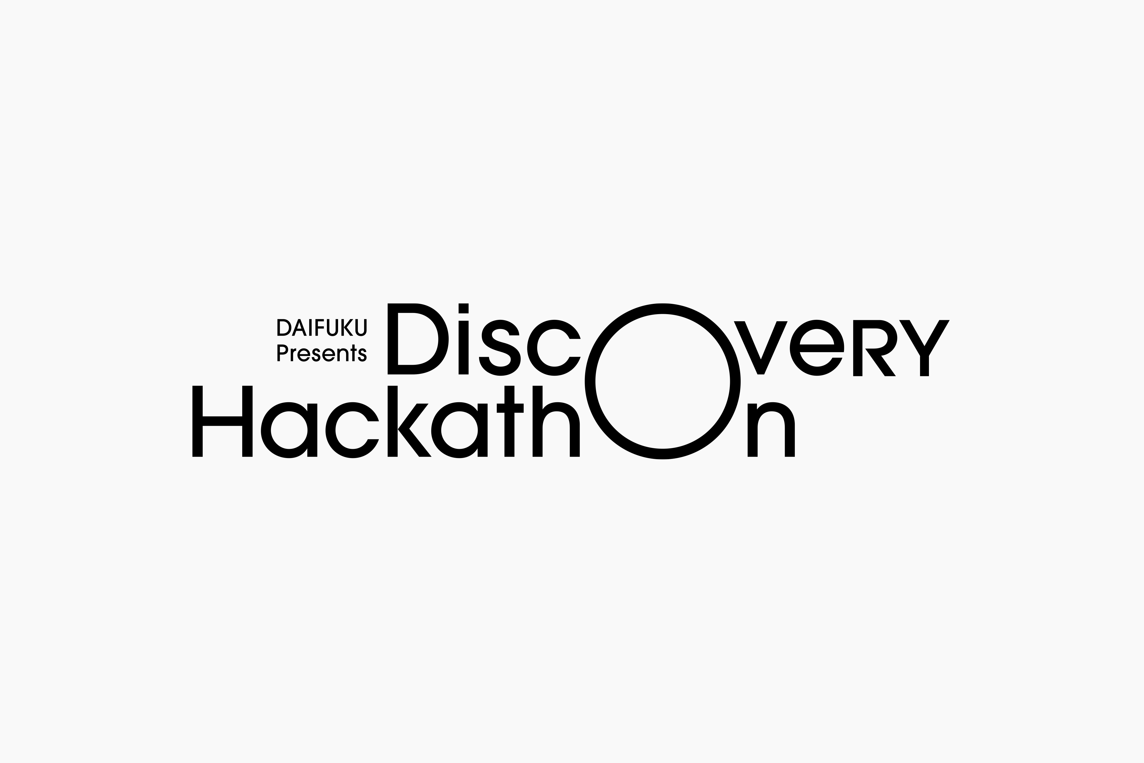
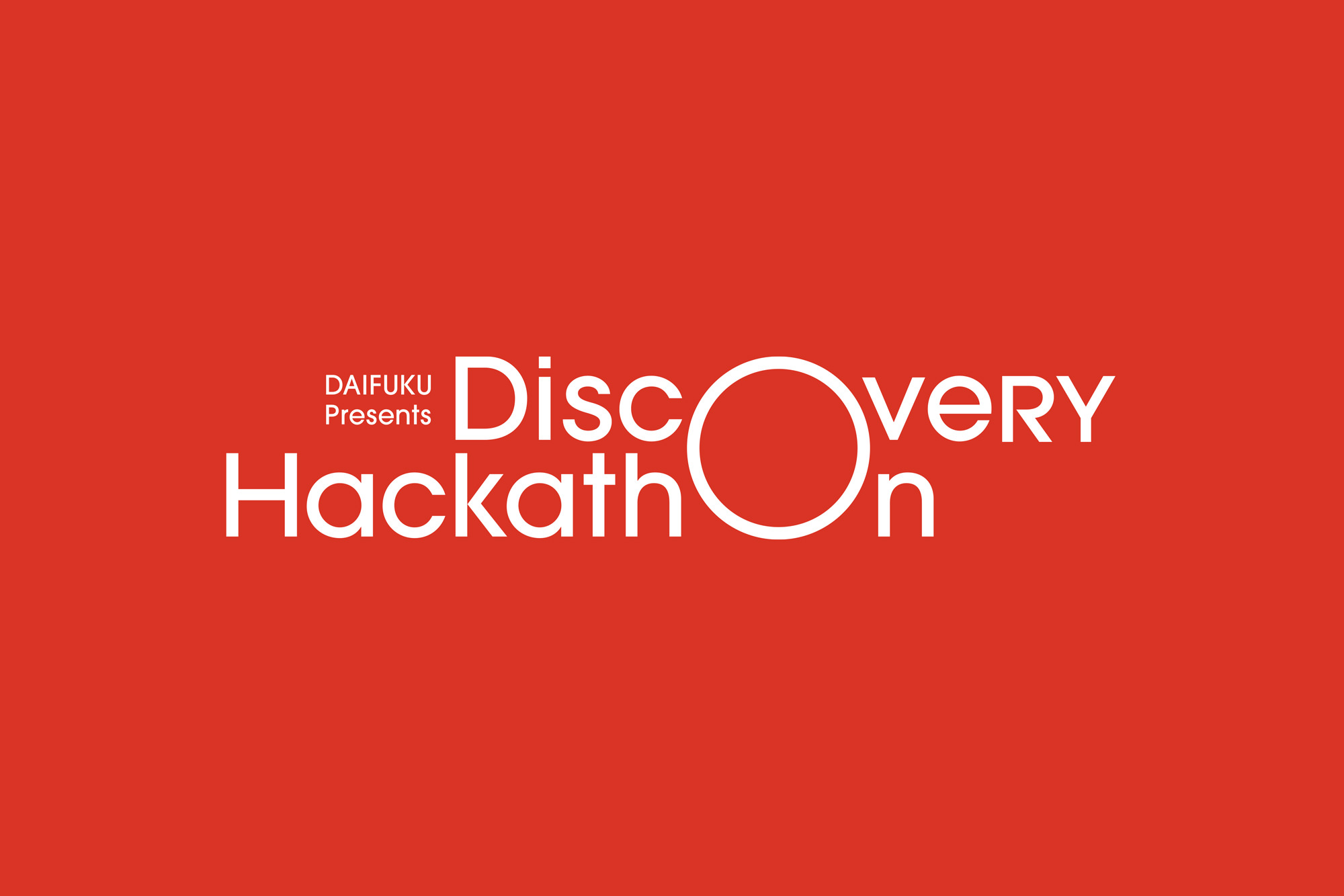
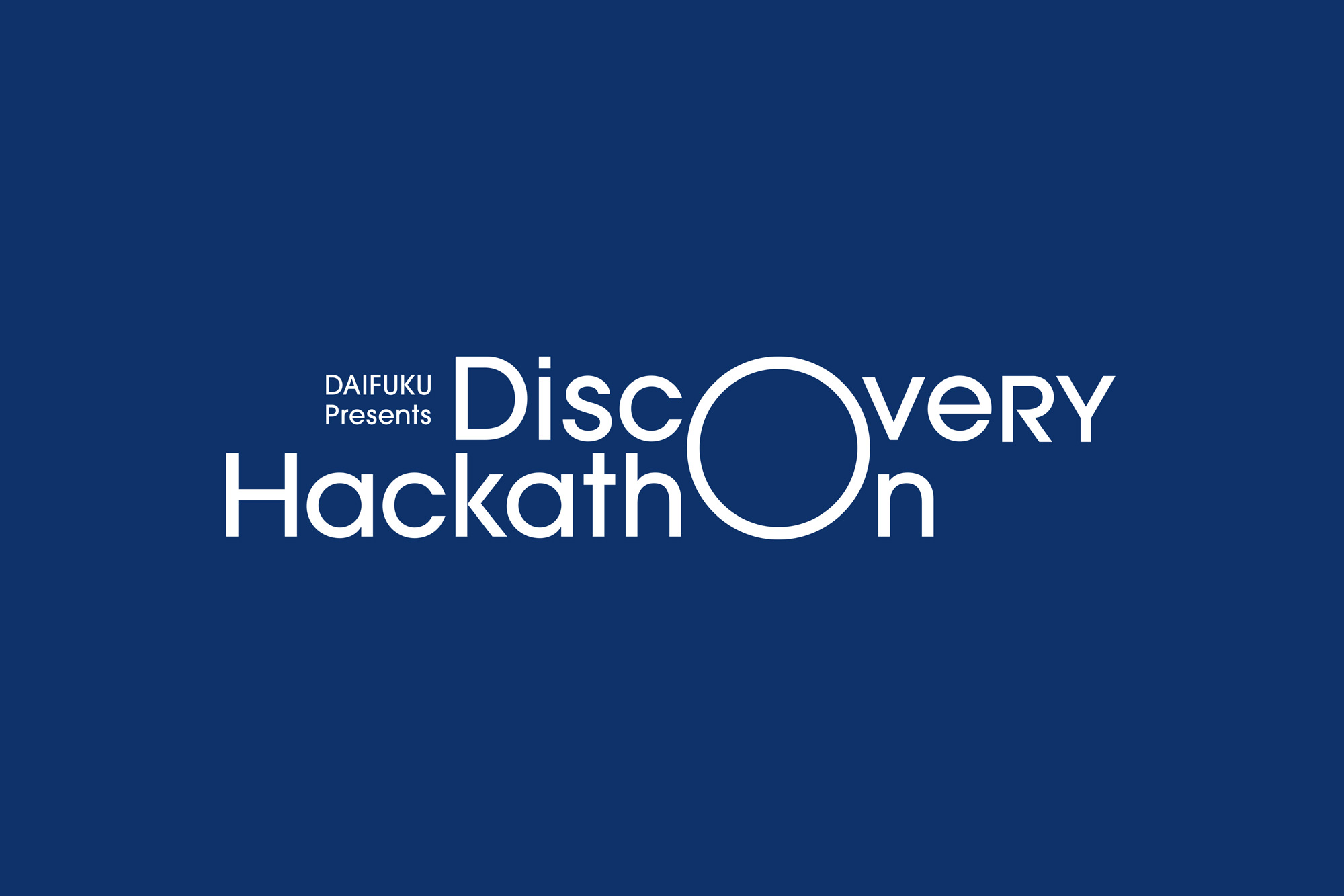
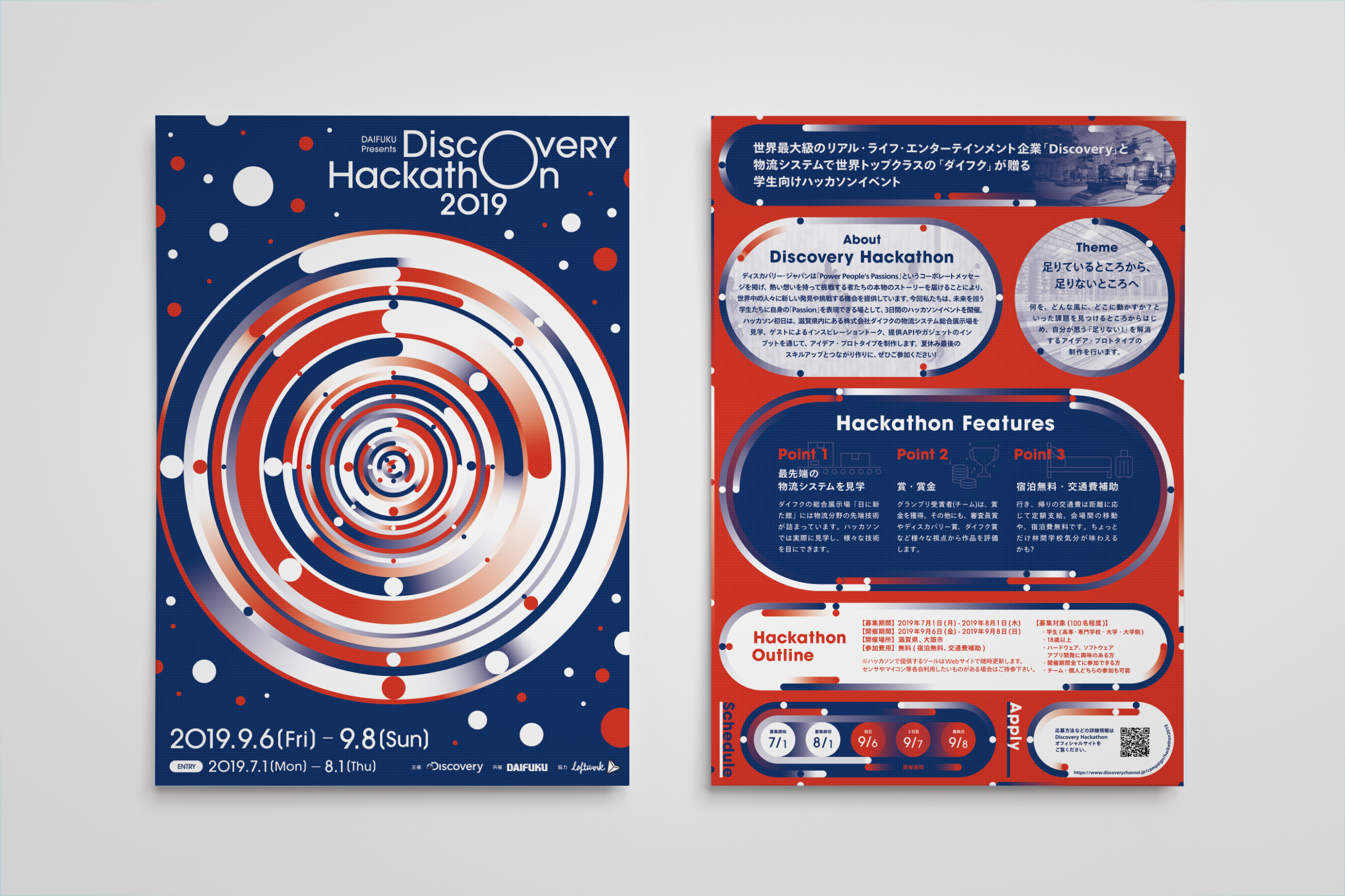
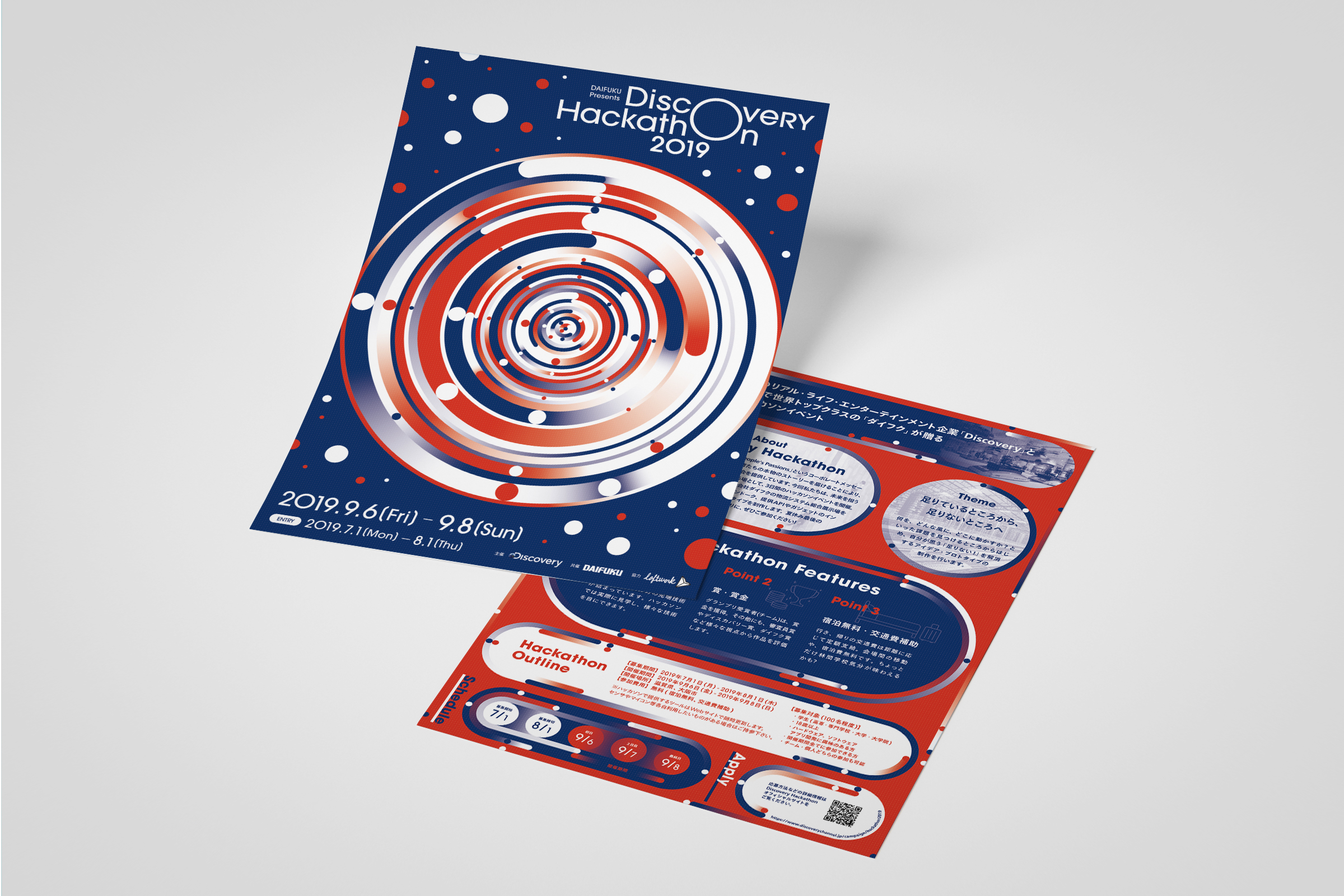
ディスカバリー・ジャパンとマテリアルハンドリング業界世界最大手のダイフクが主催する学生向けハッカソンイベントDiscovery Hackathonのロゴとキービジュアル、フライヤーのデザインを担当しました。ロゴタイプは、DiscoveryとHackathonに共通して入るoを拡大し、我々が住む地球を表現しています。またミクロ、マクロな問題から世界規模の課題をフォーカスするためのレンズでもあります。シンプルな環がアイコニックな印象を持たせながらスケールを感じるロゴタイプとして落とし込みました。カラーには学生たちの情熱を表す赤と、知的好奇心をイメージしたブルーを採用。そして世界の課題というシームレスな問題を表すためサークル状のグラフィックに展開し、大小様々な丸が渦を巻き学生たちの情熱がより大きく躍動する様子をビジュアル化しました。周りに散る丸も想像の枠から飛び出したワクワクを表現しています。
Logo, key visuals and flyer design for the Discovery Hackathon, a student hackathon event organised by Discovery Japan and Daifuku, the world's largest material handling company. The logotype represents the earth we live on by expanding the 'o' that is common to both Discovery and Hackathon. It is also a lens to focus on global issues from micro and macro problems. The simple ring gives the logotype an iconic impression, but also a sense of scale. The colours are red to represent the passion of the students and blue to represent their intellectual curiosity. To represent the seamless nature of global issues, the logo was developed as a circle-shaped graphic, with circles of various sizes swirling around to visualise the students' passions in a larger and more dynamic way. The circles scattered around the circle also express the excitement that leaps out of the boundaries of the imagination.
Design: Tomoya Wakasugi
Client: Loftwork