cogu
Logo / Graphic / Website
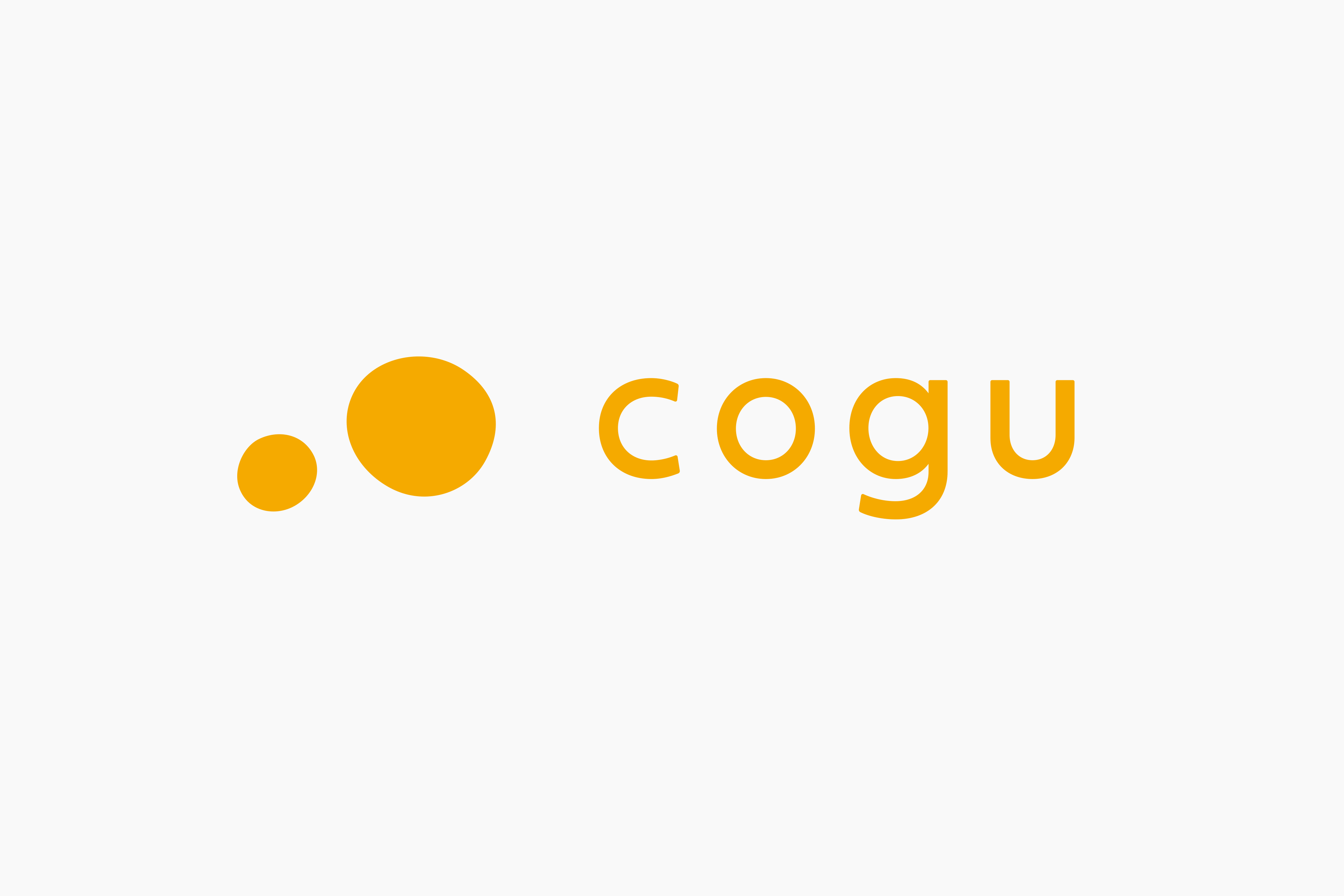
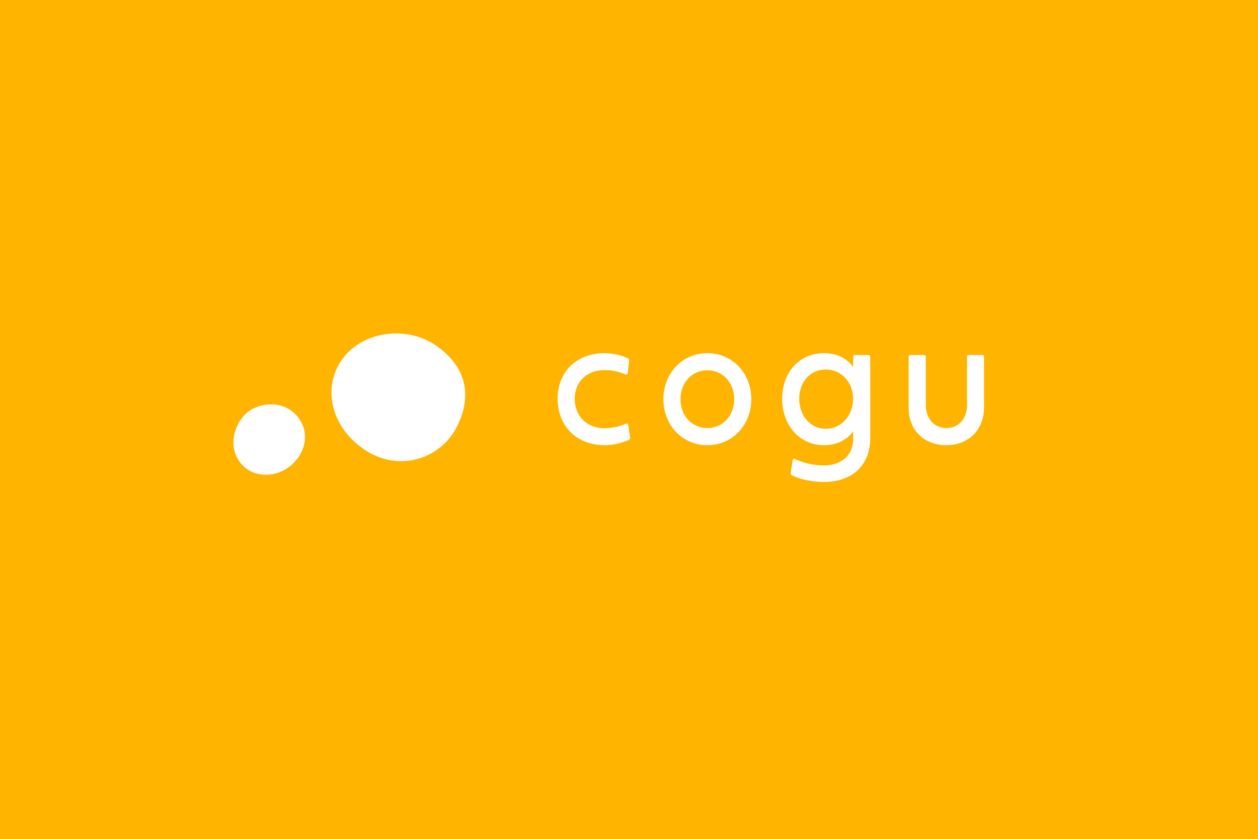
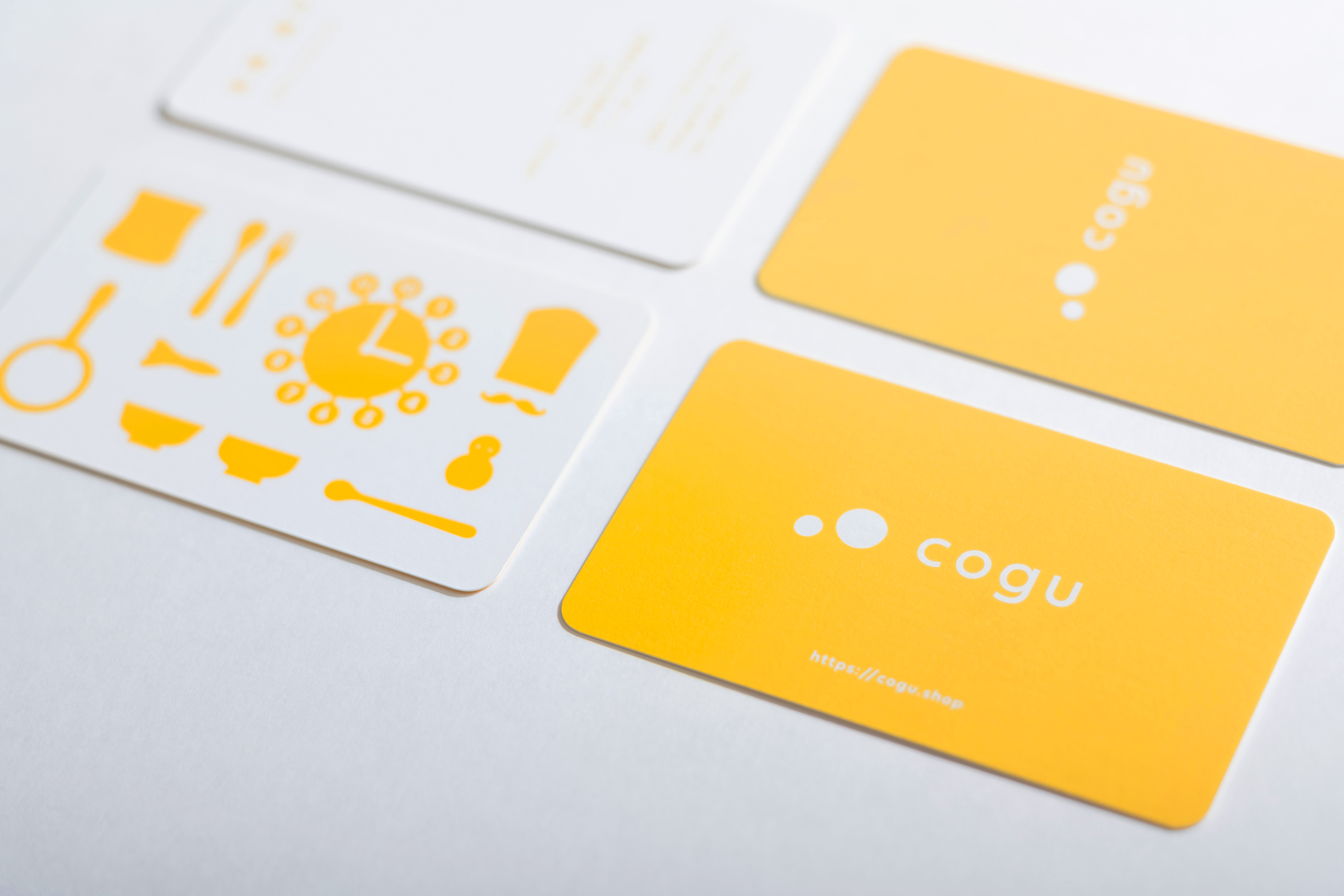
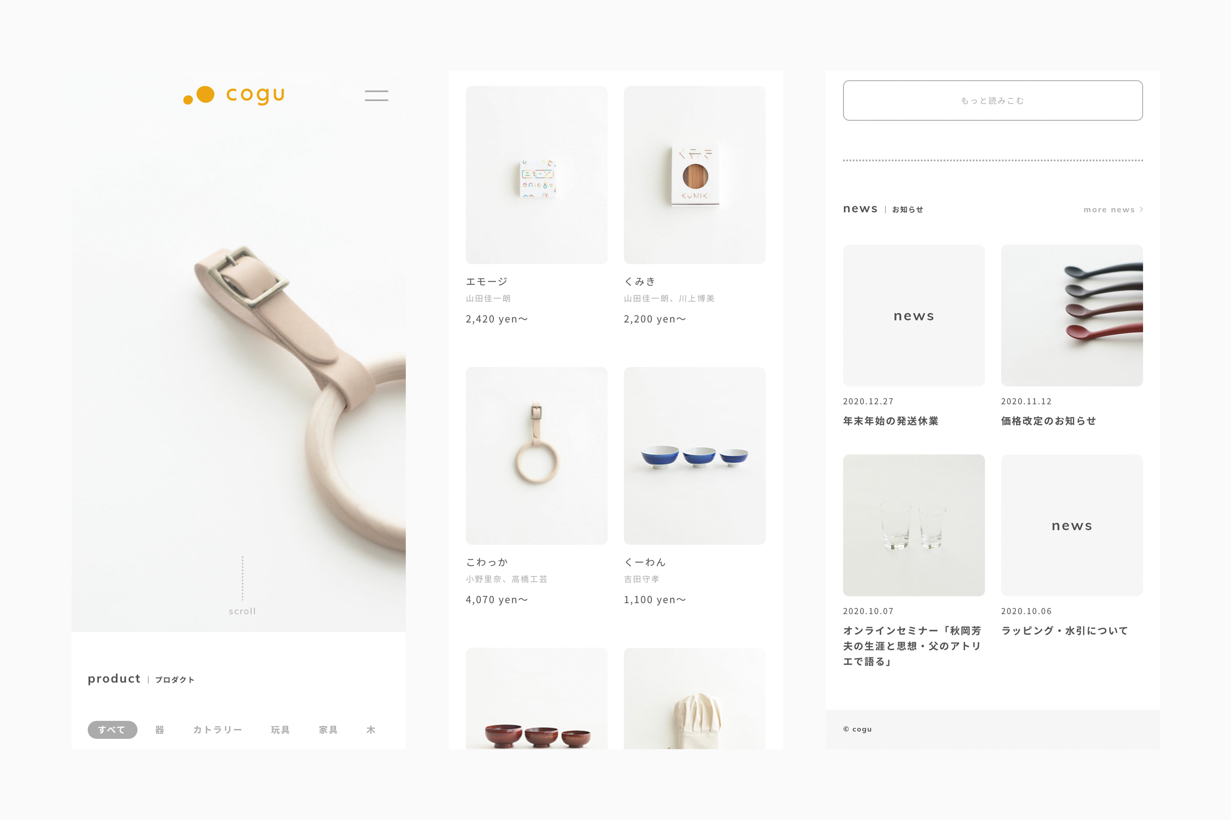
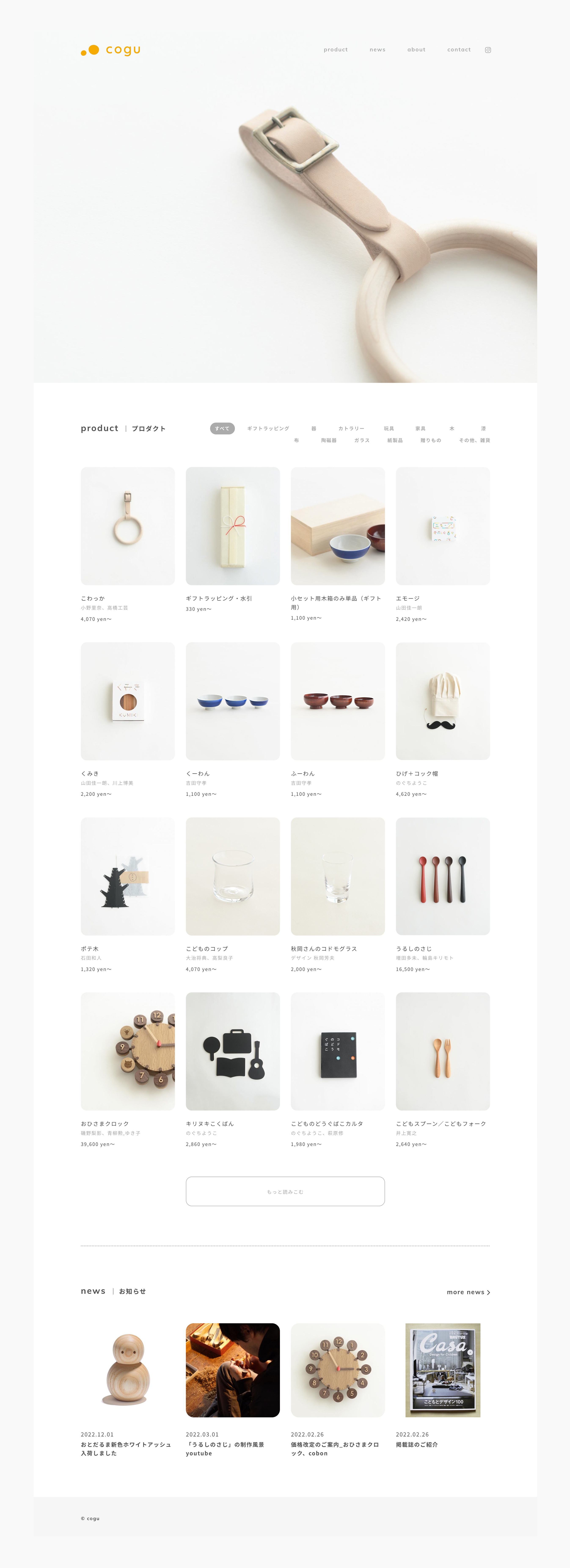
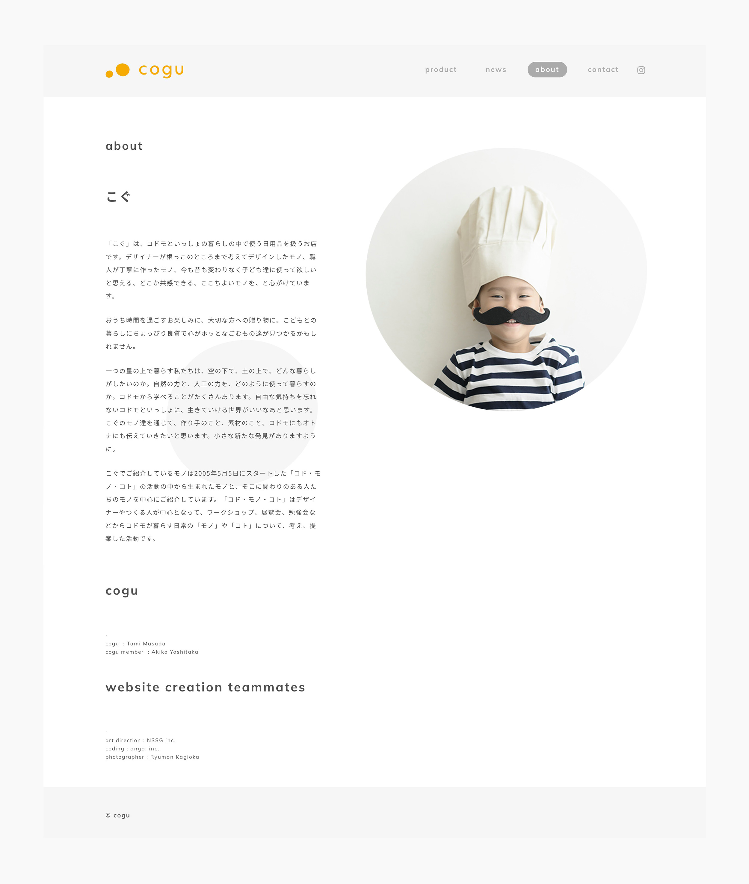
コドモといっしょの暮らしの中で使う日用品を扱うお店『cogu』のロゴとサイトのリニューアル、ショップカードや名刺のデザインを担当しました。ロゴマークはcoguの扱う道具の多くは円を含んでいるところから着想し、大小の丸を並べることで “コドモといっしょ” を感じることのできる印象に落とし込みました。正円ではなくすこしゆがんだ円は手仕事のプロダクトから感じる温もりや、安心感を与える印象を与えます。ブランドカラーには人の温度を感じる元気な色合いと安心感を与える色として、オレンジと黄色の中間色を選定しました。
We designed the logo, website renewal, shop cards and business cards for cogu, a shop dealing with daily necessities used in the daily lives of children and their parents. The logo mark was inspired by the fact that many of the tools handled by cogu contain circles, and by arranging circles of various sizes, we created an impression of "together with kids". The slightly warped circles, rather than regular circles, give the impression of the warmth and security you feel from handmade products. For the brand colour, we chose a colour between orange and yellow, which gives a sense of warmth and reassurance.
Design : Tomoya Wakasugi
Photograph : Ryumon Kagioka
Client : cogu