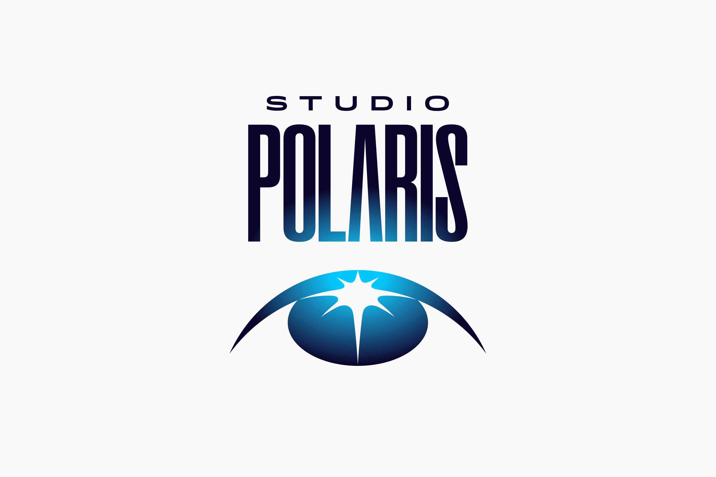
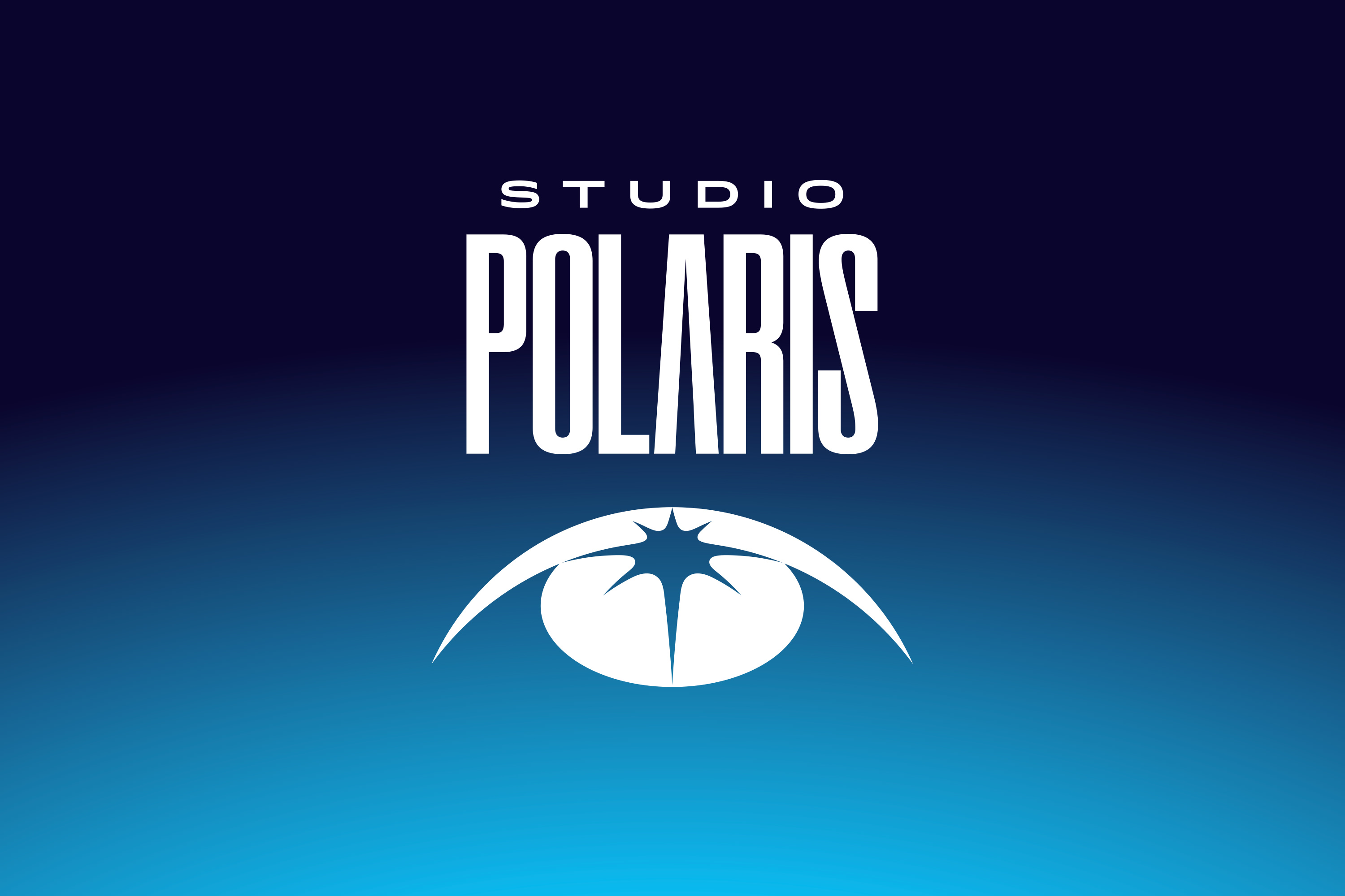
STUDIO POLARIS
Logo / Graphic
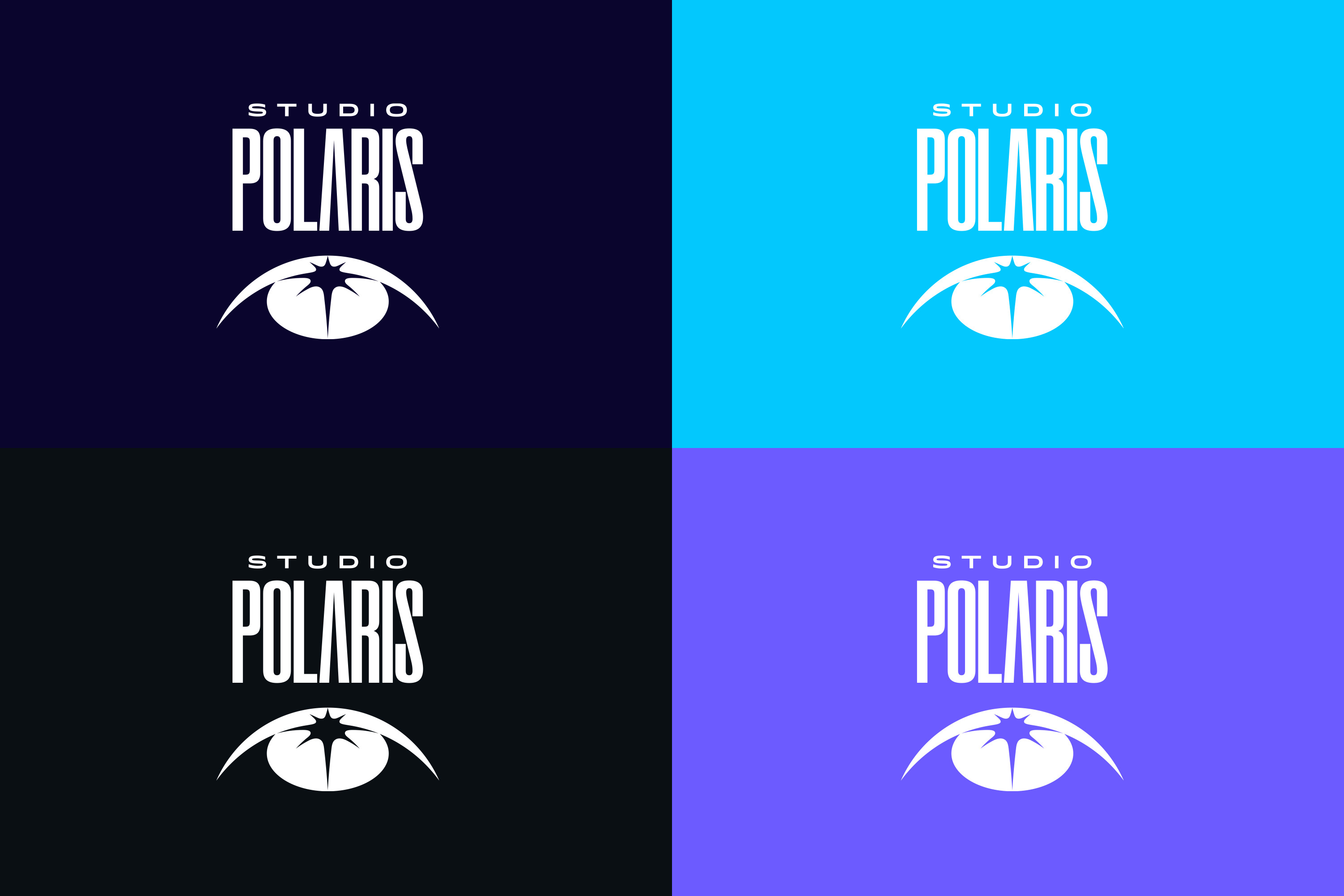
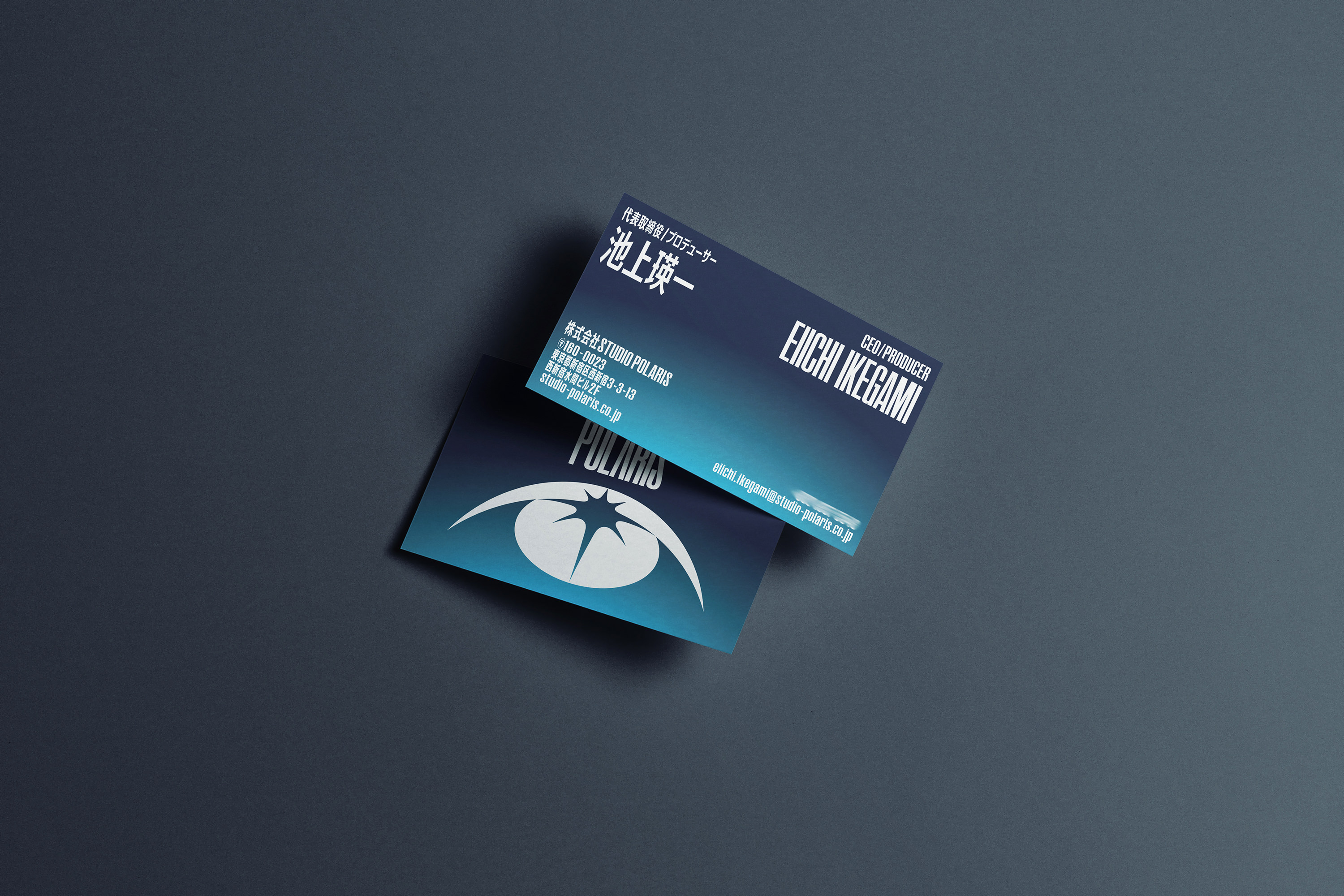
アニメーションスタジオ、STUDIO POLARISのVIのデザイン、アートディレクションを担当しました。このVIはスタジオが生み出す作品のキャラクター、スタッフ、ファンの“目”をモチーフとしています。
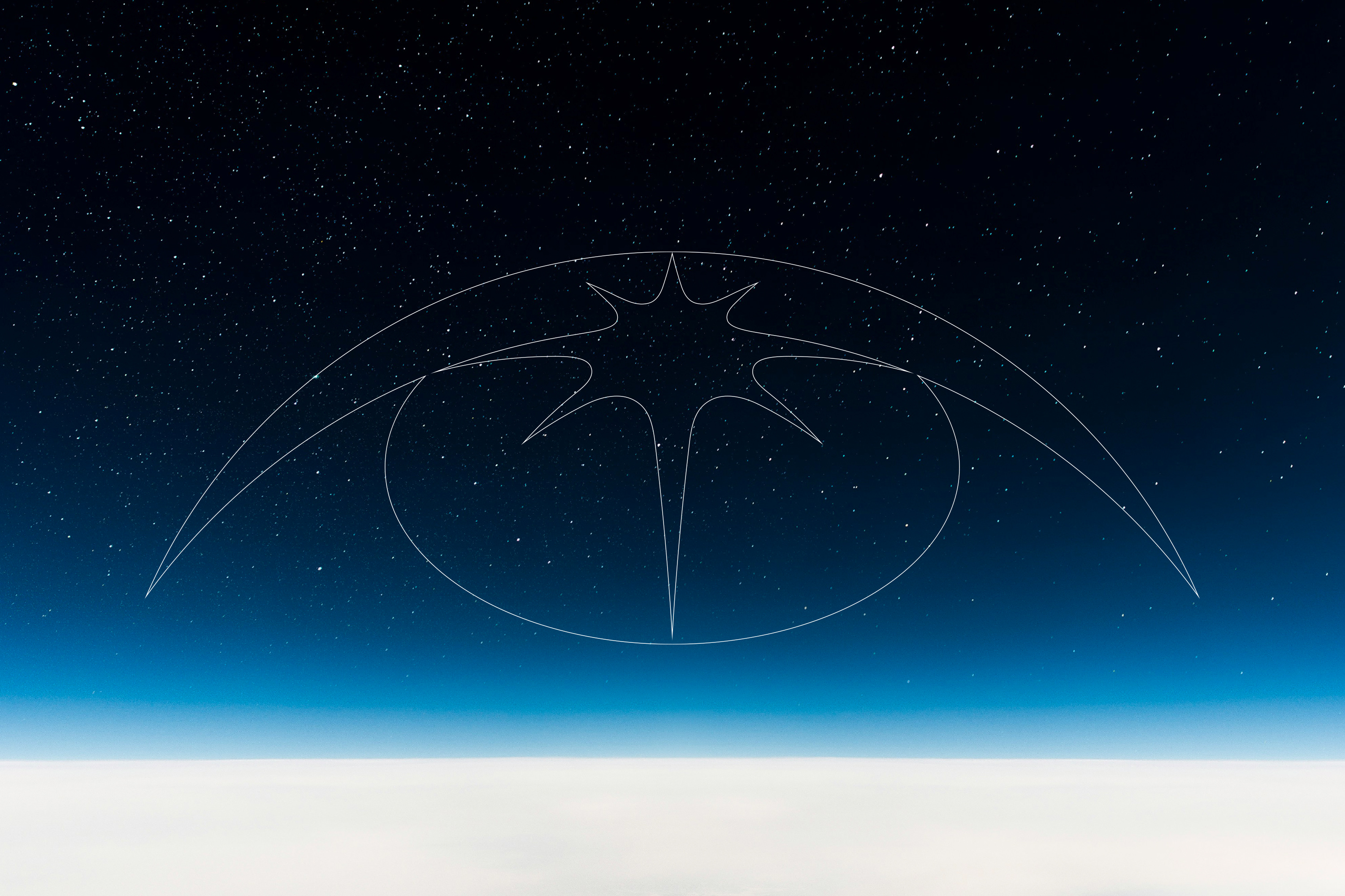
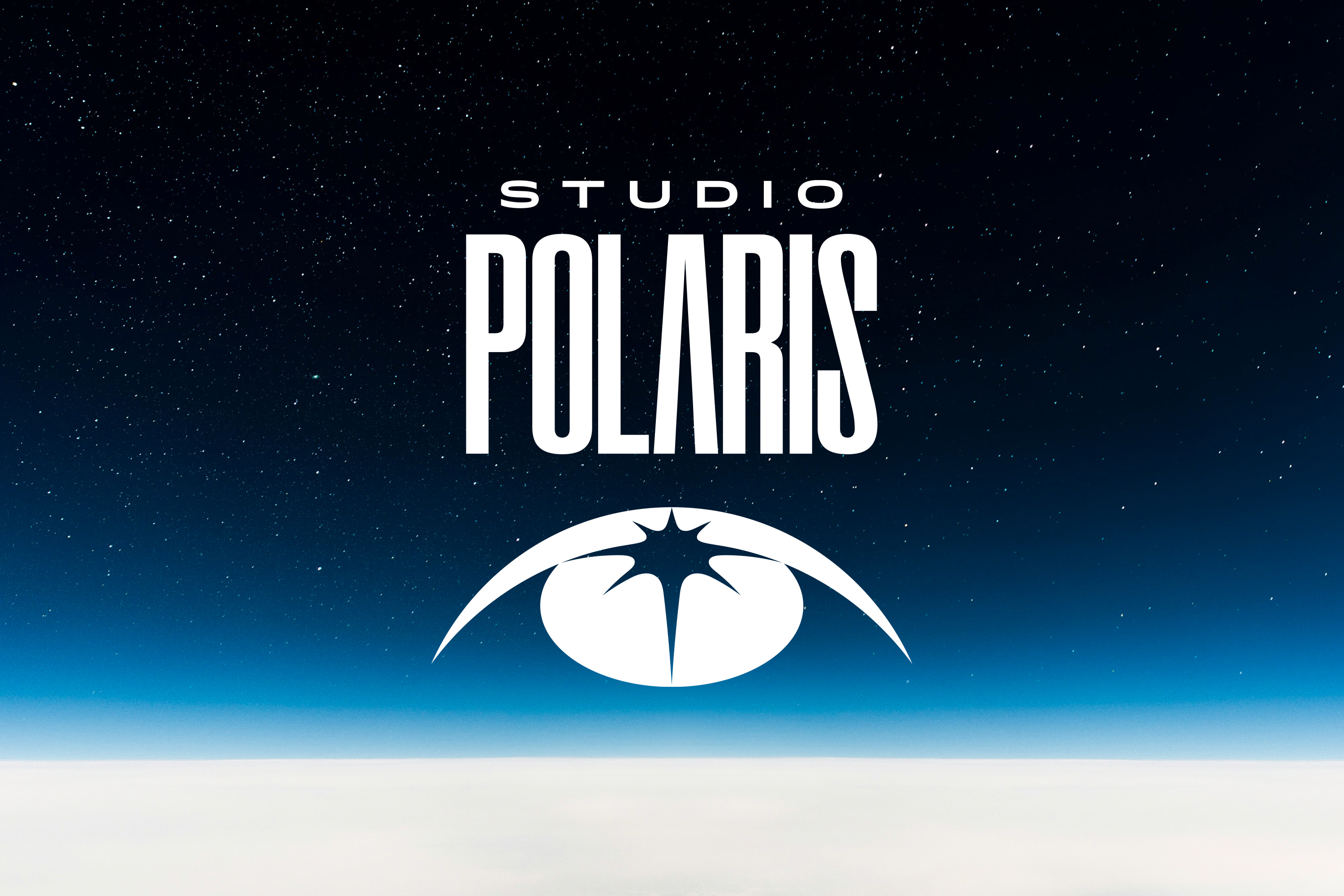
これらの目は皆、北極星(スタジオポラリス)を見つめており、その光が瞳に映る様子を表現しています。見上げる目の円弧は地球のシルエットとも重なり、国境を越えて作品を届けるというスタジオの姿勢を象徴しています。
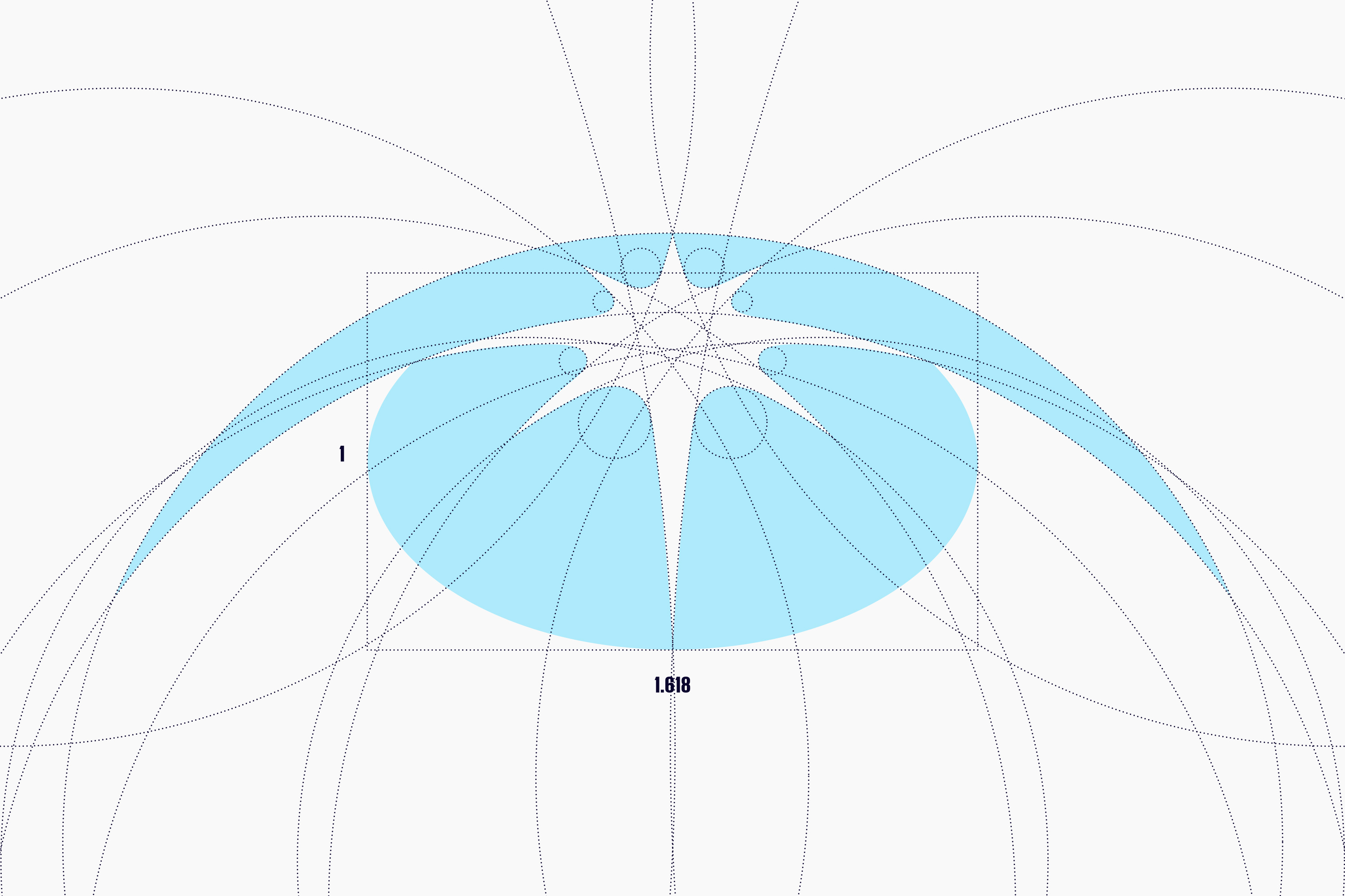
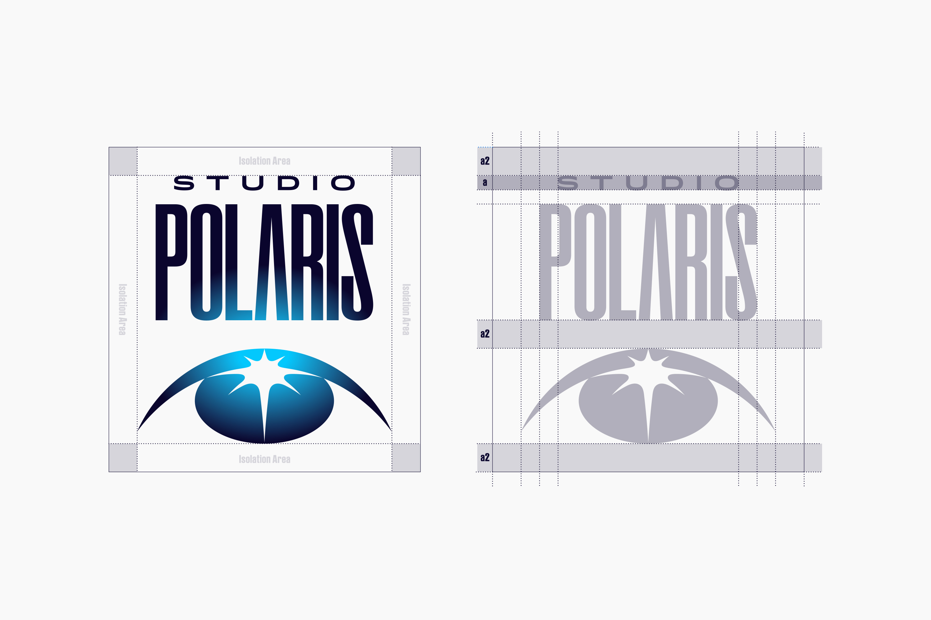
ロゴタイプはダイナミックな長体で広大な宇宙を想起させ、シンボルを下部に配置することで地球と宇宙のつながりを表現。視線の先にポラリスの存在を暗示しています。
北極星を直接描くのではなく、その存在を間接的に感じさせることで、優れた作品によって世界中の人々を導き、目が離せなくなるような未来を目指す企業姿勢をこのVIに込めました。
I was in charge of the VI design and art direction for the animation studio STUDIO POLARIS. This VI uses the “eyes” of the characters, staff, and fans involved in the studio’s works as its motif.
All of these eyes gaze toward the North Star (Studio Polaris), and the design expresses the light of the star reflected in their pupils. The arc of the upward-looking eyes overlaps with the silhouette of the Earth, symbolizing the studio’s intention to deliver its works across borders.
The logotype, with its dynamic, elongated form, evokes the vastness of space. By placing the symbol at the bottom, the design conveys the connection between Earth and the universe, subtly suggesting the presence of Polaris in the direction of the gaze.
Rather than depicting the North Star directly, the design allows its presence to be felt indirectly. Through this, it reflects the company’s aspiration to guide people around the world with outstanding works and to create a future where no one can take their eyes off what lies ahead.
Art Direction, Design: Tomoya Wakasugi(PNTR)
Client: STUDIO POLARIS